The history of the italian film poster

From nineteenth-century lithography to the twilight of painting on paper

Table of Contents:

  1. Introduction: the film poster, what remains of the film
  2. Before cinema: how the modern advertising poster was born
  3. The beginnings: the poster of early cinema (1895-1909)
  4. The 1910s: silent-era posters, the epics and the first divas
  5. The 1920s: the poster artists, the crisis and the invention of the “testone”
  6. The 1930s: the film poster, sound and Cinecittà
  7. The posters of the 1940s: war, neorealism and the first film archives
  8. The 1950s: the golden age of the Italian film poster
  9. The 1960s: poster artists, genres and the shadow of photography
  10. The 1970s: the twilight of the painted poster
  11. How a poster is made: formats, manifesto, locandina and fotobusta
  12. Film genres and their posters: an atlas in images
  13. The painters of cinema: the great Italian poster artists
  14. The poster artist’s craft: how a poster came to life
  15. Preserving and restoring a poster: a material born not to last
  16. Where the posters live today: archives, collections and the market
  17. The Italian poster and the international one: a look beyond the border
  18. Conclusion: what remains of the film
  19. Essential bibliography
  20. Directors and actors mentioned

1. Introduction: the film poster, what remains of the film

Picture any Italian town, on an evening seventy years ago. There is no television yet in every home, no phones lighting up in pockets. There is, instead, a wall on the corner of the square, and on that wall a large image, coloured, painted: the face of an actress, a hero with a sword, two lovers gazing at each other. Beneath it, in enormous letters, a title. It is the poster of a film, and for anyone passing by it is the first, and often the only, contact with that week’s cinema. It is an invitation, a promise, sometimes a small lie. It is meant to last only as long as a film’s run, and then someone will tear it down or paste another over it, and nothing of that image will remain.

This is the history of the Italian film poster: more than a century of film posters, locandine (the small Italian format) and lobby cards (Italian: fotobusta) painted by hand by the great Italian poster artists, the “painters of cinema” celebrated by Maurizio Baroni. We will tell it decade by decade, from the birth of lithographic printing in the nineteenth century to the golden age of the 1950s and 1960s, and on to the twilight of painting on paper. Along the way we will meet the Italian masters who created a distinctive and innovative art form admired throughout the world: Ballester, Martinati, Sciotti and many others whose work filled the streets and squares of Italy. We will also follow the techniques by which a poster came to life and the places where these masterpieces survive today. But before setting out on this history, it is worth pausing over a simple question, the one on which everything depends: what remains of a film once the lights in the auditorium come back up?

The memories of those who watched it remain. The print remains, if we are lucky, kept safe in some film archive. But there also remains a world of paper that for more than a century accompanied cinema like a faithful shadow: screenplays, production stills, cinema programmes, magazines, postcards and, above all, posters. For a long time these were considered scraps, things to throw away. Only recently have we understood that they were something more: they were witnesses.

The change did not come from nowhere. Over the course of the twentieth century a small revolution matured among historians. Scholars such as Marc Bloch and the historians of the Annales school, and later an Italian like Carlo Ginzburg with his “evidential paradigm”, taught that history is not made only from great official documents, but also from the smallest traces, from clues, from everything that bears the mark of human passage. In the same way, in the field of cinema, historians such as Gian Piero Brunetta established a principle now widely shared: the history of cinema does not coincide with the history of films. Around the print lies a whole archipelago of materials that prepare its arrival, accompany its life and preserve its memory.

To name these materials, scholars have proposed various words. The happiest, perhaps, is parafilmic: a term modelled on paratext, the concept with which the French critic Gérard Genette had indicated everything that, in a book, sits on the threshold of the text proper, such as the title, the cover, the preface. The poster is exactly this: a “threshold”. It is not inside the film, nor entirely outside it; it stands at the door and invites us to enter.

Of all these materials, the poster is the most fascinating. No other form of entertainment, not theatre, not opera, not the circus, has had so close a relationship with drawn advertising as cinema. A poster can tell the story of a film better than a thousand words: the faces of the actors, the lettering of the title, the colours, the distributor’s mark. When the film is lost, or simply forgotten, it is the poster that keeps its memory, working like that madeleine of Proust’s which, years later, suddenly brings a whole world flooding back.

Stagecoach · Ballester

The poster of Stagecoach (John Ford, 1939), painted by Anselmo Ballester for an Italian re-release. The charge of the warriors, rendered as a wave of fire-red that surrounds the stagecoach, turns the Italian title into pure image. The film that made the western great cinema opens this history with the work of the man regarded as its founding father.

The pages that follow tell the story of these posters in Italy, from their nineteenth-century roots, when cinema did not yet exist, to the slow twilight of the great tradition of the painted poster, between the 1970s and 1980s, when photography and then the computer took the place of the brush. It is a story we will follow decade by decade, because every era had its films, its audience, its stars and therefore its posters. But it is also a story that, from time to time, will leave the timeline behind to dwell on a few questions: how is a poster made? Who drew it, and how? Why is it so hard to preserve? And where have they ended up, today, the ones that were saved?

One caveat, finally, is due, and it is one an honest historian cannot pass over in silence. The further back one goes, the rarer the documents become. Of Italian posters from before the 1930s very little has reached us: a few examples, often in poor condition, saved from destruction by chance. For this reason the first part of this account proceeds over ground made of a few precious traces, whereas for the later decades, when the materials multiply, we can allow ourselves to go into detail. It is a limitation, but also an invitation to caution and, in its own way, a part of the story, because the very scarcity of those images from the past tells us how little, for far too long, we thought them worth saving.

2. Before cinema: how the modern advertising poster was born

A stone, a press, a thousand colours

The film poster did not fall from the sky. When the Lumière brothers projected their first films, the advertising poster had already existed for decades, with its rules, its masters and its grammar. Cinema, in the end, had to invent nothing; it borrowed a language already made and adapted it to its own ends. To understand where the poster of a film comes from, we must therefore take a step back, to the threshold of the nineteenth century, and tell a small technological adventure.

It all begins with a stone. In 1796 a Bohemian named Alois Senefelder devised a new printing process, lithography: one draws directly onto a slab of limestone with a greasy crayon, and from this matrix faithful copies of the drawing can be pulled. It was a silent revolution. In the years that followed the technique was perfected; in 1833 the Frenchman Brisset built a press capable of printing large sheets, and around mid-century the German Godefroy Engelmann developed chromolithography, that is, lithographic printing in colour. Applied to the great industrial machines, this technique made it possible to pull up to ten thousand copies a day. Think what that meant: for the first time in history, one could produce the same image, in colour, in enormous quantities, and paste it up everywhere.

Without this invention, no posters. Industry was growing, commerce was expanding, entertainments were multiplying, everyone needed to be noticed, and colour lithography arrived at just the right moment, turning the walls of cities into an immense illustrated newspaper, legible by anyone.


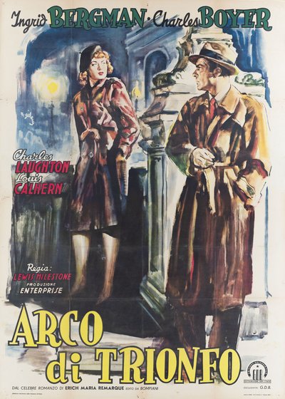
Arch of Triumph · Geleng

The poster of Arch of Triumph (Lewis Milestone, 1948). The legacy of the great nineteenth-century poster school, the painterly taste, the sense of the scene, arrives intact in works like this one, painted half a century later by Rinaldo Geleng for the melodrama with Ingrid Bergman and Charles Boyer, adapted from Remarque’s novel. It is proof that the tradition never broke off: it simply passed from the wall of advertising to the wall of the cinema.


Paris, queen of the walls

The new medium found its chosen home in Paris, at the height of the Belle Époque. Here a handful of artists decided to put their talent at the service of advertising, and in doing so invented a new art. The first and most important was Jules Chéret, whom history remembers as the father of the modern affiche: it was he who spread colour printing on an industrial scale, and it was he who made a gesture destined to matter enormously for the future film poster. Chéret began to treat letters as images, fusing them with the drawing until they could no longer be told apart. It is an intuition that, as we shall see, the film poster would carry to its furthest conclusions.

After Chéret came other names that today hang in museums: Henri de Toulouse-Lautrec, who drew the posters of the Moulin Rouge, Pierre Bonnard, and the Bohemian Alphonse Mucha, with his female figures wrapped in floral ornament. Thanks to them the poster ceased to be a mere announcement and became a popular art form, able to carry beauty out of the galleries and hang it on the walls, where everyone could see it. And “everyone” is the right word: in an age when a great many people could neither read nor write, the illustrated poster spoke a universal language made of colours and figures. It was, in a sense, one of the first mass media in history.

Once upon a time there was Italy too

While Paris was conquering the walls of Europe, Italy too was cultivating a poster tradition of the very highest order. The heart of this school was the Officine Grafiche Ricordi in Milan, yes, the same publishing house of the opera scores, which at the end of the nineteenth century gathered and trained an extraordinary generation of designers. There was Adolfo Hohenstein, regarded as the founder, there were Leopoldo Metlicovitz, Aleardo Terzi, Giovanni Maria Mataloni and, above all, Marcello Dudovich, the most elegant of them all. Around them flourished a true school of Italian advertising posters, with names that collectors compete for today: Leonetto Cappiello, who from Tuscany exported to France a dazzling, distilled poster, Achille Luciano Mauzan, a hugely prolific author of advertising and propaganda posters, not to mention Plinio Codognato, Marcello Nizzoli and Federico Seneca, masters of advertising between Liberty and Deco.

These names are no mere footnote. The Italian poster school had a very definite character: it was more narrative, more atmospheric, more painterly than the French. Where the Paris affiche aimed at concision and elegance, the Milanese cartello loved to tell a scene, to evoke a setting, to fix the climactic moment of a story, having grown up, not by chance, in the shadow of melodrama and opera. And this is exactly the skill that would serve, before long, the film poster: to translate a story into a single image. Many future masters of the film poster would emerge from precisely this milieu. The continuity is such that, in several cases, they are the very same people. It is one of the reasons why Italian posters would be, from the outset, so beautiful.


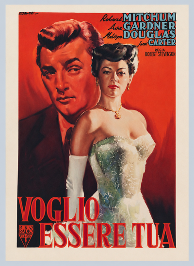
My Forbidden Past · Olivetti

The poster of My Forbidden Past (Robert Stevenson, 1951), painted by Giorgio Olivetti. The melodrama with Ava Gardner and Robert Mitchum is rendered with the sense of scene and atmosphere inherited from the great nineteenth-century poster tradition. Half a century after Chéret and Dudovich, the legacy of the pioneers lives on in the hand of a painter of cinema. It is precisely the continuity this chapter recounts.


There was also a second current, apparently its opposite, that would leave a lasting mark. At the beginning of the twentieth century, the avant-gardes, and the Futurists in particular, made advertising a field of experimentation. Marinetti and artists such as Fortunato Depero played with “words in freedom”, distorted typefaces and made text explode across the page. It may seem a world away from commercial advertising, yet many of those inventions, above all the idea of the word-image, of the title becoming an image in its own right, would later find their way into film posters. The Italian poster thus emerged from the meeting of two legacies: the figurative tradition of the great nineteenth-century poster artists and the experimental drive of the twentieth-century avant-gardes. It drew something from both.

3. The beginnings: the poster of early cinema (1895-1909)

The first poster is older than cinema

There is a detail that raises a smile: the first poster made for what would come to be called the “seventh art” is older than cinema itself. It was signed by none other than Jules Chéret, the father of the affiche. In 1892 he drew the poster for Émile Reynaud’s Pantomimes lumineuses, the show of animated images projected at the Musée Grévin in Paris, considered the ancestor of cinema. A copy of that poster is today kept at the National Cinema Museum in Turin. Chéret himself, it seems, was also commissioned to draw a poster for the Lumière brothers’ Cinématographe, but for reasons we do not know it was never used.

The official birth date of cinema is 28 December 1895: on that day, at the Grand Café in Paris, the Lumières projected their very short films to a paying audience for the first time: workers leaving the factory, the arrival of a train, the demolition of a wall. And at once, alongside cinema, came the poster. Three posters advertised the invention, signed by Henri Brispot, Abel Truchet and Marcellin Auzolle. Two of them are worth pausing on, because they tell us something important. Brispot’s poster does not show a film; it shows the crowd queuing before the gas-lit door of the hall, with a gendarme keeping order. What is advertised, in other words, is not yet a film but an event, the very magic of going to the cinematograph. Auzolle’s poster, by contrast, takes the next step, portraying an elegant family in the front row, laughing in front of L’Arroseur arrosé, the first comic film in history. For the first time, a scene from the film and the spectators watching it appear together on a poster. It is the film poster taking its first steps.

Ten years of silence

One might think that, after so promising a debut, film posters would have come thick and fast. But no: nearly a whole decade of silence followed. The reason is simple, and it helps us understand what the cinema of the earliest years was like. At the time films had no home of their own; they were shown in cafés-chantants, as one of the many attractions of the evening, or in fairgrounds and village fairs, where advertising was already done in other ways. Why print a special poster for something that lasted two minutes and was on the bill for a single evening? Only exceptional events deserved a poster, as happened in New York in 1898, when some films showed Pope Leo XIII and huge, splendid posters were printed for the occasion. But these were exceptions.

1905: cinemas are born, posters are born

The poster for the single film returned to the stage for good only when cinema found a home: the fixed hall, the venue open every day. It happened around 1905, and France led the way. Gaumont and Pathé, which then dominated the world market, began to produce posters for their films, sometimes printing four or even seven smaller ones on a single sheet. From 1907 Gaumont went so far as to devote a poster to every important title. There is something moving, looking at them today, in the disproportion between those magnificent posters, true masterpieces of the lithographic art, and the little films of a few minutes that they announced.


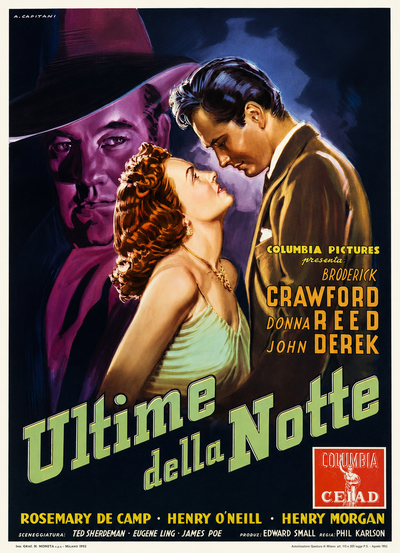
Scandal Sheet · Capitani

The poster of Scandal Sheet (Phil Karlson, 1952), painted by Alfredo Capitani. A noir about the editor of a scandal sheet who finds himself at the centre of his own crime story. Exactly half a century after the pioneering posters described in this chapter, the film poster had become a mature art and the old disproportion had been reversed: no longer magnificent posters for two-minute films, but painting and cinema at last on equal terms.


And Italy? Here we return to the difficulty mentioned in the introduction: very little survives from those years. The oldest Italian poster known today dates from 1905, for the film Briganti in Sardegna, produced by the Ambrosio company of Turin and designed by an artist whose name is unknown. The date is no accident: it was precisely in those years that the Italian film industry was being born, with Turin as its first great centre. Here, in 1906, Arturo Ambrosio founded the country’s first true production company, soon joined by Giovanni Pastrone’s Itala Film, while in Rome, at almost exactly the same time, Cines was established. For two or three years Italy and France dominated the production of illustrated film posters. The few surviving Italian examples, though by unknown artists, already reveal a sure hand and that instinct for “telling” the film which would become a hallmark of the national school. They are rare and precious clues, like shards of a shattered vase, allowing us to glimpse a whole that is, for the most part, lost.

America invents the formats

In the United States, meanwhile, things went differently and almost the opposite way. For years it seemed enough to Americans to light up the front of the venue and post a simple list of titles at the entrance. When an image really was needed, exhibitors picked more or less at random among the posters for stage dramas, following a habit inherited from the circus and the travelling theatres; anything that might intrigue the passer-by would do.

Everything changed in 1908, when the major studios, at Edison’s instigation, joined together in a consortium, the Motion Picture Patents Company, which also gave rise to a distribution company. One of its first acts was of a thoroughly American practicality: to fix the standard measurements of advertising material, borrowing them from the world of fairs and the circus. Thus were born formats destined to spread across the world, measured in “sheets”: the one-sheet, the three-sheet, the six-sheet and the gigantic twenty-four-sheet, a poster of twenty-four sheets meant to be seen from a distance, as the roads grew and the first cars went by.

Alongside the great mural formats, Americans also invented the materials for the interior of the halls, and here the matter concerns us closely, because from those inventions two Italian “classics” would be born. The lobby cards were illustrated cards, produced in sets of eight or ten, one with the title, the others with scenes from the film, and displayed in the cinema foyer: they are the ancestors of our lobby cards (Italian: fotobuste). The window cards, on the other hand, had a blank space at the top on which to print showtimes, dates and the name of the hall; from them descends directly our locandina (the small Italian format). Both would arrive in Italy later, the lobby cards remaining very rare until the end of the 1930s, the locandina appearing only after the war, but it is here, across the ocean, that their model takes shape.

4. The 1910s: silent-era posters, the epics and the first divas

The Italy that conquered the world

It is hard to believe today, but in the years before the First World War Italy was one of the world’s leading cinematic powers. Its production companies exported films across the globe, and their calling card was the great historical epic and costume drama. These were lavish, monumental productions built around vast sets and seemingly endless crowds of extras. Quo Vadis? by Enrico Guazzoni, in 1913, and above all Cabiria by Giovanni Pastrone, in 1914, established a model of spectacle that would influence even early Hollywood. In those years, Italian silent cinema set the pace.


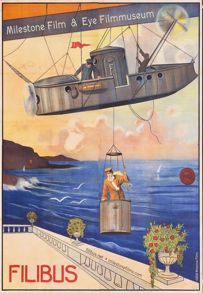
Filibus · 1915

The poster of Filibus (Mario Roncoroni, 1915). The mysterious pirate baroness who descends from her airship to pull off impossible heists, amid disguises, chases and fantastical technology: one of the most strikingly modern serials of Italian silent cinema, now rediscovered and celebrated abroad as well. The work, by an unknown designer as was the custom then, is a period print that survived destruction by chance: one of those fragments of a vase the previous chapter speaks of, reaching us with its scars.


Alongside the epic a second phenomenon was being born, destined to matter enormously for posters: the star system. In Italy it had, above all, a female face. The great divas of the silent era, Lyda Borelli, Francesca Bertini, Pina Menichelli, became the object of a genuine popular cult. The public no longer simply went “to the cinema”; they went to see Her. People imitated her poses, her languid gestures, her clothes. A word was even coined, “borellismo”, to describe that way of moving and suffering on screen. When a face becomes a magnet capable of filling the halls, it is inevitable that it will end up at the centre of the poster.

Cabiria, D’Annunzio and a name on the poster

In these years the Italian poster begins to take on a recognisable physiognomy, even if, we repeat, the surviving examples are few and must be handled with care. It reflects the grandiloquence of the epic, with crowded, dramatic compositions. The most celebrated case is that of Cabiria: because Gabriele D’Annunzio, no less, had taken part in the production as a “literary collaborator”, author of the intertitles and of the characters’ names, his name appeared on the poster with an altogether unusual prominence. It is a detail that says a great deal. At the time, in fact, the director’s name was almost never written: it was not thought capable of drawing an audience. If an exception was made for Cabiria, it was only because D’Annunzio’s prestige was “merchandise” worth spending at the box office.

Other elements too, which we take for granted today, arrived with surprising slowness and some resistance. The film’s title began to appear with any regularity only after 1910; in France it was already there, prominently, from 1904. The actors’ names cropped up later still, around 1919; before then the players often remained anonymous, and this suited the producers perfectly, since a nameless actor cost less. As for the director, the very rare exceptions, such as the poster for Za la mort with the name of Emilio Ghione prominently displayed, only confirm the rule.

Anselmo Ballester, the founding figure

It was during this decade that the man history would come to recognise as the father of the Italian film poster entered the scene: Anselmo Ballester. In 1914, while still very young, Ballester produced his first film poster design, beginning a career that would span more than fifty years. The earliest posters currently documented date from the years immediately following. Over the course of his very long career Ballester would sign thousands of posters, building a style that seems simple but is the fruit of great mastery: a sure pairing of colours, a continual play of echoes between the words and the drawing. With him something important happens: the poster ceases to be an anonymous product and becomes the work of a recognisable artist. Ballester would be the first of the three “grand old men” around whom the whole story we are telling revolves.

The genres of the silent era

Already in these years, moreover, Italian cinema had its genres, and each asked a different language of the poster. There was the historical costume film, the epic already mentioned, with its grandiloquence of crowds and colonnades. There was the diva film, the passionate melodrama built on the face and the gestures of the actress. There was the comic film, animated by hugely popular figures such as Cretinetti, the character of the Frenchman André Deed, star of the Turin-based Itala Film, or Polidor, forerunners of a comedy that the poster rendered with lively, colourful vignettes. There was the serial film, the adventure in instalments, of which Za la mort with Emilio Ghione is the most celebrated example. These are the first bricks of that world of genre imagery which, decade after decade, would fill the walls of Italy.

5. The 1920s: the poster artists, the crisis and the invention of the “testone”

When Italy lost its lead

The 1920s were, for Italian cinema, a bitter decade. The industry that had conquered the world collapsed within a few years. The reasons can be summed up thus: Italian success had rested on two extremely costly models, the epic and the diva film, which worked only so long as one could sell across the whole world. When first the war, and then American competition, closed off the international markets, the entire system crumbled. The attempt to react by joining forces in a great trust, the Unione Cinematografica Italiana, failed at the start of the decade. National output plummeted to a few dozen films a year, and Italian cinemas were soon overrun by Hollywood.

As Italy fell back, the public was learning to love a new firmament of stars: the American ones of the silent screen, from the Italian-American idol Rudolph Valentino, worshipped the world over, to the great actresses from across the ocean. The poster registered this shift precisely: the face of the star, isolated and idealised, became the subject par excellence of the poster.


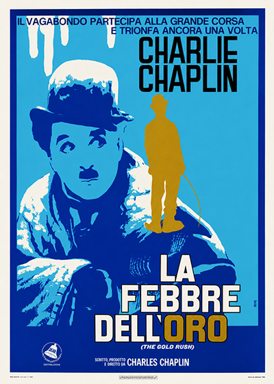
The Gold Rush · Ferrini

The poster of The Gold Rush (Charlie Chaplin, 1925), painted by Renato Ferrini. The most beloved tramp in the world, amid hunger, snow and the famous dance of the bread rolls, in the film Chaplin himself said he wished to be remembered by. It is the American stars of the silent screen who conquer the Italian cinemas of the decade, and their faces that take over the city walls.


Capitani, Martinati and a brushstroke that makes history

And yet, even in a decade of crisis, the language of the poster does not stop; on the contrary, it matures. Alongside Ballester the other two “grand old men” come to the fore: Alfredo Capitani and Luigi Martinati. Both have a rapid brushstroke and vivid colours, and both tend to specialise in different genres. To Martinati, a great lithographer, we owe one of the most successful inventions in all of Italian poster art: the “testone”. Put like that it sounds like little; in reality it is a stroke of genius. It is the great close-up portrait of the leading actor that dominates the whole poster. That giant close-up was at once an irresistible emotional appeal and a commercial guarantee: it translated into image the star cult that was winning over the public. It worked so well that the film poster would keep it, almost unchanged, for decades.


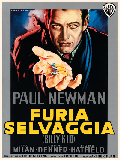
The Left Handed Gun · Martinati

The poster of The Left Handed Gun (Arthur Penn, 1958), painted by Luigi Martinati. The face of Paul Newman, the tormented Billy the Kid of Penn’s debut, fills the sheet: it is the “testone” in its finished form, the invention Martinati had perfected decades earlier and which here, in full maturity, shows all its power. A later example of an idea born in these years, and unchanged because it was perfect.

In 1926 Capitani and Martinati pooled their talent and founded a company, which they called “Maralca”, joining the syllables of their surnames. It is a small sign of a great change: poster art ceases to be a purely individual craft and begins to organise itself as a business. And yet, in a trait that is thoroughly Italian, those masters never founded a true school. They went on working as artisans, without assistants who might become their pupils. Their teaching passed by imitation and influence, not from master to disciple. Between the two wars the film designers remained few and worked in isolation. It is a detail we will come across again at the end of our story, and it explains, at least in part, why that tradition died out so quickly.

6. The 1930s: the film poster, sound and Cinecittà

Cinema becomes a matter of State

With the 1930s everything changes, and changes fast. In 1930 sound reaches Italy too, with La canzone dell’amore by Gennaro Righelli; from now on the public not only sees but hears. Meanwhile cinema becomes a serious affair, indeed a matter of State. The Fascist regime, which had quickly grasped cinema’s value for propaganda and consensus, built within a few years a whole architecture of institutions destined to last for generations. As early as 1924 the Istituto LUCE had been founded, a factory of newsreels and documentaries. Then, in rapid succession: in 1932 the Venice Film Festival, the first international film showcase in the world, in 1935 the Centro Sperimentale di Cinematografia, a school and film archive, and in 1937 the inauguration of Cinecittà, the great studios that would become the “heart” of Italian cinema.

To all this was added a robust protectionism, culminating in the Alfieri Law of 1938, which in effect established a State monopoly over the importation of foreign films. The reaction of the great American companies was sharp: they withdrew their films from the Italian market. The effect, paradoxically, was to free the screens and to give impetus to national production. For the poster artists all this meant something very concrete: more films to advertise, a growing market, work in abundance.

The “white telephones” and their posters

What sort of cinema was that of the 1930s? For the most part, a cinema of escape. The sentimental comedies of the so-called “white telephones” were all the rage, named after the luxurious, modern furnishings of their bourgeois interiors, an elegant and glossy world, often far removed from the real Italy. From these films a thoroughly Italian star system was finally born, with its beloved faces: Assia Noris, the young Vittorio De Sica in the role of the light leading man, Amedeo Nazzari, Alida Valli. The poster adapted to the taste of the time: luminous, elegant compositions, meticulous portraits of the players, a refined graphic style that took up Martinati’s “testone” and dressed it in evening wear. On the technical side, it is in this decade, especially towards the end, that lobby cards (Italian: fotobusta), until then very rare in Italy, finally begin to spread. The three historic masters, Ballester, Capitani and Martinati, dominate the scene and are preparing to become, after the war, a veritable “premier firm”.

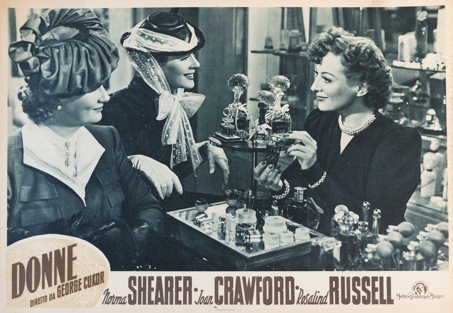
The Women · 1939 (lobby card)

The lobby card of The Women (George Cukor, 1939). Norma Shearer, Joan Crawford and Rosalind Russell at the perfume counter, in Cukor’s sparkling comedy performed by an all-female cast: the glossy elegance that the Italian public of the decade adored, in the format that was spreading through the halls in exactly those years, the lobby card, with the photographic scene and the credits printed in the bottom band. A world of furs, little hats and gossip that is the Hollywood cousin of Italy’s “white telephone” comedies.

7. The posters of the 1940s: war, neorealism and the first film archives

A decade split in two

Few decades are so sharply divided in half as the 1940s. The first part is that of the war, with a production partly bent to propaganda. The second is one of the highest seasons in the history of world cinema: neorealism. With Rome, Open City by Roberto Rossellini (1945), Shoeshine and then Bicycle Thieves by Vittorio De Sica (1948), and The Earth Trembles by Luchino Visconti (1948), Italian cinema brought to the screen the streets, the rubble, the hunger and the dignity of ordinary people, often with actors drawn from real life. It was a new language, one that made truth a moral and aesthetic choice, and that the whole world watched with admiration.


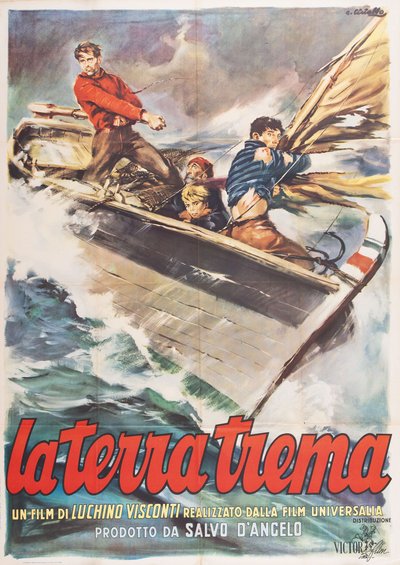
The Earth Trembles · Ciriello

The poster of The Earth Trembles (Luchino Visconti, 1948), painted by Averardo Ciriello. The tragedy of the fishermen of Aci Trezza, filmed with the real inhabitants of the village and performed in dialect, is the most radical peak of neorealism. To the painter fell the almost impossible task of giving a seductive face to a film that refused all seduction: the Italian school’s answer to this puzzle is recounted below.

It is also the decade in which, in Italy, people begin to think seriously about preserving cinema. In 1947 the Cineteca Italiana was founded in Milan, becoming the country’s first film archive and preserving an important collection of materials related to the history of cinema. Two years later, in 1949, the Cineteca Nazionale was established in Rome, likewise with a rich poster collection. It is the beginning, however tentative, of the awareness that of cinema one must save not only the prints, but also all the paper that accompanies them.

How do you draw a film that refuses spectacle?

Neorealism confronted the poster artists with a curious problem, almost a puzzle. How can you advertise, with an enticing image, a film that has deliberately chosen to renounce every form of spectacle? How do you persuade the public to come into the hall with the poster of a story made of unemployment, poverty and stolen bicycles? The answer was, in most cases, an intelligent compromise. The close-up of the protagonists and the traditional figurative framework remained, but the tones became more sober, the atmospheres more dramatic and the palette less vivid. It is one of the best examples of a constant that runs through the whole history of the film poster: the poster never merely reflects the film, but continually mediates between its own commercial function and the soul of the work it is called upon to announce.

In the postwar years, finally, a new format appears in Italy, destined for great fortune: the locandina (the small Italian format), that handy vertical card (about 33×70 centimetres) which often reproduces the large poster in miniature. It descends, as we have seen, from the American window cards. With its arrival, the set of formats that would characterise the golden age of the poster is at last complete.

8. The 1950s: the golden age of the Italian film poster

The decade when everyone went to the cinema

If we had to name a single decade as the golden age of the Italian poster, it would be this one. And not by chance: the 1950s are the years in which Italians went to the cinema more than ever before or since. In the full flood of reconstruction and then of the economic boom, the cinema hall was the chief place of leisure and encounter for the masses. Tickets were sold in numbers that would never be reached again. To this overwhelming hunger for films corresponded an equally enormous hunger for images on paper: every film, Italian or foreign, wanted its posters, its locandine, its lobby cards. Never did the poster artists have so much work.

These were also the years of “Hollywood on the Tiber”: drawn by the low costs and the great resources of Cinecittà, the American majors came to Rome to shoot their epics, from Quo Vadis (1951) to Ben-Hur (1959). And meanwhile, on the Italian front, the popular genres destined to fill the halls were being born and prospering: the mythological film, or peplum, launched by the triumph of Hercules (1958) with the bodybuilder Steve Reeves, the commedia all’italiana, which with Big Deal on Madonna Street (1958) by Mario Monicelli found its perfect formula, the comic film, dominated by the inimitable mask of Totò, whose pictures filled the halls and gave the poster artists a pretext to play with his face, the tear-jerking melodrama of Raffaello Matarazzo, with the popular pairing of Amedeo Nazzari and Yvonne Sanson, the adventure film and the swashbuckler. Above all this the star of a young director from Rimini was beginning to shine: Federico Fellini.


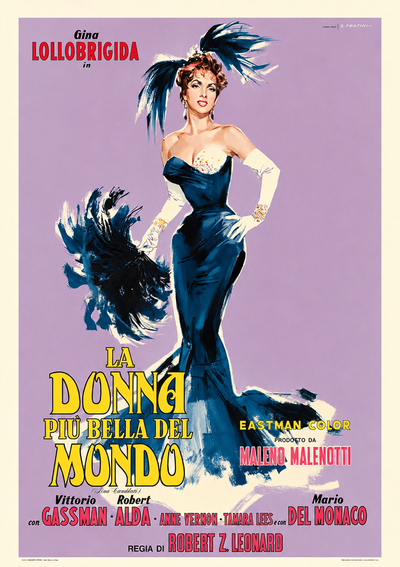
Beautiful but Dangerous · Fratini

The poster of Beautiful but Dangerous (Robert Z. Leonard, 1955), painted by Renato Fratini. Gina Lollobrigida in the role of the singer Lina Cavalieri, in one of the popular triumphs of the decade: Italian stardom of the golden age in person, with the poster of Beautiful but Dangerous promising exactly what the title declares.


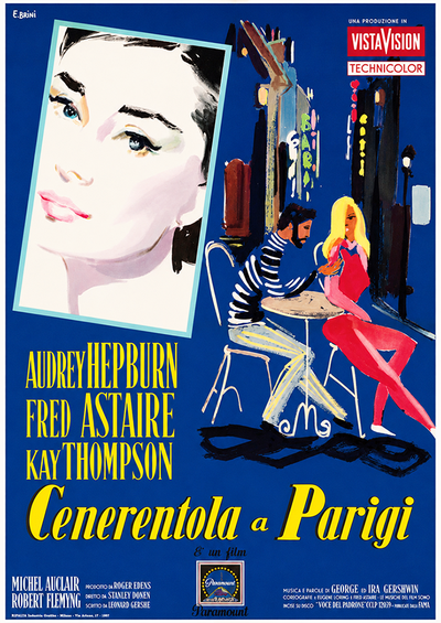
Funny Face · Brini

The poster of Funny Face (Stanley Donen, 1957), painted by Ercole Brini. Audrey Hepburn and Fred Astaire in the musical that turns fashion into dance: Brini’s soft watercolour touch, with its Macchiaioli light, is grace itself translated into poster form, perfectly suited to Donen’s Parisian fairy tale.

A team of champions

The enormous demand for images called into the field a whole generation of designers who, alongside the three historic masters, brought the Italian poster to its absolute peak. Not one but dozens of authors of the highest level worked at the same moment, each with a recognisable style and often tied to a genre: the peplum, the comedy, the sentimental drama, the adventure film, the swashbuckler. It is the proof of the maturity attained: the poster is no longer an anonymous craft but a field of real authors, to whose names and portraits a whole chapter is devoted further on.

When letters become image

The Italian style, made of painted illustration, of faces rendered with almost photographic skill, of bold colours, was recognised as one of the most beautiful in the world. So much so that Hollywood came looking for it. The most famous case is that of Silvano Campeggi, known as “Nano”, called upon to sign the posters of legendary pictures, from Ben-Hur to Casablanca, from An American in Paris to Exodus. His personal version of the Ben-Hur poster is often cited as a masterpiece: the lettering of the title, rendered in relief with an almost Futurist taste, becomes the image itself, a thing to be looked at before it is read. The same happens in the poster for Gigi, where it is the letters that fill the whole space.


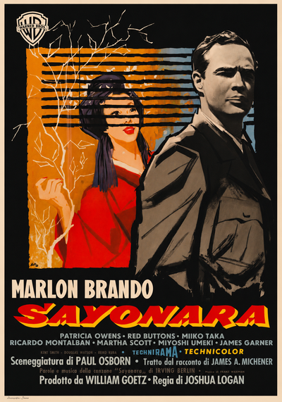
Sayonara · Campeggi

The poster of Sayonara (Joshua Logan, 1957), painted by Silvano Campeggi. Marlon Brando and postwar Japan in a melodrama about love across the barriers, awarded four Oscars: the poster of Sayonara is Nano at the summit of his dialogue with Hollywood, the Florentine artist whom the American majors asked to paint their dreams.


Here we return to an idea encountered at the outset, with Chéret: the word that becomes image. The scholar Egidio Mucci coined a curious formula for this phenomenon: “neo-logo-iconic language”, which, translated, simply means that word and figure fuse into a single thing, endlessly referring one to the other. The word wants to be seen, the image wants to be read. It is one of the most fascinating inventions of the poster, and the great Italian poster artists brought it to perfection.

9. The 1960s: poster artists, genres and the shadow of photography

A thousand films, a thousand posters

The 1960s are the decade in which Italian cinema gives its best on two opposite fronts. On one side the great auteur cinema, which conquers festivals the world over with Federico Fellini, Michelangelo Antonioni, Luchino Visconti, Pier Paolo Pasolini, Pietro Germi. On the other the explosion of genre cinema, a formidable machine turning out films at an industrial pace: the spaghetti western, inaugurated by Sergio Leone, the gothic horror of Mario Bava, the Italian-style thriller, the giallo, which would soon find its most celebrated name in Dario Argento, science fiction, the peplum still in vogue, the musicarello with the pop singers of the moment, and the commedia all’italiana in its happiest season. Every genre, naturally, calls for its posters, and the poster artists have never been so in demand.

Curiously, the nobility of the film is not mirrored in a different graphic treatment; the poster obeys laws of its own, those of immediate impact, so that a film by Antonioni can be announced with the same emphasis as a popular one. Behind those images lie hands of extraordinary quality. Alongside the great masters of the previous generation, still in full activity, a new wave of highly specialised poster artists emerges, able to interpret in ever more recognisable languages the different strands of Italian cinema: from the spaghetti western to the gothic, from the giallo to science fiction, all the way to comedy.


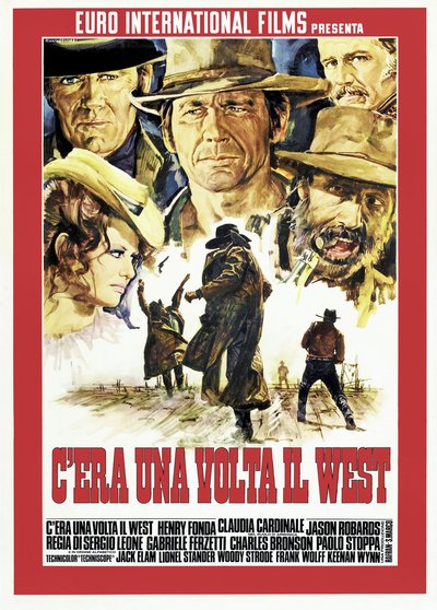
Once Upon a Time in the West · Gasparri

The poster of Once Upon a Time in the West (Sergio Leone, 1968), painted by Rodolfo Gasparri. The faces of Henry Fonda, Charles Bronson, Jason Robards and Claudia Cardinale composed like an overture around the duel: the poster of Once Upon a Time in the West is today one of the most celebrated images in the whole history of the genre, worthy of the twilight masterpiece it announced.


Photography enters the scene

On the technical side, however, something is stirring beneath the surface. Photography and offset printing begin to enter the poster, first alongside the drawing, then in its place. Photomontage, collage and retouched photography allow faster and cheaper results. The great painted illustration still enjoys a glorious season. It is in these years that Renato Casaro makes his debut, destined to be its last great master, but the conditions of decline are, by now, already written.

10. The 1970s: the twilight of the painted poster

Cinema in the age of television

The 1970s bring to the screen a cinema of political and civic engagement, while the popular genres give their last flourishes: the crime film, the risqué Italian sex comedy, horror. But it is also the decade in which the great crisis begins. Public television first, and from the early 1980s the private commercial networks, drain cinema of its audience. Halls close, spectators dwindle, and the promotion of films moves from the walls of the cities to the domestic screen, relying more and more on television spots and appearances on variety shows. The poster loses its centrality, and with it the resources and the attention that had sustained its quality.


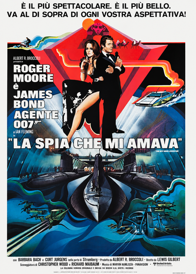
The Spy Who Loved Me · Aller

The poster of The Spy Who Loved Me (Lewis Gilbert, 1977), painted by Aller. Roger Moore in a tuxedo and Barbara Bach above a world of submarines and jet skis: even in the decade of decline, the great international launches still called for the brush. One of the last great spectacles of the painted poster, signed by an artist of the school’s final generation.


The end of a school

It is in this climate that the tradition of the painted poster dies out. The reasons add up: economic, because the market no longer offers the margins to pay for costly original illustrations; technical, because photography and offset demand less effort and cost less; generational, because the great masters are ageing and, as we have said, had trained no pupils. A true school had never been born; there were no disciples to whom to hand down a knowledge that the market, by now, no longer asked for. Pencils and brushes are used more and more rarely: photocolour becomes the norm. Renato Casaro would go on painting for a long time yet, into the 1990s, for international productions too, but he is by now the last of a line.

The poster, to be sure, does not disappear; it is still printed today, almost solely by photographic and digital means. It ceases to be that popular and collective art form it had been for nearly a century. And it is precisely its twilight that throws into relief, by contrast, the greatness of that season: the painted poster had not been a mere selling tool, but a figurative genre in its own right, with its masters, its masterpieces and an unmistakably Italian character. It is no accident that a collector and scholar, Maurizio Baroni, coined for those artists a definition that says it all, and to which we shall return.

11. How a poster is made: formats, manifesto, locandina and fotobusta

Let us stop the timeline for a moment and look closely at the object we are talking about. What, exactly, is a manifesto? The technical definition runs like this: a document of text and images, printed in multiple copies on a single face of one or more sheets. Behind this dry formula lies a small universe of formats, rules and tricks of the trade. It is, in essence, what the English-speaking world calls a movie poster, but which in Italy has a family of formats and a tradition all its own.

The formats: a large family

For a single film, posters of different sizes were usually printed. The Italian system, consolidated over the twentieth century, was organised in “sheets”. The set intended for the halls comprised: the 100×140 cm, called “two sheets” (due fogli), the standard poster, printed in a single piece; the 140×200 cm, called “four sheets” (quattro fogli), in two parts to be joined, not by choice but because the printers had no printing plate that large; and the 70×100 cm, called “one sheet” or soggettone, long an exception, which became very common over the last thirty years, when it took the place of the four-sheet, and often of the two-sheet as well, in the set for low-budget films.

To these are added the locandina (about 33×70 cm) and the lobby card (Italian: fotobusta; from 35×50 to 50×70 cm). The lobby cards consist of a series of photographs, on the lower part of which the title, cast and credits were printed. Note, however: not every format was printed for every film. The set depended on the budget and could perfectly well remain incomplete.

Outside the set for the halls there were, finally, the large formats for street billboards, the six-, eight-, sixteen-, twenty-four-, thirty-two- and forty-eight-sheet, reserved for the launches of the highest-budget films and used less and less as the years went by.


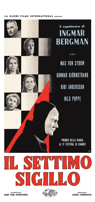
The Seventh Seal · 1957 (locandina)

The locandina of The Seventh Seal (Ingmar Bergman, 1957), painted by Carlantonio Longi. The knight who challenges Death to a game of chess, one of the absolute summits in the history of cinema, in the small vertical format of the Italian tradition, about 33×70 centimetres, with the space reserved for the name of the hall and the showtimes. Born for the shop window and the cinema entrance, the locandina is today among the formats most beloved by collectors.


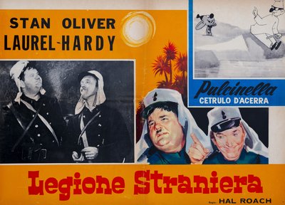
Beau Hunks · 1931 (lobby card)

The lobby card of Beau Hunks (Hal Roach and James W. Horne, 1931). Laurel and Hardy enlist in the Foreign Legion to forget a heartbreak, in one of the pair’s best-loved comedies, revived for decades in Italian cinemas. The series of photographs with title and credits in the bottom band, a direct descendant of the American lobby cards, told the film scene by scene to anyone deciding whether to buy a ticket: together with the locandina it completes the family portrait of the Italian formats.

The words

One of the things that makes the poster special is that it speaks two languages at once: that of images and that of words. To the images falls the task of catching the eye, to the words that of informing and persuading. The most important word is of course the title, usually in enormous letters, though sometimes, when the actor is hugely famous, it is his name that grows larger. Often, beneath the Italian title, the original one appears in small type, not infrequently translated in a fanciful way or altered altogether.


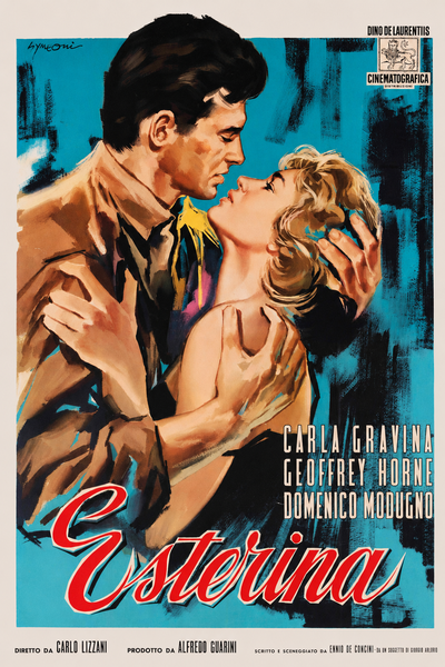
Esterina · Symeoni

The poster of Esterina (Carlo Lizzani, 1959), painted by Sandro Symeoni. For the film with Carla Gravina, Symeoni takes the path of graphic distillation that would become his signature: few elements, a single idea, modernity entering the Italian poster.

Then there are the tag lines, the slogans: “an absolute novelty”, “a colossal adventure drama” and a thousand other promises. There are the names, those of the actors, which grow in importance as the star system takes hold. The career of Marilyn Monroe, seen through the posters, is a small novel. Her name, at first absent or printed in tiny type, grows from film to film until it outstrips the very title in size. As for the director, in the Italian posters of the period he almost never appears: it was thought, wrongly, that he did not sell tickets.

On the edges, finally, hide the details most useful to the scholar: the date and the printer, the notes on the edition and, from 1958 onwards, the clauses governing the rental of the materials between the S.A.C. and the halls, with the warning to return everything. There is then, at times, the poster artist’s signature: small, in a corner, but it is the sign that this poster has an author.

The images

If the words matter, the image is decisive. It must strike and it must say at once what kind of film this is. For this the designer resorts to recognisable signs, a sword, a pistol, a spaceship, a palm tree, that spark in the public the recognition of a familiar world. The prime model is the key scene: the moment of maximum tension is frozen, the protagonists are brought into focus in the foreground and the extras are left barely sketched in the background. Sometimes the designer condenses into a single image scenes far apart from one another, like a paper trailer. At other times he invents out of whole cloth: these are the famous “graphic lies”, posters that show scenes not in the film or that make the adventure seem more spectacular than it is. All, naturally, to bring as many people as possible into the hall. When words and images fuse until they can no longer be told apart, when the title itself becomes figure, we return to that magic which runs through our whole story: the word made to be seen, the image made to be read.

12. Film genres and their posters: an atlas in images

If there is one thing the poster does better than almost anything else, it is to tell you at a glance what genre a film belongs to. Before even reading the title, the viewer “feels” whether this is a love story or an adventure, a comedy or a drama. It is a language of codes, and every genre has its own. They are worth exploring, because in each of them the great poster artists produced memorable work.

The historical film and costume epic, founding genres of Italian cinema, call for grandeur: crowds of extras, monumental architecture, heroes in the foreground. The same is true of the swashbuckler and the peplum, the mythological film of muscular heroes and monsters, where hyperbole comes naturally. Melodrama and the sentimental film, the celebrated tear-jerker, live instead on faces and tears; here the great portraitists reign, able to condense into a single gaze all the passion and grief of the story.

Then there is the lighter side. Comedy, and the commedia all’italiana in particular, favours lively, crowded posters that often play on caricature; comic films, from Totò onwards, put the actor’s face at the centre because that is what makes people laugh and sells the ticket. Later came the hugely popular Italian sex comedy, which generated an enormous number of posters. At the opposite end, auteur cinema and drama often receive a more sober, allusive treatment, even if, as we have seen, poster art rarely abandons its taste for emphasis.

Then come the genres that flourish from the 1960s onwards, each with an unmistakable iconographic repertoire. The Italian-style western, the spaghetti western, lives on gaunt faces and levelled pistols. Gothic horror lives on castles, threatened women and unnatural colours; the giallo and thriller on gloved hands and glinting blades; the crime film on night-time cities, chases and drawn guns. Science fiction brings out robots, spaceships and alien planets, a field to which an entire poster collection has even been devoted. The musicarello brings to the poster the faces of the pop singers of the day; adventure and exotic films play with palm trees, seas and distant lands; war films with explosions and heroics. Even documentaries and Istituto LUCE newsreels had their own graphic language.


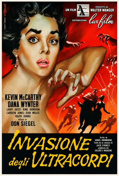
Invasion of the Body Snatchers · Biffignandi

The poster of Invasion of the Body Snatchers (Don Siegel, 1956), painted by Alessandro Biffignandi. The masterpiece of 1950s paranoid science fiction, with the pods that replace human beings while they sleep: the iconography of the genre, poised between terror and wonder, in one of its most effective Italian expressions.


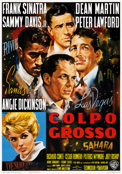
Ocean’s Eleven · Ciriello

The poster of Ocean’s Eleven (Lewis Milestone, 1960), painted by Averardo Ciriello. Frank Sinatra, Dean Martin and the whole Rat Pack in the most elegant heist in Las Vegas: the film that invented an entire strand, and a poster that captures its nightclub spirit, all tuxedos, lights and cocksure smiles.


Seen together, these posters form a small atlas of the Italian imagination of the twentieth century. Every genre is a world, every world has its signs, and poster artists were remarkably adept at moving from one genre to another within the space of a week, shifting effortlessly from epic painter to caricaturist to master of horror.

Each of these genres lives again today in a collection of restored posters, from the Italian-style western to gothic horror, from comedy to the peplum, available to explore work by work.

13. The painters of cinema: the great Italian poster artists

The scholar and collector Maurizio Baroni called them, in a perfect phrase, “painters of cinema”. Because that is what they were: painters, true artists, able to hold their own against the great names in the history of art, who nonetheless chose, or accepted, to put their talent at the service of the wall and the box office. It is worth getting to know them a little more closely, one by one, because behind every memorable poster there is a hand and a story.

For each master, what follows is a biography and a selection of works:

Many of their works have a second life today, digitally restored from original period materials.


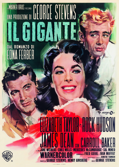
Giant · Cesselon

The poster of Giant (George Stevens, 1956), painted by Angelo Cesselon. James Dean, in his final performance, dominates the sheet with the almost photographic likeness that was the hallmark of the school’s portraitist par excellence. A work like this makes it clear why Cesselon’s close-ups alone are enough to justify an entire career.


Alongside them stands a host of distinctive talents. Enrico De Seta, prince of comedy and caricature. Rinaldo Geleng, a painter of great refinement, and his son Giuliano Geleng, who took up and carried on his art. Arnaldo Putzu, with brilliant colour and a lively line, celebrated in Great Britain as well. Alessandro Biffignandi, master of the popular poster in bright, sensual tones. Sandro Symeoni, with a modern, distilled style capable of bold, almost abstract solutions. Renato Fratini, with his dynamic line, long active in Britain too. Rodolfo Gasparri, hugely prolific, a master of comedy and popular cinema in the 1960s and 1970s. And then the many others: Giorgio Olivetti, Agatino Avelli, Dante Manno, Carlantonio Longi, Francesco Fiorenzi, the Nistris, each with his own speciality and preferred genre. Looking ahead to the era of genre cinema and horror, there is Enzo Sciotti, one of the most prolific and long-lived Italian poster artists, active from the 1960s into the most recent decades.


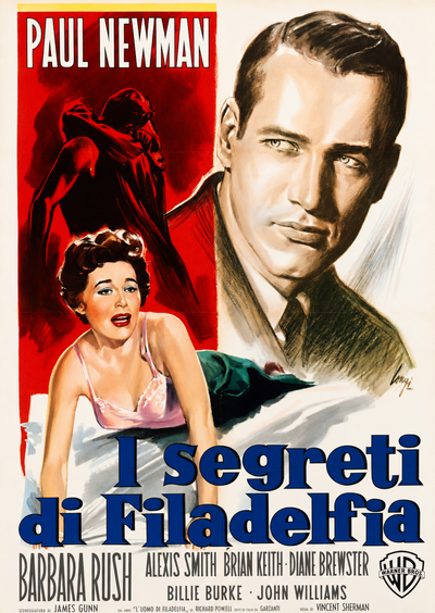
The Young Philadelphians · Longi

The poster of The Young Philadelphians (Vincent Sherman, 1959), painted by Carlantonio Longi. Paul Newman as an ambitious young lawyer moving through Philadelphia high society in a drama of ambition, prejudice and social climbing. The poster offers a close look at the hand of one of the many virtuosos listed above, poised between painterly storytelling and graphic distillation.


At the end of the line stands the last great master: Renato Casaro. Born in Treviso and a virtuoso of both airbrush and brush, he was a leading figure from the 1960s through the 1980s, his name associated first with Sergio Leone’s Italian-style westerns and then with major international productions well into the 1990s. With him, an era comes to a close. After him, photography and the computer would definitively take the place of the brush, but his posters, like those of all the “painters of cinema”, remain to remind us what the Italian poster once was: not merely a trade, but a great and unrepeatable season of art. Renato Casaro died suddenly on 30 September 2025, leaving friends stunned and projects unfinished. He was a sublime artist, but also a gentle, modest and reserved man who worked to the very end.


A Difficult Life · De Seta

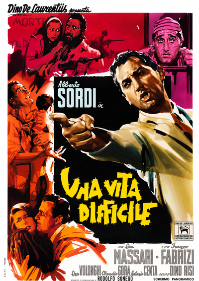
The poster of A Difficult Life (Dino Risi, 1961), painted by Enrico De Seta. Alberto Sordi as an idealistic journalist moving through twenty years of Italian history, from the postwar period to the economic boom, in one of the high points of the commedia all’italiana. The prince of caricature takes on one of the bitterest and finest films starring the actor who came to embody an era.


14. The poster artist’s craft: how a poster came to life

Behind every poster lay an amount of work that is hard to imagine today. The poster artist had to be a skilled painter, a capable portraitist and, at the same time, an exceptionally fast worker, because production companies were always in a hurry. The process was almost always the same: the press office asked the artist for a number of sketches, perhaps three, five or ten, which were submitted to the head of the company. One was chosen, and from it came the finished artwork, the bozzetto.

The bozzetto is the one-off original, painted by hand before mechanical reproduction begins. It is there that the poster artist’s art truly lives: the texture of the brushwork, the physical presence of the paint, the pencil revisions, all the things printing would later flatten. This is why the original bozzetti that survive today are exceptionally valuable artefacts.

We have a wonderful account of this working method from Silvano Campeggi, “Nano”. It all began with a screening of the film, shown in the original language in a small projection room for the executives. Then came the production stills, nearly a hundred of them, from which the right face and framing had to be chosen. From there came the bozzetto, or rather several of them, ranging from the most obvious solution to the most daring. Campeggi said he preferred to work at a small scale because, when enlarged, the brushwork gave the finished poster a looser, more natural flow. He also recalled how, over time, he had stopped concentrating solely on the actors’ likenesses and begun to aim for the overall effect, using boldly coloured backgrounds to set off the foreground. The poster, he said, had to “hit you right between the eyes”.

One observation of Campeggi’s is worth more than a treatise. The poster, he explained, did not have to please the head of the press office; it had to speak to the public, and the public was different in the city and the provinces. Posters for the provinces had to be more illustrative, simpler, almost fairy-tale-like. Those for the city, where the hurried, distracted gaze belonged to the passer-by and the motorist, had to be more distilled and emphatic, built around a single idea capable of stopping you in an instant. This is why, at times, works by different poster artists were chosen for the various formats of the same film, and why, in multi-sheet posters, the image was never simply enlarged but completely rethought.


The Frightened City · Putzu

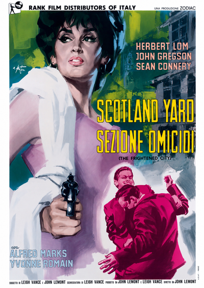
The poster of The Frightened City (John Lemont, 1961), painted by Arnaldo Putzu. The London crime film with Herbert Lom and a young Sean Connery on the eve of 007: a perfect subject through which to observe the craft described in this chapter, the key scene frozen, the protagonists in focus, the city in the background, everything built to catch the passer-by’s attention in an instant.


15. Preserving and restoring a poster: a material born not to last

The paradox

Here lies the paradoxical heart of our whole story. The poster is, by nature, an ephemeral object, printed to last only as long as a film’s run, “the span of a morning”, Brunetta wrote, and then destined for the pulping mill, to be torn down or to disappear beneath the paste and paper of the next poster. To speak of preserving such an object can seem almost a contradiction in terms. And yet it is precisely this fragility that makes the surviving examples so precious. Italian posters, considered among the most beautiful in the world, were rarely collected and almost always discarded. Those that remain are few, and each bears the scars of its own history: folds, tears, faded colour.

Saving a poster

Poster restoration is a specialised craft, and a fascinating one. A particularly valuable account comes from Brigitte Bussière, restorer at the Bibliothèque du film in Paris, whose description allows us to follow the stages of the work almost as if it were a surgical operation.

The process begins with examination: the type of paper must be identified, its condition assessed and the stability of the colours checked. Some reds used by certain printers are notoriously unstable. The restorer must also establish how far it is possible to intervene without altering the work. Surprisingly, an old poster from the beginning of the century is often easier to treat than a recent one: modern papers, low in fibre, can cause the printed surface to lift away along with the colour. If the poster has been mounted on an unsuitable canvas backing, the next step is delining, removing the old support, an operation Bussière calls “an adventure” and one that can mean days of millimetre-by-millimetre work with a small chisel. Cleaning follows, with water baths or, cautiously, neutralising products, but some marks, felt-tip pen stains and the halos left by adhesive tape, remain forever.

Then comes the new lining. Unbleached cotton is stretched over a frame, coated with reversible adhesive and a thin layer of Japanese paper; the wet poster is laid on this bed, and losses are filled with old paper of the same type so that it takes colour like the original. After five to eight days of drying in a controlled environment, colour retouching begins, using reversible tempera and watercolours, fine brushes for details and an airbrush for larger areas. It is patient work in which the apparently “easy” colours, such as black and red, are often the most treacherous. Finally, each work is protected in a transparent sleeve and accompanied by a restoration record documenting its history and treatment. For a poster, as we now know, is a document to be preserved with care.

Fra Diavolo · 1933

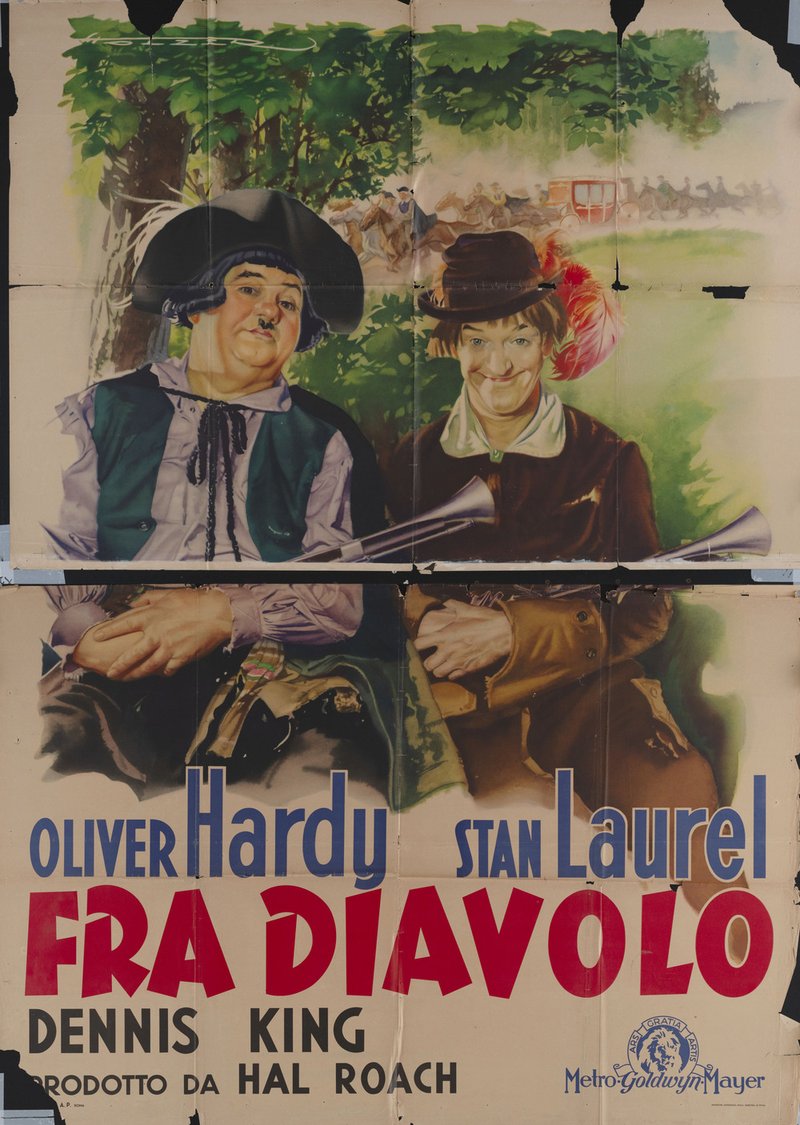
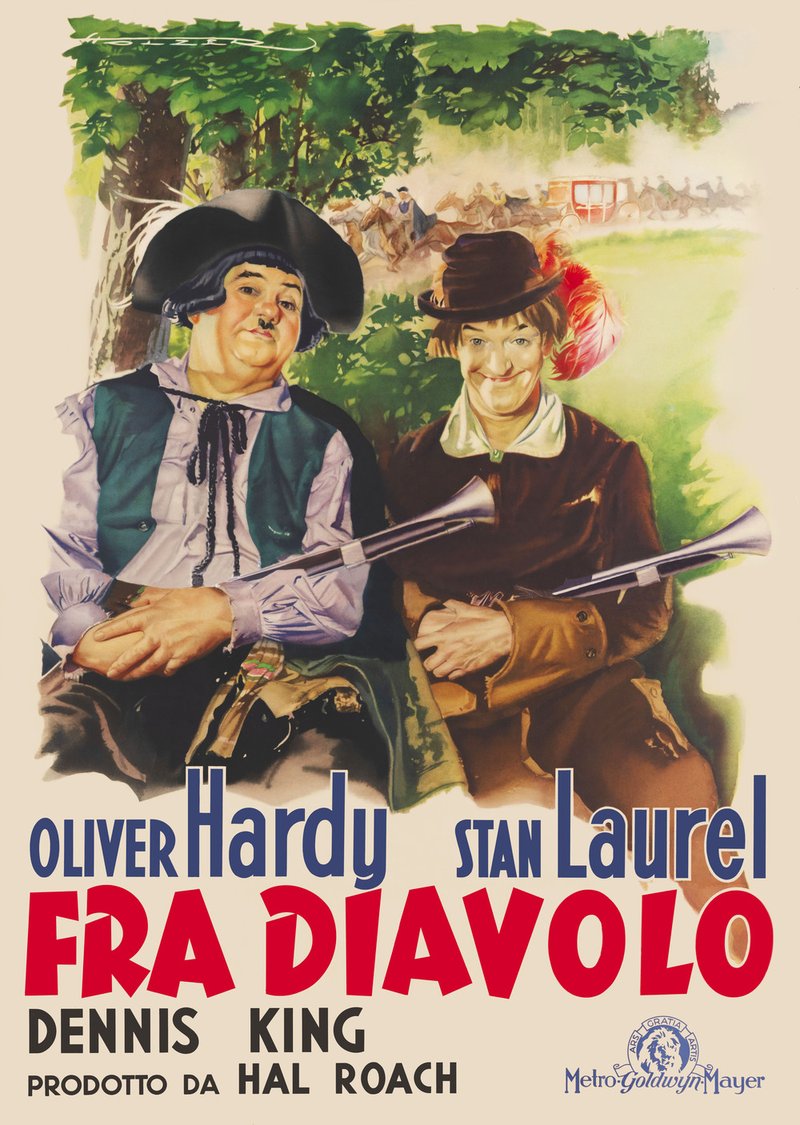
Before and after: the digital restoration of the poster of Fra Diavolo (Hal Roach, 1933). On the left, the period print bears the scars of ninety years of history: folds, tears, faded colour. On the right, Laurel and Hardy are restored to the colours in which they once appeared on the walls. It is the work described in this chapter applied to a heritage that, for far too long, no one thought worthy of care.

Fra diavolo_x4_prima1_resized Fra diavolo_x4_dopo_resized
Before
After

16. Where the posters live today: archives, collections and the market

If many posters have been lost, others have survived and today are preserved in places devoted to safeguarding their memory. Their first “homes” were the film archives: in Milan, in 1947, the Cineteca Italiana was founded, the country’s first film archive; in Rome, from 1949, the Cineteca Nazionale likewise contributed to the preservation of Italy’s cinematic heritage and the materials associated with it. In Turin, the city that had been the cradle of poster art, the National Cinema Museum holds one of the richest and most significant collections. The Cineteca di Bologna gave its own collection the evocative name Archivio della grafica. Together, Turin, Bologna and Rome form the three great Italian centres.


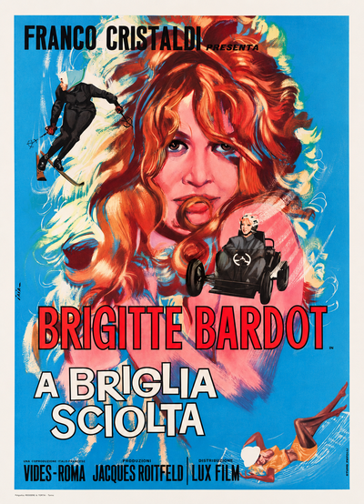
Please, Not Now! · Iaia

The poster of Please, Not Now! (original French title La bride sur le cou, Roger Vadim, 1961), painted by Piero Ermanno Iaia. Brigitte Bardot in Vadim’s Parisian comedy, at the height of her splendour: one of those faces that could make a film poster an object of desire in its own right. The image captures the fascination that helped transform ephemeral advertising material into something worth preserving and collecting.


hen there are archives devoted to artists and films. The CSAC at the University of Parma holds thousands of bozzetti, including a major bequest from Anselmo Ballester. Archives and foundations have grown up around directors and actors; valuable papers, such as those of Cesare Zavattini, have found homes in public libraries such as the Panizzi Library in Reggio Emilia. And then there are the collectors, whose passion saved what institutions neglected: great private collections emerged, from Nicola Gargano’s, numbering tens of thousands of pieces and later largely acquired by the Puglia Region, to the collection that entered the Provincial Library of Foggia, and finally the celebrated Salce Collection in Treviso. Nando Salce began his collection in 1895, at the age of eighteen, purchasing from a municipal billposter Giovanni Maria Mataloni’s poster for Incandescenza a gas brevetto Auer.

S.A.C. (Servizi Ausiliari Cinema) deserves a story of its own. From 1958 it built a distribution and logistics system so efficient that its solution was gradually adopted by every distributor: first for posters and locandine (the small Italian format), then for film prints too, from celluloid to digital. As Marco Momigliano of S.A.C. recounts, the obligation to return the material was printed on the posters, but in practice this rarely happened and, all things considered, it was a stroke of luck. Those “retained” materials, instead of ending up in the pulping mill, found their way into collections and archives. Today that heritage is enjoying a second life: a programme of recovery and digital restoration, carried out in collaboration with the Cineteca di Bologna, is bringing back to light tens of thousands of period posters and locandine, along with the work of the painters of cinema who created them.

17. The Italian poster and the international one: a look beyond the border

To understand what makes the Italian school distinctive, it helps to place it alongside other great traditions. France, homeland of the affiche, has always cultivated an elegant, distilled poster, more attentive to harmony than spectacle. The United States imposed its own industrial model on the world, built on standard formats and commercial efficiency, with the studio brand at its centre. At the opposite extreme stands the celebrated Polish school of the postwar years, which turned the poster into pure artistic invention, free to ignore the faces of the stars and scenes from the film, creating images fit for gallery walls. These are three very different paths, all of great value, but none resembles the Italian tradition.

Italy occupies a position of its own between them: neither a purely commercial system nor pure artistic invention, but a rare synthesis of painterly power and promotional purpose. That painterly power has ancient and distinctly Italian roots: the dignity of the Renaissance portrait, Caravaggio’s chiaroscuro, the light of the Macchiaioli, the elegance of Boldini. Italian poster artists, perhaps without ever declaring it, were the last heirs to that great tradition. This balance helps explain why Italian film posters are considered among the most beautiful in the world. On one side stood the great illustrative tradition of past centuries; on the other, a voracious market fuelled by some of the highest levels of cinema-going in Europe. Artistic skill and mass demand together produced not one master, but a whole crowd of masters working at the same time.


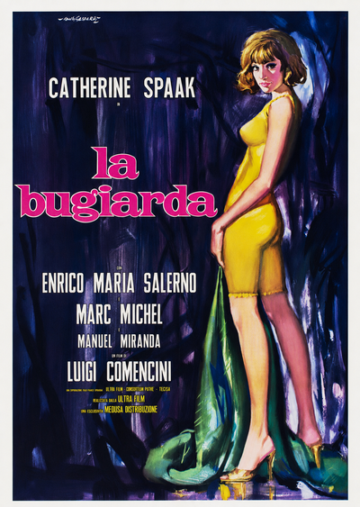
La bugiarda · Gasparri

The poster of La bugiarda (Luigi Comencini, 1965), painted by Rodolfo Gasparri. Catherine Spaak torn between too many men and too many lies, in Comencini’s bittersweet comedy: an example of Gasparri’s versatile, brilliant hand applied to the social comedy of the 1960s.


There is, finally, one aspect that is easy to overlook. As an image displayed in public, the poster was subject, like the film itself, to censorship. Before it could be posted, it required authorisation from the local police headquarters, whose date sometimes appears on the document and now provides a useful clue for dating it. It is a detail that weaves the history of the poster into the larger history of state control over images and entertainment, making the poster a document not only of cinema but also of the society and politics of its time.

The same film, two posters

One comparison, more than any argument, reveals the identity of the Italian school: placing side by side the posters for the same film in different national editions. For decades, when a major Hollywood film was released in Italy, it did not simply arrive with its American poster; an Italian artist often created an entirely new one for the local market. And there the difference in both hand and conception becomes clear, because two posters for the same film, produced only weeks apart, can tell its story in completely different ways.

Italy and America: emotion against brand

The American poster emerged from a powerful industrial system and bears its marks: a preference for immediate effectiveness, clean graphic composition, strong typography and the studio logo. The priorities are brand recognition and an instantly legible title. The Italian poster, by contrast, works through faces and emotion. The great painted portrait, the “testone”, brings the viewer eye to eye with the star and gives colour and brushwork a warmth that pure graphic design does not seek. Where the American poster informs and organises, the Italian poster seeks to move through painting. It is no accident that Hollywood, on more than one occasion, came looking for that Italian hand.

Italy and France: story against elegance

With France, the comparison is between two different kinds of nobility. The French affiche, heir to the great season of the late nineteenth century, favours economy, elegance and atmosphere: it says much with little, playing on allusion and taste. The Italian poster is more narrative. It wants to tell a scene, capture a moment, fill the eye. Two conceptions of beauty: restraint and harmony on one side, passion and story on the other. Both are of the highest order, yet unmistakably different.

Italy and Poland: the star against the idea

The extreme case is the Polish school, which in the postwar years turned the poster into pure artistic invention: metaphor, abstraction, complete freedom from the film’s literal imagery. The Italian poster chooses the opposite path, remaining faithful to the star’s face and to the concrete promise of spectacle. On one side, the poster as a conceptual work, almost a painting for the gallery; on the other, the poster as a popular invitation, made to stop the passer-by outside the cinema. They are opposite answers to the same question, “how do you announce a film?”, and their contrast makes clear just how recognisable and original the Italian approach was.


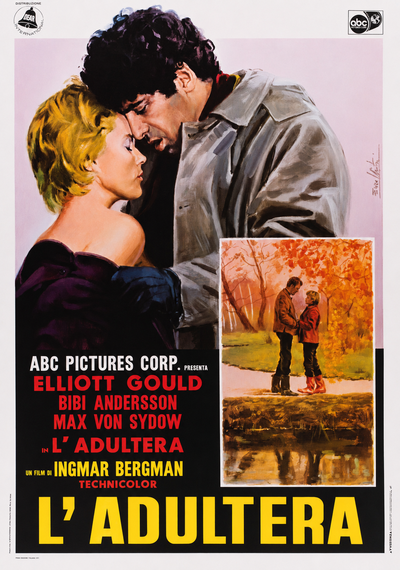
The Touch · Nistri

The poster of The Touch (Ingmar Bergman, 1971), painted by Lorenzo Nistri. The drama with Bibi Andersson and Elliott Gould, the Swedish master’s first film in English: even the most austere European auteur cinema, on reaching Italy, passed through the brush of a painter. It is the phenomenon described in this chapter: the film remains the same, but the poster changes from country to country.


18. Conclusion: what remains of the film

Let us return, in closing, to the question from which we began: what remains of a film? The memories of those who saw it remain. The print remains, if we are lucky. And there remains the world of paper that accompanied cinema like a shadow for more than a century, above all the poster. Nothing can tell the story of a film quite like a poster: the lettering of the title, the painted faces of the actors, the colours, the promise of an emotion. And nothing, years later, can bring that world so vividly back to the surface.

We have seen how the poster’s history is inseparable from that of cinema and from the country that produced it. Every decade had its style because every decade had its films, its audiences and its dreams: the silent epics and first divas, the crisis of the 1920s and the “testone”, sound and Cinecittà, war and neorealism, the golden age of the 1950s, the auteurs and genres of the 1960s, the slow twilight of painting. The poster recorded all of this, translating it into its own language of faces and colours. That is why we can read it today as a precious source for tracing changes in the tastes, customs and imagination of entire generations.

Behind it all remains the central paradox: what was created to live only as long as a film’s theatrical run has become one of the most authentic witnesses to the history of cinema. And with that comes a collective duty: to preserve this fragile heritage, for too long entrusted to the passion of collectors alone, so that it can continue to tell its story to future generations.

One image from a film says all this better than any argument. In The 400 Blows by François Truffaut, the young protagonist walks through Paris, stops in front of a poster and tears the face of an actress from it to carry with him. It is the gesture of someone who recognises in a poster not a mere advertisement but a fragment of a dream worth keeping. It is also the same gesture, a little childish, a little furtive, but full of passion, from which the great collections were born. That gesture contains the meaning of this story: in film posters, among the most beautiful in the world, survives not only the memory of the films, but also the memory of those who loved them.


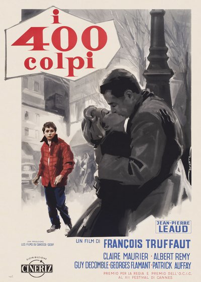
The 400 Blows · 1959

The poster of The 400 Blows (François Truffaut, 1959). Antoine Doinel, the boy played by Jean-Pierre Léaud into whom Truffaut poured his own childhood, in the debut that launched the Nouvelle Vague. It is the film mentioned a few lines above, the one with the poster torn out of love: to close these pages with its Italian poster is to give that gesture back, keeping the image instead of tearing it away.

The works reproduced on this page come from the original prints of the period, recovered, photographed and digitally restored by Movie.it.


19. Essential bibliography

ALLEN, Robert C. and GOMERY, Douglas, Film History. Theory and Practice, New York-San Francisco, Random House, 1985.

BARONI, Maurizio, Pittori di cinema, Milano, Lazy Dog Press, 2018.

BERTETTO, Paolo (a cura di), Schermi di carta: la collezione di manifesti del Museo nazionale del Cinema di Torino. Il muto italiano 1905-1927, Torino, Edizioni d'Arte F.lli Pozzo, 1995.

BLOCH, Marc, Apologia della storia, Torino, Einaudi, 1950.

BRUNETTA, Gian Piero, Il colore dei sogni: iconografia e memoria nel manifesto cinematografico italiano, Torino, Testo & Immagine, 2002.

BUSSIÈRE, Brigitte, La restauration des affiches, Paris, BiFi, 2000.

Il Cinema nei manifesti di Silvano Campeggi: Nano 1945-1969, Firenze, Giunti Opus Libri, 1988.

DELLA TORRE, Roberto e MOSCONI, Elena (a cura di), I manifesti tipografici del cinema: la collezione della Fondazione cineteca italiana 1919-1939, Milano, Il Castoro, 2001.

EDWARDS, Gregory J., The Book of the International Film Poster, London, Tiger Books International, 1988.

GENETTE, Gérard, Soglie: i dintorni del testo, Torino, Einaudi, 1989 (ed. orig. Seuils, Paris, Seuil, 1987).

GESÙ, Sebastiano (a cura di), Cinemalie siciliane, Comiso, Salarchi Immagini, 2001.

GINZBURG, Carlo, Spie. Radici di un paradigma indiziario, in «Rivista di storia contemporanea», 1, 1979.

L'Italia al cinema. Manifesti della raccolta Salce 1911-1961, Venezia, Marsilio, 1992.

LE GOFF, Jacques e NORA, Pierre (a cura di), Fare storia, Torino, Einaudi, 1981 (ed. orig. Faire de l'histoire, Paris, Gallimard, 1974).

LOFFREDO, Michele (a cura di), Sogni attaccati al muro: manifesti e dipinti di Silvano Campeggi Nano, Poggibonsi, Lalli, 1998.

MAIOLI, Andrea (a cura di), Eroi di mille leggende: manifesti cinematografici 1930-1960, Bologna, Graphis, 1993.

MUCCI, Egidio, autore del saggio in cui è coniata la formula «neo-linguaggio logoiconico».

PACINI, Nicoletta (a cura di), Cose da un altro mondo: i manifesti del cinema di fantascienza, Torino, La Stampa, 2005.

QUINTAVALLE, Carlo Arturo, Manifesti: storie da incollare, Milano, Rizzoli, 1996.

RETEUNA, Dario, Cinema di carta: storia fotografica del cinema italiano, Alessandria, Falsopiano, 2000.

RONDOLINO, Gianni, Storia del cinema, Torino, UTET, 1977.

ROSSI, Attilio, I manifesti, Milano, Sonzogno, 1992.

NONNATO, Silvia, Quel che resta del film: la storia, la conservazione, il trattamento del manifesto cinematografico, tesi di laurea, Università di Bologna, a.a. 2011-2012.

20. Directors and actors mentioned

Directors: Michelangelo Antonioni · Dario Argento · Mario Bava · Ingmar Bergman · Charlie Chaplin · Luigi Comencini · George Cukor · Vittorio De Sica · Stanley Donen · Federico Fellini · John Ford · Pietro Germi · Enrico Guazzoni · James W. Horne · Phil Karlson · John Lemont · Sergio Leone · Robert Z. Leonard · Carlo Lizzani · Joshua Logan · Raffaello Matarazzo · Lewis Milestone · Mario Monicelli · Pier Paolo Pasolini · Giovanni Pastrone · Arthur Penn · Gennaro Righelli · Dino Risi · Hal Roach · Mario Roncoroni · Roberto Rossellini · Vincent Sherman · Don Siegel · George Stevens · Robert Stevenson · François Truffaut · Roger Vadim · Luchino Visconti.

Actors: Bibi Andersson · Fred Astaire · Barbara Bach · Brigitte Bardot · Ingrid Bergman · Francesca Bertini · Charles Boyer · Marlon Brando · Charles Bronson · Claudia Cardinale · Sean Connery · Joan Crawford · James Dean · Henry Fonda · Ava Gardner · Emilio Ghione · Elliott Gould · Carla Gravina · Audrey Hepburn · Stan Laurel and Oliver Hardy · Jean-Pierre Léaud · Gina Lollobrigida · Herbert Lom · Dean Martin · Pina Menichelli · Robert Mitchum · Marilyn Monroe · Roger Moore · Amedeo Nazzari · Paul Newman · Assia Noris · Steve Reeves · Jason Robards · Rosalind Russell · Yvonne Sanson · Norma Shearer · Frank Sinatra · Alberto Sordi · Catherine Spaak · Totò · Rodolfo Valentino · Alida Valli.
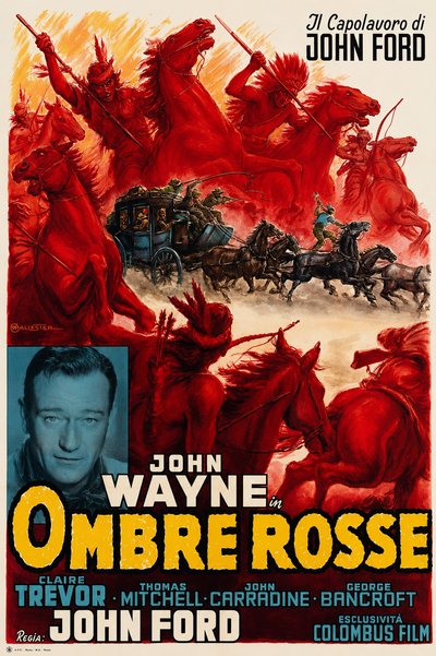
We use cookies and, with your consent, share hashed customer data with Google and Meta to measure ad performance. We never share clear-text personal data. Privacy policy