Anselmo Ballester: the painter who gave a face to Italian cinema
Rome, 1897–1974. Half a century of posters that made the history of the seventh art.
June 1, 2026
There is something deeply Roman in the way Anselmo Ballester lived his relationship with images: a sense of the grandiose tempered by artisanal practicality, an eye capable of looking at melodrama without ever losing itself in excess. Born in Rome on 15 July 1897 from Federico Ballester, a painter of Spanish origin, Anselmo followed his father's artistic activity from childhood, producing his first works at just fifteen years of age. His father's workshop was his first academy, and he had no need to proclaim himself a prodigy to be one.
The legacy of a Catalan father and the revelation of cinema.
After attending the Accademia di Belle Arti in Rome, he specialised in film advertising, working for the most important production houses of the silent cinema era. These were years in which the seventh art, born just two years before him, was conquering Italy with the speed of an epidemic. Young Anselmo, during one of his Parisian stays with his father, was struck by one of the first projections of images onto the façade of a building: from that moment on, the cinema machine would become his creative horizon for almost half a century.
In his Rome studio first at Via della Croce 50a, then at Passeggiata di Ripetta 19 he would spend nearly fifty years preparing thousands of sketches and drafts for posters and billboards of every format, collaborating with production and distribution companies of the caliber of Titanus, Paramount, RKO and Fox. Together with colleagues he founded the B.C.M. group, the first Italian agency dedicated to film advertising, which monopolised the poster market for a long period.
Art or craft? The poetics of an unrivalled poster artist.
Ballester had a precise theory about his own work. In his own words, the cinema poster artist "should unite within himself all the qualities of the painter, the portrait artist, the illustrator, the decorator, and carry in his mind a lavish palette of colours and a fertility of ideas, preferably inspired ones. He must succeed in satisfying both the taste of refined people and that of the rougher ones, who are the majority."
It is a declaration of poetics that says everything: the conscious duality of someone who works between art and industry without pretending the two are the same thing. His work is grounded in a solid academic training, enriched by the study of contemporary artistic currents and an eclectic research, whose outcome only apparently realistic is based on a visual repertoire that the general public had learned to read, and that the marketing world demanded insistently.
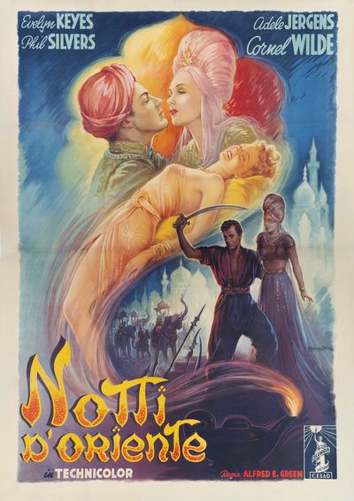
Nights of the Orient: when the poster doesn't tell, but seduces
Among the works considered here, the one for Alfred E. Green's film is perhaps the most overtly painterly, the most free from any obligation of verisimilitude.
Ballester deploys a warm and dreamlike palette flaming oranges, solar yellows, evening blues, building a vertical composition that proceeds through superimposed dreamlike layers: the romantic couple at the top, almost dissolved into the air; at the centre, an abandoned female figure; at the bottom, the solitary warrior with his sabre, surrounded by mists and Moorish architecture.
Echoes of Alphonse Mucha and Viennese Art Nouveau graphics are recognisable, but the structure is already thoroughly modern in its capacity to overlap distinct temporal planes on the same sheet.
You don't see a film: you sense an atmosphere. For certain genres of exotic adventure, Ballester had understood, the poster must not narrate, it must enchant.
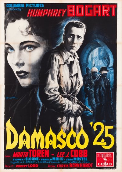
Damasco '25: Bogart between love and war, in the shadow of noir
This work, created for the film released in Italy in 1952, positions Bogart with extraordinary effectiveness at the intersection of love and war. The challenge was not to betray an already well-established iconography, while still stamping it with its own life.
Ballester resolves it with a dual-register composition: in the foreground, the face of Marta Toren, painted with an almost photographic chiaroscuro, her eyes piercing the surface like headlights in the night; in the background, Bogart advances through the shadow of an Orientalist arch, raincoat drawn tight and pistol in hand.
The dialectic between the absolute black of the foreground and the cobalt blue of the architectural interior generates a chromatic tension that is already, in essence, the visual core of the noir genre.
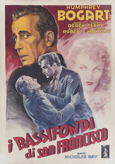
The Bowery: montage as pictorial composition
If in the previous poster Bogart was a romantic icon, here he becomes brute force. His face occupies almost a quarter of the sheet in the upper left, shown in three-quarter profile against a brick-red background that drips with restrained violence. Below, a body falls, dragged by a young man with a gun; in the upper right, the evanescent silhouette of a blonde woman floats like a ghost or like a memory.
What strikes you is the structural modernity of the solution: no sequential storytelling, but an associative logic, three simultaneous images that the brain assembles on its own into a narrative. It is the language of cinematic montage translated into graphic design, anticipating solutions that editorial design would not adopt until the 1960s.
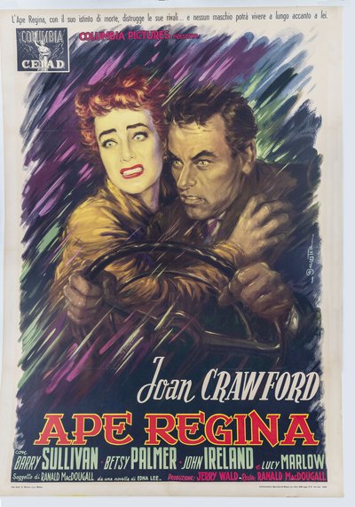
Queen Bee: Joan Crawford's emotional storm in a whirl of colour
Among the five posters, this is probably the boldest in terms of painterly gesture. The background is a vortex of broad, violent brushstrokes, purple, green, midnight blue that materialises the emotional storm of the story. From this turbulence emerge the two protagonists at the wheel, hands gripping the steering column, faces crossed by an expression that blends fear and ferocity.
Joan Crawford is portrayed with that theatrical quality that was at once her trademark and her critical undoing. Ballester does not soften it: he amplifies it. The Crawford of his poster is a woman the wind itself seems to assail, and the red and yellow typography supporting the title is among the most successful graphic solutions in his entire output.
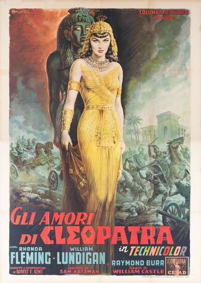
Sins of Jezebel: the epic as an auteur miniature
In the 1950s, Ballester's production reaches heights of refinement that border on preciousness and his sketches become genuine works of art. The poster for William Castle's film is the most eloquent demonstration: the colossal sphinx looming black and green against the background, Rhonda Fleming in a golden gown occupying almost two-thirds of the sheet, the battle of chariots and foot soldiers spread like an ancient frieze in the lower right. Every detail of the jewellery, every fold of fabric is resolved with a care that belongs more to miniature painting than to commercial graphics. The Egypt he depicts never existed, but it is immediately, inevitably recognisable and that is the most authentic measure of his talent.
The legacy of an artist without category
When Ballester abandoned his career as a poster artist in the early 1960s to devote himself to pure painting and portraiture, he left behind an archive of over three thousand posters and billboards that together constitute the most faithful visual biography of twentieth-century cinema. He does not appear in the post-war art history manuals too commercial for the academy, too cultured to be dismissed as mere craftwork. His sketches, preserved today at the Centro Studi e Archivio della Comunicazione of the University of Parma and at the Museo Cinema a Pennello in Montecosaro, reveal a painterly quality that far transcends their original function.
As the scholar Paola Pallottino has observed, to find one of his posters is to rediscover an entire era: the golden years of cinema, condensed into the space of a single billboard. In an age when film promotion relies on algorithms and retouched photography, Ballester's work retains a quality no software can replicate: that of a human being who watched a film, understood it, and reinterpreted it with his hands, his mind, and a palette of colours. Painted cinema, indeed.