
Ercole Brini, Master of the Watercolour Movie Poster
Edited by Paolo Zelati, Editorial Director
June 19, 2026
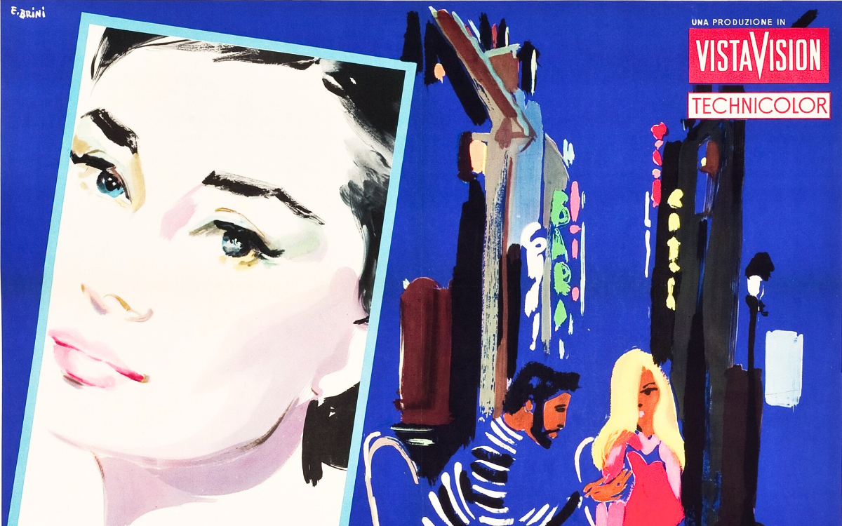
Watercolour is too fragile, too delicate for a film poster. Ercole Brini used it anyway and, precisely for that reason, became one of the most original voices in Italian cinema poster art. Watercolour might seem an unlikely technique for a movie poster. Too fragile, too delicate, too quiet for an image that has to stop the passer-by from a distance and survive on a wall for weeks.
Ercole Brini did exactly the opposite of what the logic of the trade suggested, and for this very reason he became one of the most original and recognisable figures in Italian film poster art. His liquid transparencies, his colours that seem to breathe, his barely sketched figures that leave the eye to complete them: all of this made watercolour not a limitation but an unmistakable signature.
Rome, the Academy and the Double Life of Painter and Poster Artist
Born in Rome in 1913, Brini trained at the Accademia di Belle Arti and throughout his life cultivated a double artistic identity that set him apart from most of his colleagues. Even before turning to cinema, in the 1950s he pursued a successful exhibiting career in "high" art, that of galleries and shows, building a reputation as a genuine painter rather than a mere commercial illustrator. He was also a highly skilled advertising graphic artist, particularly admired for his posters for beauty products, a field that demands elegance, synthesis and that lightness of touch that would later become his hallmark in cinema too.
When he arrived at film poster art, Brini brought both sides of this experience with him: the pictorial culture of the gallery artist and the communicative ability of the advertising designer. The result was a style unlike any other. While the great Roman poster artists, from Anselmo Ballester to Alfredo Capitani, built images of strong realistic and dramatic impact, Brini chose the opposite path: rarefied atmospheres, fairy-tale accents, fluid compositions that suggest more than they show. His images need no complex constructions, a few liquid strokes are enough to evoke what lies outside the frame.
The quality of his work soon crossed national borders. His talent had caught the eye of Adolph Zukor, the legendary head of Paramount, who in 1952 invited him to the United States to produce a number of sketches: one of these was chosen to illustrate Shane with Alan Ladd. What was meant to be a brief stay turned into a six-month experience, during which Brini grew passionate about that kind of work and produced other pieces destined for various American films. He was so highly appreciated that two years later he returned once again to the United States for several months, a sign of a reputation that had by then crossed the ocean. It is no coincidence that he was also a respected teacher of advertising graphics and painting in several Roman schools: he had something to teach, and he knew it.
Bicycle Thieves (Vittorio De Sica, 1948)
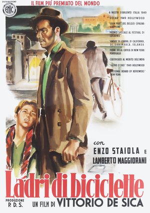
The poster for Bicycle Thieves, an absolute masterpiece of Neorealism, is today one of the rarest and most sought-after pieces in all of Italian film poster art: only one known copy exists in the world. Brini chooses a composition shifted to the left, with father and son in the foreground rendered in liquid brushstrokes and a deliberately reduced palette, while in the background the figure of the thief moves away with the stolen bicycle. The asymmetry of the composition and the rarefaction of the colours underline the oppression and solitude at the heart of De Sica's story. It is a poster that, with minimal means, conveys the full emotional weight of the film.
Breakfast at Tiffany's (Blake Edwards, 1961)
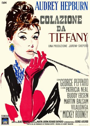
The poster for Breakfast at Tiffany's is perhaps Brini's most famous image, and it contributed decisively to building the myth of Audrey Hepburn. The actress's face, rendered in his unmistakable stylised watercolour, is supremely elegant: the red glove, the long cigarette holder, the blue necklace, the upswept hair. Everything is synthesised in a few essential strokes that capture the grace and irony of the character of Holly Golightly. Brini, who created the Italian posters for almost all of Audrey Hepburn’s films, finds here his ideal subject: two forms of elegance, that of the actress and that of the painter, meeting and enhancing one another.
Rope of Sand (William Dieterle, 1949)
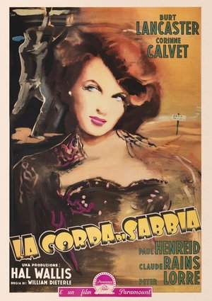
The poster for Rope of Sand, with Burt Lancaster and Corinne Calvet, shows the other side of Brini, more dramatic and sensual. The face of the female lead dominates the composition with an intense and ambiguous gaze, rendered with soft brushstrokes and a warm palette of browns and golds that evokes the desert in which the story unfolds. In the background, barely sketched, the male figures and the desert landscape introduce the tension of the narrative. It is a perfect example of how Brini could adapt his liquid technique even to dramatic subjects, without ever sacrificing the lightness of his touch.
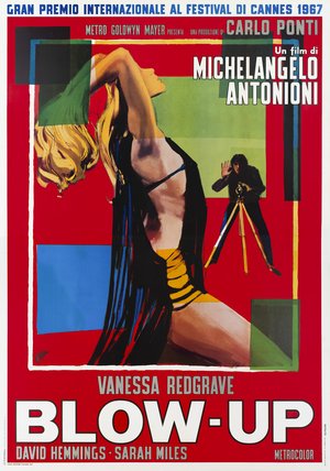
Blow-Up (Michelangelo Antonioni, 1966)
The poster for Blow-Up, winner of the Grand Prix at the 1967 Cannes Film Festival, shows a surprisingly modern Brini, capable of dialogue with the visual culture of the 1960s. Against a bright red background, the arched female figure is surrounded by geometric fields of pure colour, blue, green, yellow, black, that recall abstraction and contemporary design. On the right, the small figure of the photographer with his tripod introduces the central theme of Antonioni's film. It is an image that demonstrates how Brini, while faithful to his technique, knew how to renew himself and capture the spirit of an era in full transformation.
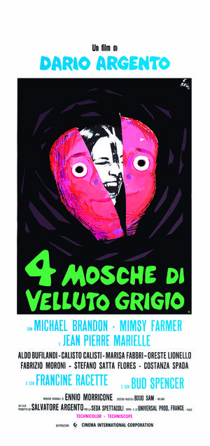
Four Flies on Grey Velvet (Dario Argento, 1971)
The "locandina" (Italian small format) for Four Flies on Grey Velvet by Dario Argento is one of Brini's most audacious and unsettling works. Against a black background, a screaming face in black and white is enclosed in a pink and red heart shape, split in two like a tragic mask, with two large staring eyes fixing the viewer. The acid-green title completes an image of strong psychological impact, perfectly calibrated to the disturbing thriller of the film. Here Brini shows that he could also measure himself against the horror-thriller genre, bending his language to extreme expressive demands.
The Legacy of Ercole Brini
Brini died in Rome on 4 July 1989, leaving a stylistic legacy unique in the landscape of Italian cinema painters. His choice of watercolour, a fragile and unheroic technique, was an artistic statement as much as a technical choice: a way of saying that the film poster could be light without being superficial, delicate without being weak, poetic without sacrificing communicative effectiveness. His lesson, taken up by generations of students in the Roman schools where he taught, and today reassessed by collectors and scholars around the world, remains that of an artist who knew how to transform an apparent weakness into his greatest strength, and who showed how a few liquid strokes are enough to tell an entire film.
The works reproduced on this page come from the original prints of the period, recovered, photographed and digitally restored by Movie.it.