Franco Picchioni, the Painter Who Came from the Newsstands
Edited by Paolo Zelati, Editorial Director
July 13, 2026
Before reaching the walls of Italian cities, Franco Picchioni's painting passed through Italian hands every week: on the covers of pocket thrillers, on comic books, even on postcards of pop singers. Born in Rome in 1942, Picchioni signed his works with the pseudonym "P. Franco", his name reversed into a trademark and under that mark he crossed the entire popular imagination of the Sixties and Seventies: the western, the spy story, the sword-and-sandal epic, motor racing, the masked hero. His is one of the clearest cases of a phenomenon that nourished the Italian film poster: the newsstand painter who brought to cinema the speed, the sensuality and the narrative instinct learned on magazine covers.
Rome, the School of the Film Poster
Franco Picchioni was born in Rome on 21 June 1942. After art school he attended the Istituto Don Orione, where the film poster was an actual subject of study: a detail that shows how much, in the Rome of those years, painted cinema was considered a craft to be learned like an applied art. His first works, painted covers and line illustrations, appeared in the early Sixties in the magazine Giallo Selezione. At first he signed "Picchioni" or simply "Franco", then he found the mark that would become his brand: P. Franco.
The King of the Covers
From 1965 he worked for Edizioni COFEDIT and from that moment all the titles of the Roman publisher carried the imprint of his modern, effective covers. In 1966 he began an intense collaboration with Edizioni Ma.Ga., painting the covers of the series Gialli del Cerchio Rosso and F.B.I. Story, novels that, as has been affectionately written, were collected more for the beautiful girls on the covers than for their content. In 1968 came the covers for Fratelli Spada, where he met an admirer of his, Romano Felmang, the cover artist of the Mandrake comics: it was Felmang who secured him, in 1970, a series of covers for the famous magician's albums and who later put him in direct contact with comics publishers. This is how the covers of Zorro, The Saint, Sylvie, Loana, Sgt Clem, I Diavoli were born. In the same period his hand reached another corner of the national imagination: the illustrated postcards of pop singers, from Celentano to Mina, from Adamo to Claudio Villa, all signed P. Franco.
The Works Chosen for the Italian Releases
From the newsstands to the walls the step was a natural one. Picchioni worked closely with Studio Paradiso, one of the historic workshops of Roman poster art, and kept direct relationships with the film companies, creating sketches that were chosen for posters and promotional materials. His territory was genre cinema at the peak of its vitality: the Italian western, costume adventure, crime films, and even an undisputed master like Hitchcock, with Topaz in its 1969 Italian release. There is also a circumstance that our archive documents with precision and it is worth a small lesson in the history of the trade: for Zorro il cavaliere della vendetta the poster and the "locandina" (Italian small format) were painted by two different hands, the poster by Giovanni Di Stefano and the locandina by Picchioni. Distributors often requested different subjects for the different formats and it could happen that two painters met on the same film, each with his own vision. And there is, finally, a symmetry that seems written on purpose: the man who painted the covers of the Zorro comic books also painted the masked hero for the cinemas.
A Horse in Via Goito
A first-hand memory of this writer captures the man better than any biography. Rome, 1974: at the SAC headquarters in Via Goito 58, in the very heart of the city, Franco Picchioni arrives on horseback, the inseparable western hat on his head. It is not a publicity stunt: he wants to know whether we have reprinted the materials of a certain film. "They paid me pennies because this film will never make a penny, they said. Well, I've just seen the box office figures", he explains. The film had performed far beyond expectations, poster and locandina had been reprinted, and Franco, once he had his confirmation, got back on his horse and headed straight for the distributor's publicity office. The episode says everything about the character, but it also sheds light on a precise historical truth about the trade: the painters remained owners of their works and the payment for promotional use was to a certain extent tied to the print run, higher for a film with great expectations, lower for a minor title, whose reduced budget compressed every cost, including the painter's work.
The Style: Synthesis and Instant Impact
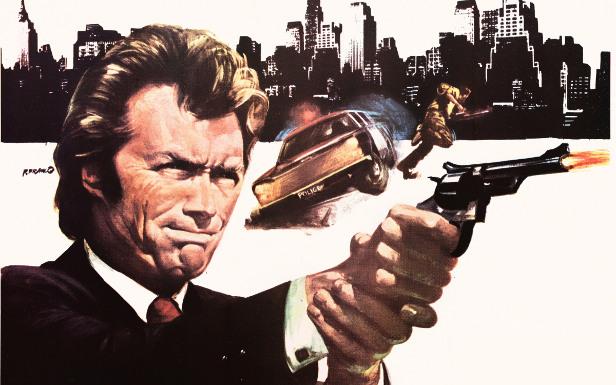
His training on covers explains the style of P. Franco: one image, one idea, no dispersion. The sources recall his broad visual culture, from his knowledge of Italian painters such as Averardo Ciriello to that of Americans like Frank Frazetta and in his works this double schooling is visible: from Italy, the portrait and the construction of the poster around the star; from America, physical energy, the body in tension, dramatic colour. Picchioni works in broad colour fields and clean profiles, loves the single-colour ground, turquoise, orange, black, that fires the figure forward and possesses a particular talent for the fetish objects of genre cinema: the engraved revolver, the whip, the helmet, the racing car. They are the totems of popular cinema and he paints them with the care that others reserve for faces.
The Works
And His Name Was Holy Ghost (Roberto Mauri, 1971)
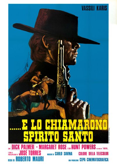
The poster for And His Name Was Holy Ghost is an exercise in style on the gunfighter's profile: the gaunt face under the enormous brim of the hat stands against a flat turquoise sky and before the face, vertical as a column, rises a revolver with a fully engraved frame, a ceremonial weapon more than a duelling one. Below, small as a memory, a rider with a levelled carbine crosses the dark field of the poncho. The composition works by subtraction, three elements in all and entrusts everything to the contrast between the motionless monumentality of the profile and the precious detail of the weapon: it is the Italian western reduced to its icon.
The Wild Racers (Daniel Haller, 1968)
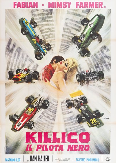
The poster for The Wild Racers turns the sheet into a racetrack: six single-seater racing cars, each with its own livery, wheel around the centre of the image like the numbers of a dial, among speed streaks that scar the pale ground where the circuit's billboards can be glimpsed, blurred. And at the centre of the carousel, still in the eye of the storm, a driver in a red racing suit kisses the neck of a blonde girl who surrenders with closed eyes. Speed all around, desire at the centre: the racing film and the love story told in a single rotating figure, with a compositional idea that still seems to spin before one's eyes.
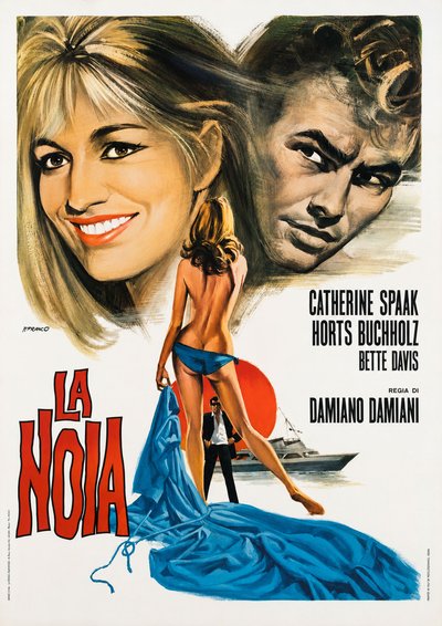
The Empty Canvas (Damiano Damiani, 1963)
The poster for The Empty Canvas lays Moravia's novel out on the sheet as on a blank page: above, the two great faces, Catherine Spaak smiling luminously and Horst Buchholz brooding, painted in stormy greys; at the centre, a female figure seen from behind, with a blonde ponytail, lets a long blue drape slip down and gather in the foreground like a wave, before a red disc of sun, a man in black with dark glasses and a white yacht. The red title, stacked vertically, closes the corner like an ideogram. It is the P. Franco of the covers lent to auteur cinema: sensuality told through symbols, the body as statue, the white emptiness that lets everything breathe. One of his most elegant sheets.
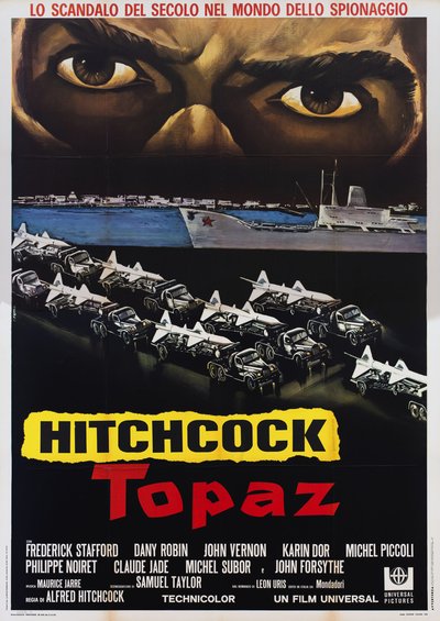
Topaz (Alfred Hitchcock, 1969)
The poster for Topaz, for the first Italian release, builds tension in horizontal bands: at the top, two enormous, feverish eyes span the entire width of the sheet and watch over the scene; in the middle, a Soviet freighter with a red star glides past a night harbour; below, in orderly, menacing columns, military trucks carry missiles pointed toward the title. The word "Hitchcock" stands on a torn yellow band, larger than the title itself: the real draw is the director. It is a poster of pure geometry of fear, without stars and without embraces, translating the missile crisis into a drawn nightmare.
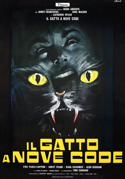
The Cat o' Nine Tails (Dario Argento, 1971)
The poster for The Cat o' Nine Tails is a nocturnal apparition with two faces: from the absolute black of the ground emerges the gigantic muzzle of a black cat, its phosphorescent yellow eyes and its jaws open on their fangs, and above it, kneaded into the same darkness, surfaces, tipped backwards, the terrified face of a woman, her hair blending into the beast's fur. The yellow squared title seals the dark below. The beast and the victim painted one inside the other, instinct and fear fused into a single creature: Argento's second giallo finds its perfect icon on the walls, built with a visible, nervous brushstroke that keeps the image between portrait and hallucination.
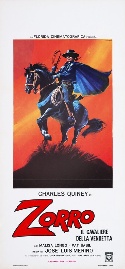
Zorro, Rider of Vengeance (José Luis Merino, 1971)
The locandina for Zorro, Rider of Vengeance rears the hero's black horse on a dark mound, against an orange sky crossed by blades of yellow light: Zorro, his blue cloak swollen by the wind and his whip whirling above his hat, commands the scene like an equestrian statue in motion. The white lasso hanging from the saddle, the embroidered details of the costume, the horse's straining head: every element is drawn with the precision of a comic book cover and not by chance, for the same hand was painting the covers of the Zorro comics in those very years. The red title, with its giant Z slashed like a sword stroke, closes an image that is at once a poster and an adventure panel.
The Last Show: The Circus
When the season of painted covers and film posters drew to a close, Picchioni did not stop painting spectacle: he moved to circus posters, tigers, lions, tamers, the last Italian advertising that still demanded painting. There is something fitting in this epilogue: the man who had painted gunfighters and racing drivers ended his career with the beasts and the circus tent, that is with the oldest form of popular wonder. Franco Picchioni died in Rome in 2002, leaving a body of work scattered among newsstands, cinemas and town squares which only today collectors and archives are piecing back together.
P. Franco among the Maestri Cartellonisti
Within the landscape of Italian cinema painters, Picchioni represents with particular purity the current that came from popular illustration. His documented admiration for Averardo Ciriello places him in the wake of the great Italian portraitists, while his taste for dramatic anatomy and dense colour links him to the American masters of the fantastic. His story runs parallel to that of a Luciano Crovato, another painter of the same generation active in genre cinema, and physically crosses that of Giovanni Di Stefano on the double Zorro of 1971. Covers, postcards, posters, circus billboards: few artists demonstrate better than P. Franco that Italian painted cinema was not an island, but the most visible province of a whole continent of popular images.
The works reproduced on this page come from the original prints of the period, recovered, photographed and digitally restored by Movie.it.