Ezio Tarantelli, the First E of Studio E2
Edited by Paolo Zelati, Editorial Director
July 23, 2026
Some stories of the Italian film poster are best told in pairs. Ezio Tarantelli's is intertwined with Enzo Sciotti's: two young men from the same Roman workshop who one day decided to strike out on their own and founded a company named after their initials, Studio E2, the two E's of Ezio and Enzo. Of that signature, destined to mark a substantial portion of Italian cinematic imagery between the 1970s and 1980s, Tarantelli was the first E, the senior partner, the solid and versatile painter whom critics remember above all for the Italian western, but who crossed the entire spectrum of popular cinema with brush in hand: comedy, adventure, re-releases of classics, and even the very first Japanese cartoons to arrive in our theaters.
Rome, from Studio Battaglia to Studio E2
Ezio Tarantelli was born in Rome on 9 February 1941. His name, it should be said at once to avoid a frequent confusion, is the same as that of the famous economist murdered by the Red Brigades in 1985: they are two different people and ours is the painter. His road began in the poster workshops of Cinecittà: he was already at work at the Studio Bat of Riccardo Battaglia, together with his colleague Renzo Cenci, when in 1960 a sixteen-year-old boy joined the studio, destined to become his partner for life, Enzo Sciotti. The friendship born at the workshop's drawing tables turned over the years into an enterprise: the two founded Studio E2, an independent structure with which they faced the poster market as protagonists. Before then, Tarantelli's signature also appears beside that of other image workshops, such as Studio Policrom: a journey through the botteghe that was the true higher education of this trade. Tarantelli died in Rome in 2008 and today his posters are preserved in public collections as well, such as the Cinema Graphics Collection of the Provincial Library of Foggia.
The Works Chosen for the Italian Releases
Critics remember him in particular for his illustrations for the Italian western and genre cinema, the great sea of popular film where his quick, sure hand was a guarantee. But the range of his works tells a much wider story: auteur comedy in the re-releases that made headlines, American war cinema brought back to Italian audiences, the international stardom of Brigitte Bardot and an achievement rarely credited to him: his work on some of the early Japanese animated features to reach Italy, when the great television invasion was still almost a decade away. His works were chosen by distributors large and small and the variety of the companies that chose them shows how much the market trusted him: any subject could be placed in Tarantelli's hands, certain that what came back would be a clear, robust, effective poster.
The Roma Interlude
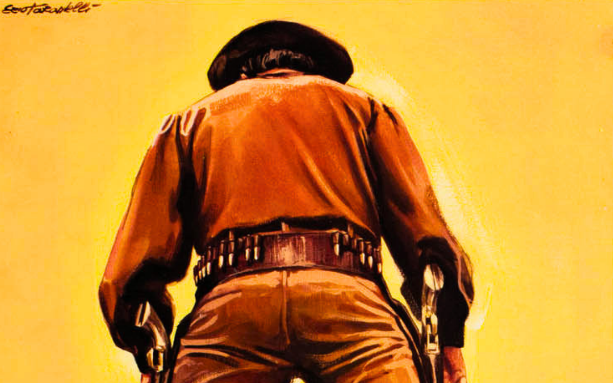
There is a chapter of his activity that deserves a smile and is precisely documented: in the autumn of 1982, the year before AS Roma's second league title, the magazine Giallorossi also published Tarantelli’s illustrations. Its October issue included a poster of Claudio Valigi by Tarantelli, while Roberto Pruzzo appeared on the cover. The painter of gunfighters lent to the goal-scorers: a perfectly natural crossing for men who, like the poster artists, could paint any popular hero, from the prairie horseman to the centre-forward of Testaccio. It is also a document of how, in the years when the film poster began to contract, these artists carried their talent wherever painted images were still needed.
The Style: the Solidity of the Trade
Tarantelli's painting is that of a professional formed in the school of the workshops: classical construction, faces true to life and full of character, warm colour laid down with confidence. His most evident talent is the ability to adapt his register to the subject without losing solidity: the granite portrait for the American star, the soft luminous touch for the French diva, the graphic concept for satirical comedy, the clean faithful line for animation. In this he is a stylistic brother of his partner Sciotti, with a difference of temperament: where Enzo seeks emotional impact, Ezio seeks balance. His posters do not assault the passer-by, they persuade him. It is the quality of artists who rarely took centre stage but were, in truth, indispensable: without artists like him, the poster industry could never have kept the pace of hundreds of releases a year.
The Works
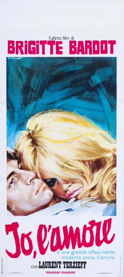
Two Weeks in September (Serge Bourguignon, 1967)
The "locandina" (Italian small format) for Two Weeks in September is a blonde wave: Brigitte Bardot's mane, painted lock by lock in luminous yellow, fills almost the whole scene as it spills over the face of the man lying beside her, of whom only the pale eyes and profile remain visible. The background is a storm of turquoise and blue brushstrokes, abstract and utterly modern, that makes the gold of the hair vibrate and the title runs below in a pink brush cursive, like a love note. Presented as Bardot's latest film, the sheet stakes everything on the myth of the diva and resolves it with elegant sensuality: not a body, but a head of hair and a gaze. Sometimes stardom is a matter of synecdoche.
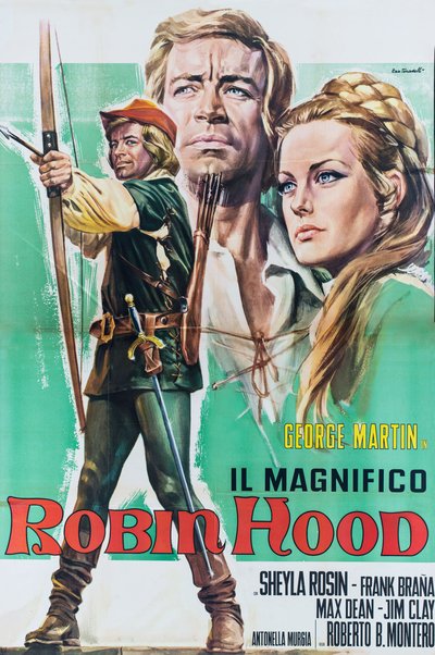
The Magnificent Robin Hood (Roberto Bianchi Montero, 1970)
The poster for The Magnificent Robin Hood dresses the entire sheet in green: on an emerald field enlivened by strokes of white, the hero at full figure draws his bow skyward in green hose and a red-plumed cap, while behind him rise the two great portraits, the protagonist's proud face and that of a blonde lady with her braid gathered like a crown. The arrow already loosed strikes home below, beside the credits. It is the formula of serial adventure cinema brought to its cleanest degree: action figure, pair of faces, identity colour, all legible in a flash, with that flawless professionalism that was the mark of the Roman workshops.
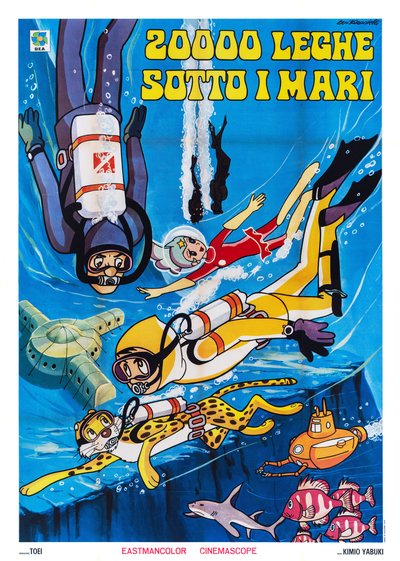
20.000 leghe sotto i mari (Kimio Yabuki and Takeshi Tamiya, Italian edition 1970)
The poster for 20.000 leghe sotto i mari opens up a blue seascape full of wonders: wet-suited divers descending among the bubbles, a little girl in a red suit and transparent bubble helmet, a spotted feline complete with breathing gear, an orange submarine with round eyes, a passing shark and a school of pink fish, with an undersea base surfacing from the blue. This is an early example of Japanese animation reaching Italian cinemas, years before the great television boom, and Tarantelli translates it with absolute respect for the original design and a poster artist's command of the page: the eye descends in a spiral through the water, from character to character, down to the bottom of the sea. A pioneering document, almost ten years before the great wave of robots and television theme songs.
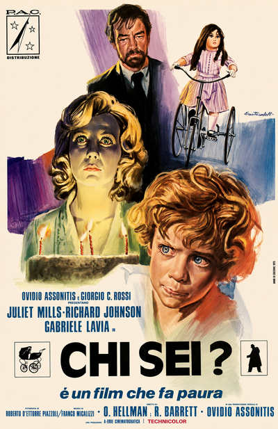
Beyond the Door (Ovidio Assonitis and Roberto D'Ettorre Piazzoli, 1974)
The poster for Beyond the Door builds its dread with the means of watercolour: on patches of violet and blue, the face of Juliet Mills emerges lit from below by the candles of a birthday cake, her green eyes wide in a livid glow, while above her watches the dark figure of a bearded man and, on the right, a girl with a doll's face pedals an old-fashioned tricycle. In the foreground, a red-haired boy stares out of frame with enormous eyes. The promise printed beneath the title, "it's a film that will scare you", and the two pictograms at the sides, a black pram and a man's silhouette, complete a sheet that shows nothing of the horror and lets all of it be sensed. On the sheet the direction is credited to the American pseudonyms O. Hellman and R. Barrett: to travel abroad, even Italian demonic horror changed its name.
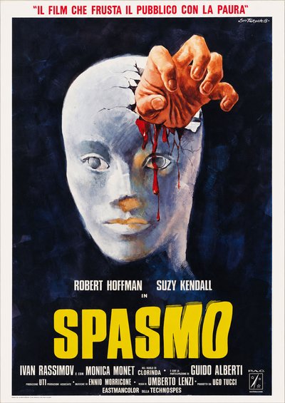
Spasmo (Umberto Lenzi, 1974)
The poster for Spasmo is one of the purest images of the Italian giallo: from the night-blue darkness, laid down in dense brushstrokes, surfaces the head of a female mannequin with a smooth, absent face, and from the cranium, cracked like an eggshell, emerges a real hand, carnal, clutching something from which blood runs in thin trickles down the forehead and across the eye. Nothing else, up to the red band above promising "the film that whips its audience with fear" and the yellow title in vibrating letters. Mannequins are the secret obsession of Lenzi's film, and the poster turns it into a surrealist emblem: the inert and the living, the mask and the wound, in a single nightmare apparition. One of the absolute peaks of Tarantelli's work.
Tarantelli Among the Maestri Cartellonisti
Within the landscape of Italian cinema painters, Ezio Tarantelli represents the backbone of the system: the workshop artists who guaranteed constant quality across enormous volumes of work. His story is inseparable from that of Enzo Sciotti, the Studio E2 partner with whom he shared half a century of the trade, and its roots reach into that Battaglia workshop where Renzo Cenci also worked: a genealogy of colleagues and friends that is the true load-bearing structure of the Roman film poster. And his pioneering work on Japanese animation makes him a precursor to the work that, a few years later, Mario Piovano would do for the wave of Heidi and the robots. When the story of painted cinema is told, the soloists are always cited; Tarantelli reminds us that this story was written above all by an orchestra.
The works reproduced on this page come from the original prints of the period, recovered, photographed and digitally restored by Movie.it.