
Renato Ferrini, Colour as Language, Line as Emotion
By Movie.it Editorial Team
June 8, 2026
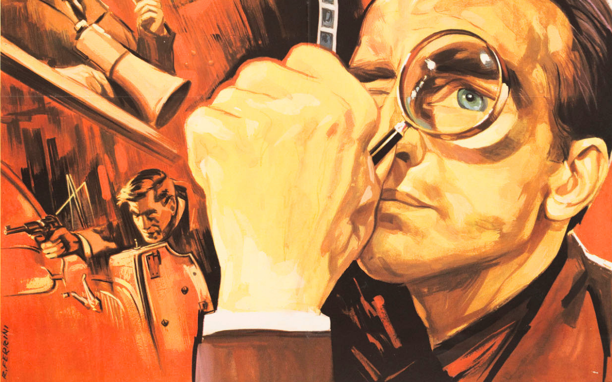
Renato Ferrini is one of the most original and least celebrated figures in Italian cinema poster art of the twentieth century. In a landscape dominated by the painterly realism of the BCM school (Ballester, Capitani, Martinati), his artistic trajectory followed an independent path, oriented towards graphic synthesis, visual symbolism and a use of colour that did not describe reality but interpreted it. From the Academy of Fine Arts in Florence to post-war Rome, Ferrini built a personal and recognisable language that places him among the pioneers of the modern Italian film poster.
Training and Move to Rome: from Stamps to Cinema
Born in Orbetello in 1910, Ferrini moved to Florence at nineteen to attend the Academy of Fine Arts, where he acquired a solid technical grounding that in his early works translated into a meticulous, almost photographic style. In 1936 he moved to Rome, where he gradually entered the city's film world. In later years, alongside his work for cinema, he also developed an important career in stamp design: from 1955, the Italian postal service began issuing stamps designed by Ferrini, a field that demands compositional precision, economy of line and the ability to communicate in an extremely confined space. An apprenticeship that further sharpened his vocation for synthesis.
Stylistic Evolution: from Realism to Essential Graphic Art
The most significant turning point in Ferrini's career was his progressive abandonment of descriptive realism in favour of a more abstract and symbolic approach. While his contemporaries focused on physiognomic fidelity in actor portraits and narrative representation of scenes, Ferrini began working by subtraction: fewer details, more tension; less painting, more sign. Colour ceased to be a narrative element and became a psychological ground, a total and monochromatic presence that shaped the entire perception of the image. A choice that brings him closer, within the specific Italian context, to the international graphic design research of the 1950s and 1960s.
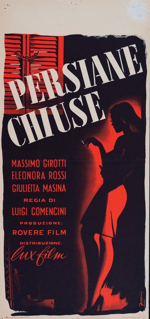
Behind Closed Shutters (Luigi Comencini, 1951)
The "locandina" (Italian small format) for Behind Closed Shutters, directed by Luigi Comencini in 1951 with Massimo Girotti, Eleonora Rossi Drago and Giulietta Masina, is one of the most emblematic demonstrations of Ferrini's stylistic maturity. The composition is radical in its economy: a total black background, a red shutter in the upper left, and the backlit silhouette of a female figure holding a cigarette, illuminated by a red halo that lifts her from the darkness. No actor portraits, no narrative scene: just an atmosphere, dense and unambiguous, that communicates in an instant the film's mood of moral ambiguity and erotic tension. The white title lettering, in large angled characters, is integrated into the composition as a pictorial element. It is a locandina that anticipates by a decade the solutions of European art cinema.
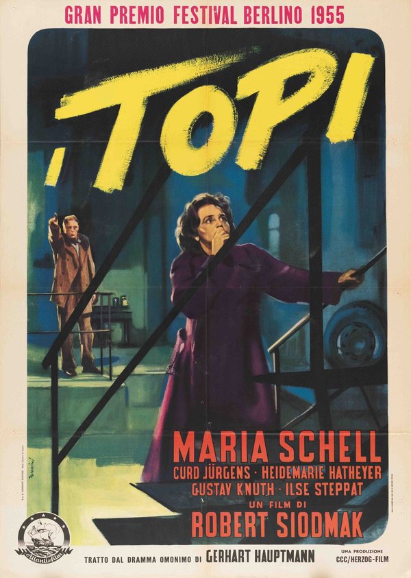
The Rats (Robert Siodmak, 1955)
In the poster for The Rats by Robert Siodmak, winner of the Golden Bear at the 1955 Berlin Film Festival in 1955 with Maria Schell and Curd Jürgens, Ferrini adopts a solution of strong dramatic impact. The figure of Maria Schell in the foreground, wrapped in a purple coat with her hand raised to her face in a gesture of dismay, stands against a nocturnal industrial interior rendered in cold blues and greens. In the background, the male figure stretches towards her in an unsettling movement. The yellow title, laid down in rapid and vigorous brushstrokes like a scratch, dominates the composition from above with an immediate graphic force. The whole perfectly conveys the claustrophobic and psychologically oppressive atmosphere of the film, based on the homonymous drama by Gerhart Hauptmann.
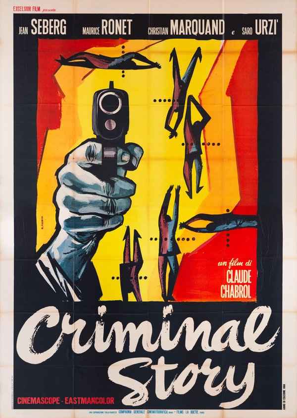
The Road to Corinth (Claude Chabrol, 1967)
In the poster for The Road to Corinth, the Italian release of La Route de Corinthe directed by Claude Chabrol in 1967, with Jean Seberg and Maurice Ronet, Ferrini achieves one of the most audacious results of his career. The composition abandons all realistic reference: against a background of flat yellow and red fields, a hand gripping a pistol aims directly at the viewer in extreme close-up, while all around it stylised figures fall, fly and contort in postures of death, reduced to near-abstract silhouettes. It is an image of extraordinary graphic modernity, in dialogue with the visual culture of the American jazz poster and the visual modernity associated with Chabrol and the Nouvelle Vague generation. The title lettering, in informal white cursive brushstrokes, completes a film poster that is in every respect a work of graphic design ante litteram.
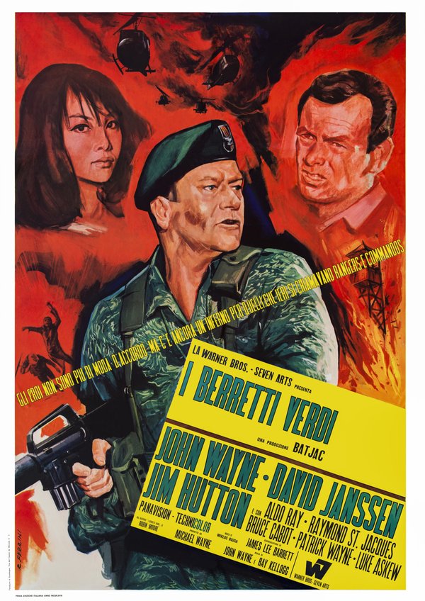
The Green Berets (John Wayne and Ray Kellogg, 1968)
The poster for The Green Berets, a Warner Bros./Seven Arts production from 1968 with John Wayne, David Janssen and Jim Hutton, shows Ferrini working in a completely different register: the big-budget war film, with its demands for spectacle and the immediate recognisability of its stars. The solution is a large pictorial triptych on a blazing red background: at the centre, the portrait of John Wayne in military uniform with a rifle in hand; to either side, the faces of the other protagonists emerge from the background like apparitions. Helicopters and explosions at the top complete a composition of high visual energy. Compared to his more abstract works, here Ferrini demonstrates his ability to modulate his style according to genre and expected audience, without sacrificing a high-quality pictorial management of light.
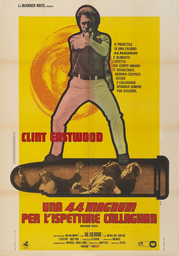
Magnum Force (Ted Post, 1973)
In the poster for Magnum Force by Ted Post, released in Italy as Una 44 Magnum per l'ispettore Callaghan in 1973 with Clint Eastwood, Ferrini chooses a hybrid, painterly-photographic solution that reflects the tendencies of the Italian film poster in the 1970s. The full-length figure of Eastwood on a brilliant yellow background, cut out like a collage and overlaid on a spiral orange circle, is flanked by a bullet casing containing a photographic action scene. The red title lettering at the bottom closes the composition with the force of a brand. It is a poster that communicates immediacy and urban violence with effective visual economy, perfectly calibrated to the American crime genre that dominated the Italian market at the time.
The Legacy of Renato Ferrini
Ferrini died in Rome in 2005, at the age of ninety-four, after a career that had spanned half a century of Italian cinema and graphic art history. His work, still largely to be catalogued and studied systematically, represents an original and courageous contribution to the history of the Italian film poster: that of an artist who did not merely illustrate films, but sought each time to find the visual equivalent of their psychological and emotional substance. In an era when the movie poster was perceived as a simple promotional tool, Ferrini treated it as a problem of pure visual communication, bringing to the Italian film poster solutions that echoed some of the most advanced developments in international graphic design.
The works reproduced on this page come from the original prints of the period, recovered, photographed and digitally restored by Movie.it.