
Pierpaolo Scalera, The Movie Poster in the Age of Photography
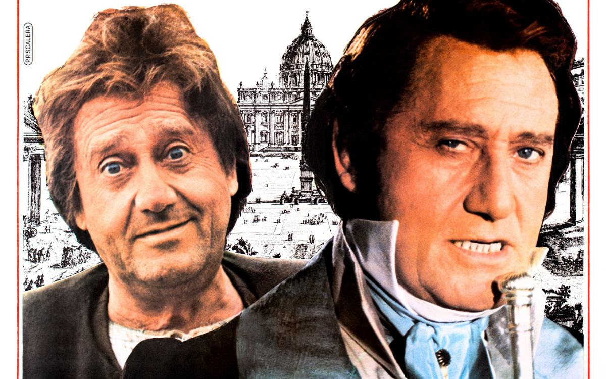
Pierpaolo Scalera is one of the great image-makers of the photographic era: he does not paint the stars, he composes them, cuts them out, ignites them on grounds of pure colour, and governs typography the way the old masters governed the brushstroke.
July 22, 2026
In the long history of the Italian film poster there is a moment when the brush gives way to the camera, and that transition is often described as an ending. The story of Pierpaolo Scalera proves it was also a beginning. Born in Rome in 1938, Scalera is one of the great image-makers of the photographic era: he does not paint the stars, he composes them, cuts them out, ignites them on grounds of pure colour, and governs typography the way the old masters governed the brushstroke. His mark, "P.P. Scalera", and the name of his firm, "Scalera Pubblicità", appear on the edge of some of the most recognisable posters of Italian cinema in the last decades of the twentieth century: proof that even when the walls stopped being painted, they still needed an author's eye.
Rome, a life in the image
Pierpaolo Scalera was born in Rome on 10 November 1938, and in Rome he still lives today, with his wife Laura. His career spans one of the most delicate periods in the history of the film poster: the years in which distributors moved progressively from painting to the production still, and in which the quality of a sheet no longer depended on the hand that painted it but on the intelligence that constructed it. Scalera was among those who understood that this change did not abolish the profession but transformed it: in place of the painted portrait, what now mattered was the choice of the right image, the crop, the background colour, the typeface, the balance between full and empty. Thus was born a signature that is not a painter's but an image director's, one that collectors have learned to recognise and seek out exactly like a painted one.
The works chosen for the Italian releases
His name accompanies titles ranging from auteur cinema to great comedy, from horror to the musical, for the major distribution companies of the period, from Gaumont to the Cecchi Gori galaxy. Looking at his works preserved in the Movie.it archive, photographed from the original vintage prints, one is struck by the variety of registers: the ringing red field of a costume comedy, the absolute black of a horror film, the Mediterranean sky of an Oscar-winning film. And one is struck by a constant: Scalera never fills the sheet, he organises it. Where the average photographic poster of the Eighties and Nineties piles up faces and copy, his subtracts, orders, breathes. It is the lesson of the great poster painters carried into a new language: the passer-by has one second, and the image must win that second.
The style: the concept above all
Where the painters built the poster around a face or a gesture, Scalera builds it around an idea. An open razor in a shaft of light can tell an entire horror film; a silver frame holding a smile can evoke a musical crowned with eight Oscars; a screen stretched across a town square can contain all of cinema's nostalgia for itself. This gift for conceptual synthesis is his true inheritance from the masters of the brush, and he accompanies it with two instruments he handles like a virtuoso: the background colour, often a single field that makes the sheet recognisable from a hundred metres, and typography, chosen and drawn as an integral part of the image, never as a mere label.
The works
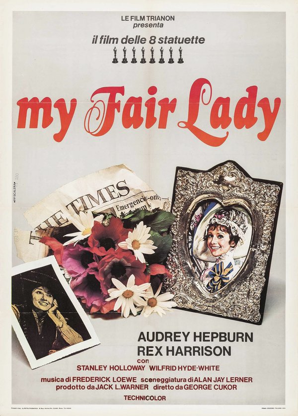
My Fair Lady (George Cukor, 1964)
The poster for My Fair Lady, created for the 1976 Italian re-release (the film had first reached Italian cinemas in 1965) dispenses with a scene and opts for a still life: on a pearl-grey ground, an embossed silver frame holds the smile of Audrey Hepburn in her racing hat, beside a bunch of anemones and daisies wrapped in a page of the Times and a small black-and-white photograph of Eliza the flower girl. Above, eight statuettes in a row under the words "il film delle 8 statuette", the film of the eight Oscars, and the title in a red cursive like an Art Nouveau-style sign. It is intimate, jewel-like and precious, treating the film like a family memory to be reopened: Eliza's story, from the pavement to the silver frame, told through objects.
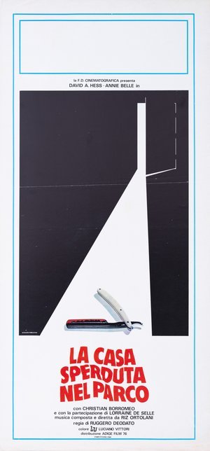
The House on the Edge of the Park (Ruggero Deodato, 1980)
The "locandina" (Italian small format) for The House on the Edge of the Park is one of the peaks of minimalism in the Italian film poster: an almost total black field, cut by the triangle of white light entering through a half-open door, and in that light a single object, photographed with still-life precision: an open straight razor, its blade stained with blood. Nothing else, until the red title in its skewed lettering. The black is the house, the light is the menace, the razor is the promise: three elements and the film is already complete in the viewer's eyes. An exercise in subtraction that few designers would have had the courage to sign, and that time has turned into a cult object.
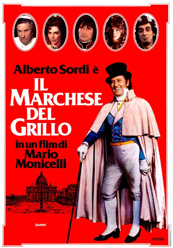
The Marquis of Grillo (Mario Monicelli, 1981)
The poster for The Marquis of Grillo has become an icon on a par with the film: on a blazing red field, Alberto Sordi full-length in tailcoat, cloak and top hat, leaning on his cane with the smile of a man who knows better, while above five oval portraits frame the other characters like family miniatures and below an engraving of St Peter's Square anchors the story to papal Rome. The photograph cut out against solid colour, the period frames, the white title with its nineteenth-century flavour: every choice translates the spirit of the film, aristocratic Rome seen through the lens of satire and mischief, into graphic language. A red that, once seen, is never forgotten.
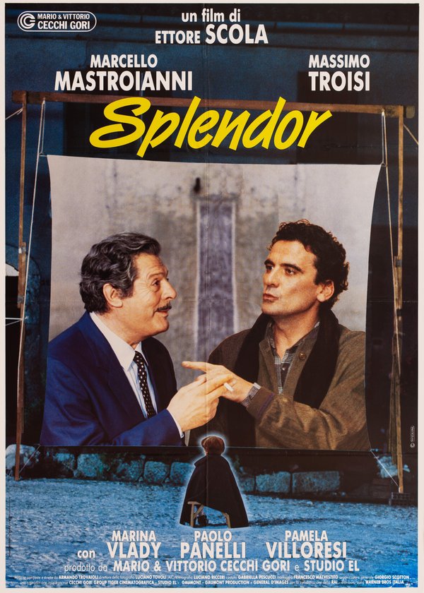
Splendor (Ettore Scola, 1989)
The poster for Splendor stages cinema within cinema: in a blue evening square, a white screen stretched on a wooden frame carries the giant image of Marcello Mastroianni and Massimo Troisi in conversation, and before the screen, tiny and seen from behind, a lone child on a chair watches. The yellow title runs in cursive like a neon sign, that of the film's Splendor cinema. It is a poster built on a single perfect idea: the child spectator before the giants, that is, the declaration of love for the movie theatre that is the heart of Scola's film, resolved with a simplicity that moves.
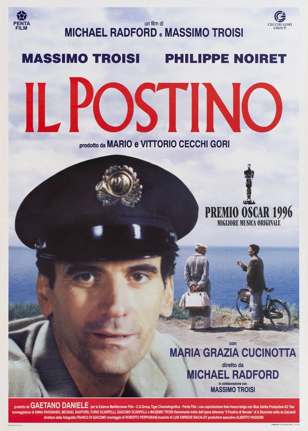
Il postino (Michael Radford, 1994)
The poster for Il postino, in the version created for the film’s 1996 re-release, fixes in collective memory the final image of Massimo Troisi: the gentle, tired face under the postman's cap, giant in the foreground against the sky and sea of the island, while on the right, small on the cliff, the poet and the postman talk beside the bicycle. The red title in classic lettering, the statuette with the words of the 1996 Academy Award for Best Original Dramatic Score, the Mediterranean light enveloping everything: the composition holds together the intimacy of the portrait and the breadth of the landscape, and it is impossible today to look at it without thinking that this face was about to leave us. A poster that became, without meaning to, a farewell.
Scalera among the Maestri Cartellonisti
Within the landscape of the Italian film poster, Pierpaolo Scalera represents the continuity of visual intelligence beyond the end of painting. His conceptual minimalism ideally takes up the baton from the more graphic seasons of a Sandro Symeoni, and his work runs parallel to that of Massimo Petrollo, known as Maxy, who worked within the same distribution network, with whom he shares the historic task of having kept the quality of the cinema image high when the brush was already a memory. The Maestri Cartellonisti painted the dream; Scalera proved it could still be built with photography, colour and the silence of white space. The walls of Italian cities owe him some of the last truly unforgettable images of Italian cinema.
The works reproduced on this page come from the original prints of the period, recovered, photographed and digitally restored by Movie.it.