
Marcello Colizzi, the Italian Movie Poster Artist of Wit and Elegance
By the Movie.it Editorial Team
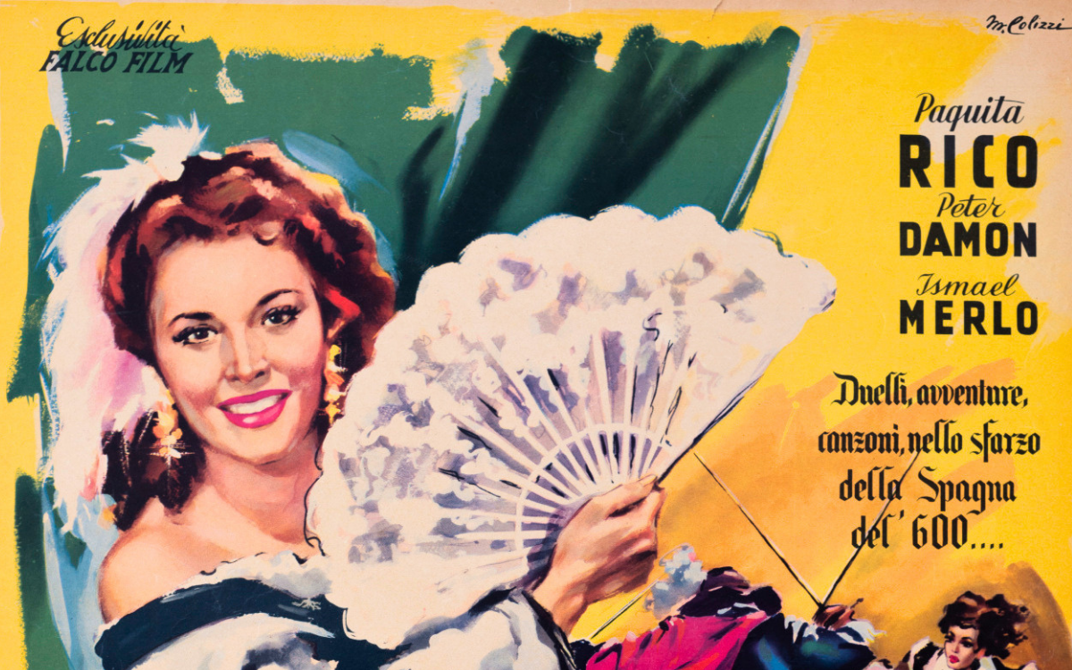
July 8, 2026
Marcello Colizzi, (Rome, 1929–2022) was one of the most brilliant artists of the Italian film-poster tradition, creating more than three hundred posters for Italian and international films. Born into an artistic family, he brought a rare quality to the film poster: irony. Raised in the world of satirical illustration, he was able to combine a taste for the visual gag with the solid craft of a painter and graphic designer, moving with the same ease between Italian comedy, Hollywood spectacle and auteur cinema. His images, always recognisable for the elegance of their composition and a touch of lightness, helped promote some of the most celebrated films of the 1960s.
Born into Art: From Attalo's Satire to the Cinema
Marcello was the son of Gioacchino Colizzi, the celebrated caricaturist known by the pseudonym Attalo, a historic contributor to humorous magazines such as Marc'Aurelio, a breeding ground for many of Italy's leading humorists and screenwriters. In that household of pencils and jokes he absorbed from boyhood the culture of rapid drawing, comic sensibility, which would remain his most personal signature. It is no coincidence that many of his posters retain that strong humorous streak typical of the writers and illustrators of the 1950s: an irony never gratuitous, able to condense the tone of a film into a single detail. It was this inheritance that set him apart from his more dramatic colleagues and made him especially sought after for comedies.
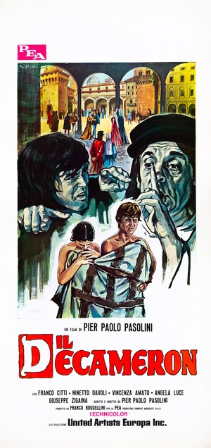
Decameron (Pier Paolo Pasolini, 1971)
The "locandina" (Italian small format) for Il Decameron, the first film in Pier Paolo Pasolini's Trilogy of Life, assembles several episodes of Boccaccio's tales into a single scene. In the background, under the arcades of a Renaissance square with ochre and yellow buildings, a crowd of characters in medieval costume moves about. In the foreground three figures stand out: on the left a dark-haired young man, crouching, from whom a large pointing hand extends; on the right an old man in a black cap raising his hand to his face; and at the centre a couple of half-naked youths wrapped in a coarse sackcloth bound by a rope. The title is in red, beneath the line "un film di Pier Paolo Pasolini". The composition, at once choral and theatrical, conveys the earthy, sensual tone of the film.
A Recognisable Hand
Colizzi's hand stands out for the balance of its composition, the cleanness of its line and a rare sense of the scene. He could alternate the full, soft colour of the portrait with the most modern graphic solutions and organise many elements within a single image without ever creating confusion. Whether it was an intense close-up or a choral scene, his aim was always the same: to guide the viewer's eye with clarity, letting a detail, a colour or a visual idea set the tone of the film. This versatility places him alongside an artist like Averardo Ciriello, equally at ease with glamorous portraiture and adventure scenes, though Colizzi inflected it with a sensibility all his own, more ironic and graphic. It is this compositional clarity, together with the lightness of his touch, that makes his work instantly recognisable.
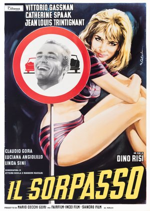
The Easy Life (Dino Risi, 1962)
The poster for The Easy Life, Dino Risi's masterpiece starring Vittorio Gassman, is one of the most famous graphic inventions in Italian cinema. Against a black ground, a young Catherine Spaak in a striped outfit is painted with her long legs drawn up and a teasing gaze, while at the centre stands a no-overtaking road sign: inside the red disc, in place of the two cars of the signal, is set a black-and-white photograph of Vittorio Gassman laughing. At the bottom, the title in yellow. The pairing of the painted figure and the photographic insert, of seduction and gag, sums up at a glance the irreverent spirit of the film and that ironic vein which is Colizzi's signature.
Italian Comedy and the Ironic Vein
Comedy brought out Colizzi at his most inventive. He worked on films such as Crazy Desire, perfectly at home in the sparkling world of early-1960s Italian comedy. It was here that the humour inherited from his father developed into striking visual ideas, playing with the codes of the road sign, of advertising and of the illustrated magazine. It is a way of conceiving the poster not as a mere lure, but as a small authorial invention, surprisingly modern even today.
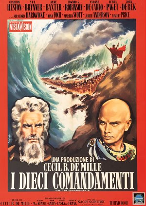
The Ten Commandments (Cecil B. DeMille, 1956)
The poster for The Ten Commandments, Cecil B. DeMille’s biblical epic, was created for the film’s 1959 Italian re-release, following its original Italian theatrical release in 1957., stakes everything on the contrast between the two leads and on the great set piece. At the bottom, two large portraits face each other: on the left the bearded, white-haired face of Charlton Heston as Moses, on the right the shaven, severe face of Yul Brynner as the pharaoh, with his Egyptian collar. Between them opens the immense wall of water of the Red Sea, with the people crossing on the dry seabed and the tiny figure of Moses in his red cloak raising his arms. The red border and the monumental lettering heighten the epic breadth. It is a poster of grand spectacle, in which the dramatic portrait and the choral scene coexist in perfect balance.
Grand Spectacle: Paramount and Hollywood
Alongside comedy, Colizzi worked on numerous Italian campaigns for Paramount releases and major Hollywood productions. His hand gave shape to the Italian image of American classics such as John Ford's The Man Who Shot Liberty Valance and the ensemble comedy It's a Mad, Mad, Mad, Mad World, as well as of historical and epic blockbusters. In these works the ironic vein gives way to a more dramatic and monumental painting, made of intense portraits and spectacular scenes, a field also explored in those years by specialists in genre posters such as Enzo Nistri. Yet Colizzi always brings to it his compositional rigour, able to hold many elements together without confusion.
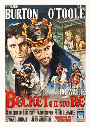
Becket (Peter Glenville, 1964)
The poster for Becket, the historical drama with Richard Burton and Peter O'Toole, is built on the face-off between the two leads. In the foreground, side by side, the intense face of Burton as Thomas Becket and that of O'Toole as King Henry II, wearing a gold crown set with blue stones. Around them, smaller scenes populate the composition: two young women leaning out of a window, a scuffle between men, and two costumed riders galloping. The title is in red on a pale ground. Colizzi organises the many elements without ever crowding the image, keeping the psychological drama of the two faces at the centre and relegating the action to the margins, in a balance worthy of true graphic direction.
Adventure and the Large Format
Colizzi also took on costume adventure and the more demanding formats, including large horizontal posters that allowed him to develop broad, panoramic compositions. In these works his painting becomes warm and dynamic, able to distribute many figures and different planes across a broad surface without losing the thread of the story, and to convey in a single glance the sense of exoticism and epic.
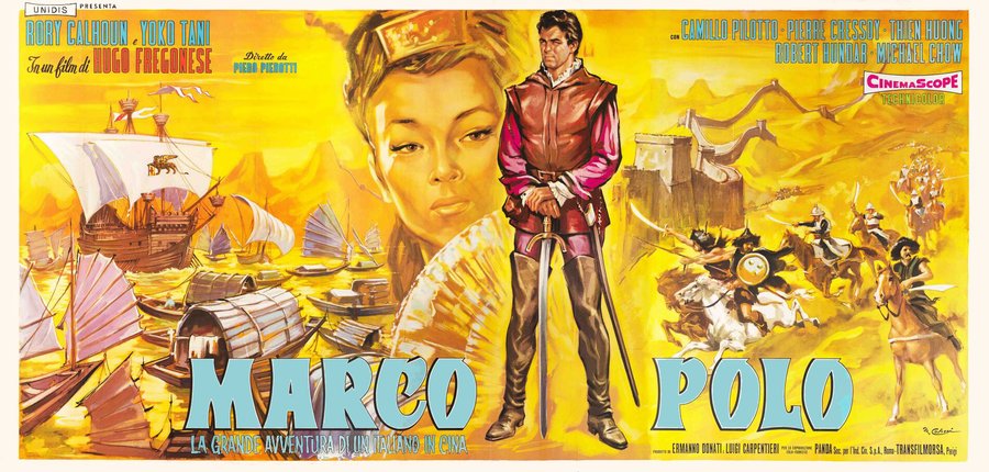
Marco Polo (Piero Pierotti, 1962)
The large horizontal poster for Marco Polo, an adventure film in CinemaScope, spreads the epic of the Venetian traveller across a broad panoramic format. At the centre, standing with his sword and red doublet, the young Marco Polo; behind him, on the left, Chinese junks and the large face of an Oriental woman with a fan, on the right a walled fortress and a charge of horsemen sweeping across the desert. The palette is dominated by yellows and ochres, which give the whole a sandy, exotic warmth. The title, in large blue letters, runs from one end of the sheet to the other. It is an example of the Colizzi devoted to grand adventure spectacle, able to fill an unusual format with dynamism and a sense of narrative.
A Versatile Talent
Versatility is perhaps Colizzi's most surprising quality. From exotic adventure to auteur cinema, from comedy to historical drama, his hand was able to adapt to the most distant registers, at times weaving many figures into a single crowded scene, both in the large posters and in the small-format locandine and elsewhere isolating a single face in close-up. It is this ability to move from the choral fresco to the essential portrait, from satire to grand spectacle, that makes Marcello Colizzi one of the most accomplished, and unjustly overlooked, figures of the golden age of the Italian cinema poster.
The works reproduced on this page come from the original prints of the period, recovered, photographed and digitally restored by Movie.it.