Rodolfo Valcarenghi, Movie Poster Artist at Studio Favalli
By the Movie.it Editorial Team
July 21, 2026
Rodolfo Valcarenghi was born in Rome on 24 July 1933 and grew professionally at the heart of the system: Studio Favalli, the atelier that supplied Lux Film and the great distributors with the sketches and finished posters intended for the theatrical launch of the films, a specific form of use that left all other rights in the works with their authors. The workshop functioned as a true university of the trade, to the point that talented young men from all over Italy came there to audition, including, in the very decade of Valcarenghi's rise, a contemporary from Treviso named Renato Casaro. That Valcarenghi was the house's leading signature is not an impression but a documented fact: in the public collection of film posters catalogued by Internet Culturale, of the seventy sheets attributed to Studio Favalli, nineteen bear his name as author, the highest number among all the workshop's artists. Valcarenghi worked at Studio Favalli during the golden age of the Italian film poster; in 1967 he joined Alberto Giolitti’s studio, beginning a new phase of his career devoted largely to comics and illustration. He died in Rome on 2 August 2008, leaving a body of work that public collections and collectors are still piecing together.
The Works Chosen for the Italian Releases
The sheets bearing his signature tell of front-rank campaigns: the De Laurentiis and Ponti co-productions distributed by Paramount, the auteur cinema of Lux, and Universal's star- driven productions. Like all the masters of Italian film poster art, Valcarenghi took into account the general indications that accompanied each release, the star to celebrate, the tone of the film, but once faced with the blank sheet, the creative solution was his own: he submitted his work, and, as the workshop's catalogue repeatedly documents, it was often selected for the campaign. It is the dynamic that explains the surprising quality of these materials: not works simply executed to order, but autonomous creations born to convince, first of all, those who had to choose them.
The Style: Elegance as a Trademark
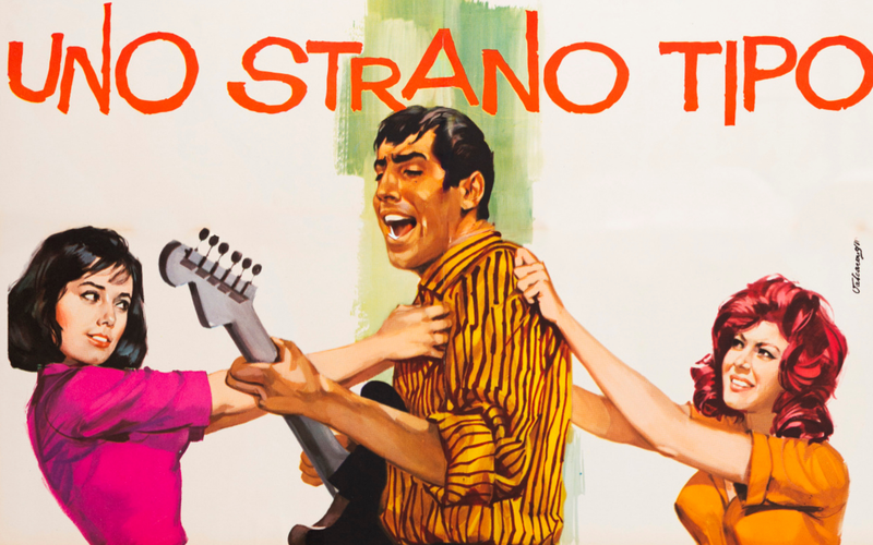
Looking at Valcarenghi's works preserved in the Movie.it archive, photographed from the original vintage prints, the word that keeps returning is elegance. He could handle everything: equestrian spectacle, battle scenes, the kiss. But he is most unmistakably himself in his portraits of women and in his embrace of modern graphic design. In him the classical lesson of the workshop lives alongside an eye fixed on the international currents of the Sixties: the result is posters that today read as period graphic design in the noblest sense, able to stand beside the best magazine covers and advertisements of that unrepeatable decade.
The Works
Attila (Pietro Francisci, 1954)
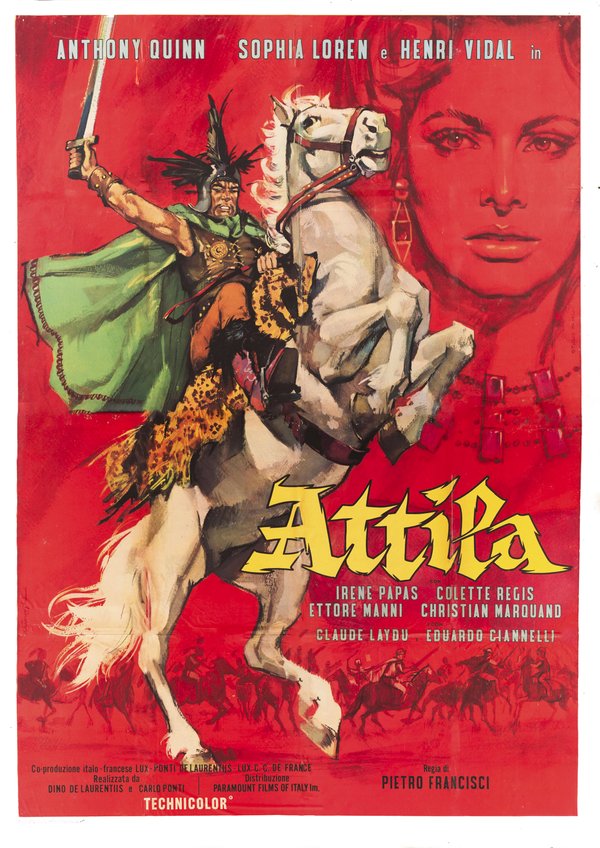
The poster for Attila (1954) sets the sheet ablaze with red: Anthony Quinn, plumed helmet and green cloak in the wind, rears a white horse with a flaming mane while brandishing his sword, the saddle draped in a leopard skin, while from the scarlet ground emerges, gigantic and monochrome, the face of Sophia Loren, her earrings and necklace barely suggested in pencil strokes. Below, a line of silhouetted horsemen charges across the plain. The total red of the ground, which absorbs the diva like an apparition, is an act of chromatic courage that turns the historical epic into an almost abstract image: the Scourge of God reduced to his colours, blood, gold and fury.
Redhead (Helmut Käutner, 1962)
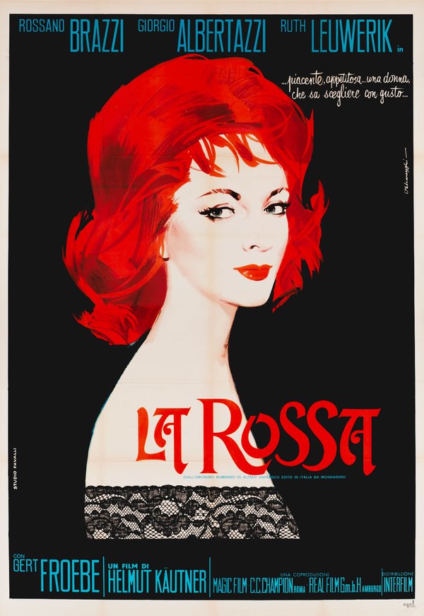
The poster for Redhead is an exercise in high elegance that seems to come from a Parisian fashion magazine: on an absolute black ground, the portrait of a woman with flaming red hair, her pale skin resolved into pure white space, green eyes and scarlet lips, her bust closed by a band of black lace drawn with an engraver's precision. Above runs, brush-written like a note, the promise of "a pleasing, appetising woman who knows how to choose with taste" and the red title with its elongated serifs completes an image built on three colours alone. It is the poster as a portrait of style, femininity told through subtraction: among the most refined works of the decade and proof that Italian poster art could also speak the language of fashion.
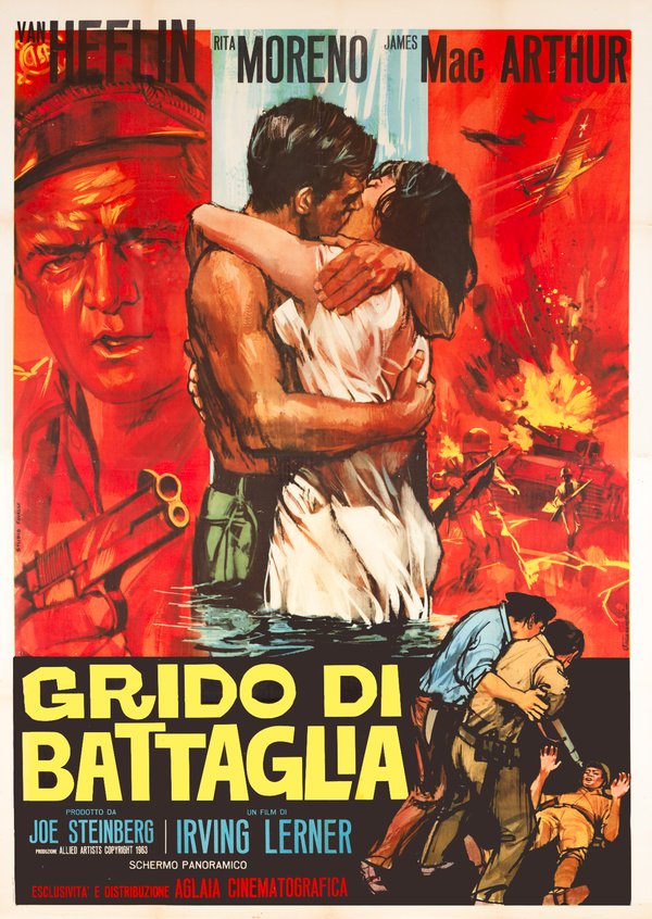
Cry of Battle (Irving Lerner, 1963)
The poster for Cry of Battle organises its war melodrama into three registers of colour: at the centre, in a strip of watery blues and greens, the couple kisses waist-deep beneath a waterfall, she in a wet white slip, he bare-chested; on the left, tinted in monochrome red, the hard face of Van Heflin above hands gripping a shotgun and a pistol; on the right, in the same burning red, the battle, diving planes, a tank in flames, soldiers on the attack and below a man dragging a wounded comrade to safety. The cool water of love set into the fire of war: the chromatic structure is itself the story, handled with the compositional wisdom of a great workshop.
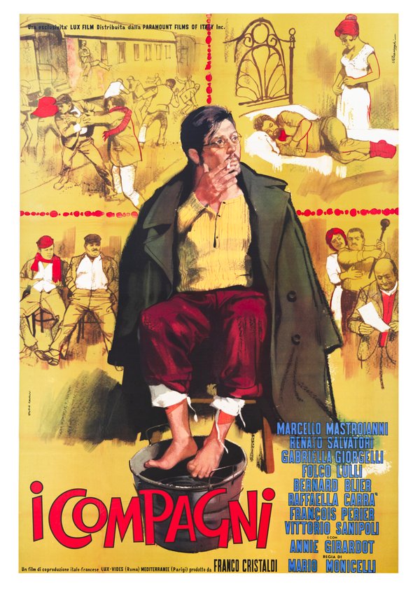
The Organizer (Mario Monicelli, 1963)
The poster for The Organizer stands among the peaks of illustration applied to auteur cinema: at the centre, painted with rich, full-bodied brushwork, Marcello Mastroianni's Professor Sinigaglia sits in shirtsleeves with his green overcoat over his shoulders, spectacles on his nose, a cigarette at his lips and his feet soaking in a tub, the very image of the weary, indomitable agitator. Around him, on a golden ochre ground, the working-class Turin of the film unfolds in lightly drawn vignettes, the brawl at the station, the seated workers, the poor interiors, with touches of red, the scarves, the head-wraps, stitching the whole together like punctuation. The sheet reproduces the structure of an illustrated popular tale and the choice is perfect for Monicelli's film: History in one man, the chorus all around.
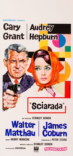
Charade (Stanley Donen, 1963)
The "locandina" (Italian small format) for Charade, created for the film’s 1969 Italian re-release, places Hollywood's most elegant couple inside a pop frame: Cary Grant, eyebrow raised and pistol aimed, beside an Audrey Hepburn with enormous green eyes wrapped in an orange headscarf and behind them an abstract composition of geometric blocks, black, shocking pink, light blue, green, that savours of Swiss graphics and design magazines. The title, in quotation marks inside a round-cornered red box, is treated like a logo. Suspense and sophisticated comedy translated into an utterly modern visual language, where even the thriller dresses in fashion: a small lesson in how closely Italian poster design of the early Sixties followed international design trends.
Valcarenghi Among the Maestri Cartellonisti
Within the landscape of Italian cinema painters, Rodolfo Valcarenghi is the name that best tells the story of Studio Favalli from the inside. The workshop's public catalogue places him beside his colleagues Ermanno Iaia, second in number of works, Alessandro Biffignandi, Arnaldo Putzu and Renato Fratini: a team of talents who set out from that atelier toward careers that were often international, and among whom Valcarenghi represents continuity, the artist who was the studio's most consistent presence. His graphic elegance finds an echo in the more modern work of Sandro Symeoni and he belonged to the same generation as Renato Casaro, who auditioned at Favalli's. If the history of the Italian film poster is a history of workshops, Studio Favalli is its central chapter: and in the central chapter, the leading signature is his.
The works reproduced on this page come from the original prints of the period, recovered, photographed and digitally restored by Movie.it.