Behind this short, modern pen name is Massimo Petrollo, a Rome-born artist and one of the last illustrators to work consistently within Italy’s major film-distribution circuit, at a time when photography had already taken over almost every billboard and cinema façade. His defining period was the 1980s and 1990s: the era of American majors distributed by Italy’s leading companies, video-store thrillers, and the last great Italian comedies. It was a time that still occasionally called for a painter, and Massimo Petrollo, today a living witness to that era, was there, with his artwork ready.
A family of paper and ink
Massimo Petrollo was born in Rome on 21 June 1952 inside a world that printed cinema, literally. His family, five very close brothers, gave life to one of the leading printing houses specialised in producing the advertising materials for film distributors: founded by the eldest brother, Pino Petrollo, active under the name Selegrafica from the Seventies and later becoming Selegrafica 80. Posters, small-format sheets, lobby cards, all the material that accompanied a film into Italian cinemas passed through printing houses like theirs. Massimo thus grew up breathing the trade from the paper side, and when his talent for drawing emerged, the road opened in a way both natural and unique: he began presenting works suited to become the posters of upcoming films, and those designs were well received. The distributors chose them once, then again, and he kept proposing them. It also happened, sporadically but as documented by the sheets themselves, that the right sketch helped the family printing house win the printing order, presenting the distributor with the complete package, image and production, and that the printing house itself remunerated the work. It is likely that Maxy's career as a poster artist began exactly this way: not from the desk of a publicity office, but from the precise point where art met industry.
The works chosen for the Italian releases
Maxy's signature thus appears on the materials of the most diverse releases: the domestic thriller, action science fiction, family comedy, the horror franchise. It is found on the titles of the Cecchi Gori and Penta Film galaxy, the distribution powerhouse of Italy's Nineties, as well as on releases from distributors such as Artisti Associati International. Looking at his works preserved in the Movie.it archive, photographed from the original vintage prints, five images span the entire landscape of commercial cinema across those fifteen years, revealing an artist who changed tools and register with every commission without ever losing his distinctive touch. And on more than one of those sheets, in the margin, beside the film credits, one can also read the name of the printing house: Selegrafica 80. The work and the paper, the painter and the family, on the same sheet.
The style: airbrush and montage
Maxy's pictorial register is that of his era: the airbrush, with its raking lights, its polished surfaces, its beams cutting through the dark. It is the international language of the Eighties poster, and Petrollo commands it with confidence, building thriller atmospheres out of a few high-contrast elements: a silhouette, a blade, a shaft of light on a chequered floor. But alongside this there is Maxy the caricaturist, able to distort faces with affection in the oldest tradition of the trade, and there is Maxy the graphic designer, who treats photography as material to be manipulated, tinting it, montaging it, even shattering it into pixels when the film speaks of artificial creatures. Three registers, a single visual intelligence: that of someone who knows the poster must arrive first, by any means necessary.
The works
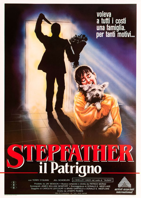
The Stepfather (Joseph Ruben, 1987)
The poster for The Stepfather is a small classic of thriller airbrush art: on the threshold of a wide-open door, against the light, stands the black silhouette of a man holding a bouquet of flowers in one hand and, raised above his head, a knife in the other. In the foreground, unaware, a girl in a yellow sweater smiles as she hugs her little dog. The violet beam of light striking the tiled floor, the long advancing shadow, the contrast between the innocence of the domestic scene and the menace at the door: the film's whole mechanism, horror entering the home with a smile, is already here, told with exemplary economy of means.
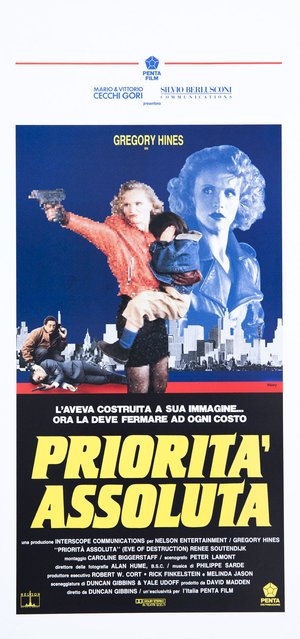
Eve of Destruction (Duncan Gibbins, 1991)
The "locandina" (Italian small format) for Eve of Destruction shows Maxy the graphic designer at work on a science fiction subject: the film's android woman advances gripping a pistol, a child in her arms, and her figure is deliberately shattered into a grain of pixels that betrays her artificial nature, while behind her the same woman reappears intact, tinted blue, like a disquieting double. Below, Gregory Hines, in pure photography, bends over a body with a radio in his fist, before a black-and-white skyline. The montage of overlapping registers, pixels, duotone, photography, turns the very surface of the sheet into the film's theme, the creature built in man's image, with a graphic idea that still looks ahead of its time today.
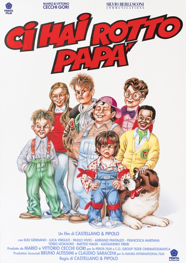
Ci hai rotto papà (Castellano e Pipolo, 1993)
The poster for Ci hai rotto papà lines up a gang of caricatured kids, rebellious tufts of hair, glasses, braces, dungarees, together with a big St Bernard with its tongue hanging out, all painted with a polished airbrush that gives the characters the consistency of living toys. Every child has his own calibrated expression, from the little troublemaker's grimace to the girl's smile, in the best tradition of group caricature. In that gallery of rascals there is also, at his absolute screen debut, a very young Elio Germano, future great actor of Italian cinema: his first public portrait is a caricature painted by Maxy, and it is a detail that by itself justifies the preservation of this work.
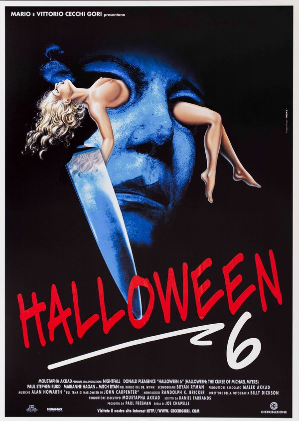
Halloween: The Curse of Michael Myers (Joe Chapelle, 1995)
The poster for Halloween: The Curse of Michael Myers plunges into blackness the blue, spectral face of Michael Myers's mask, surfacing from the dark like a dead moon, and superimposes on it a nude female figure, lying back with long blonde hair loose over the giant blade of a knife that crosses the image diagonally. The red title, traced like writing in blood, closes the composition. It is the language of Nineties horror brought to its heraldic essence, the mask, the blade, the victim, with a treatment of colour that fuses photography and painterly intervention into a single nocturnal surface. On the margin of the sheet, the printed credit "Graphic Design Maxy" certifies the author and at the same time photographs an era in which even the trade had changed its name.
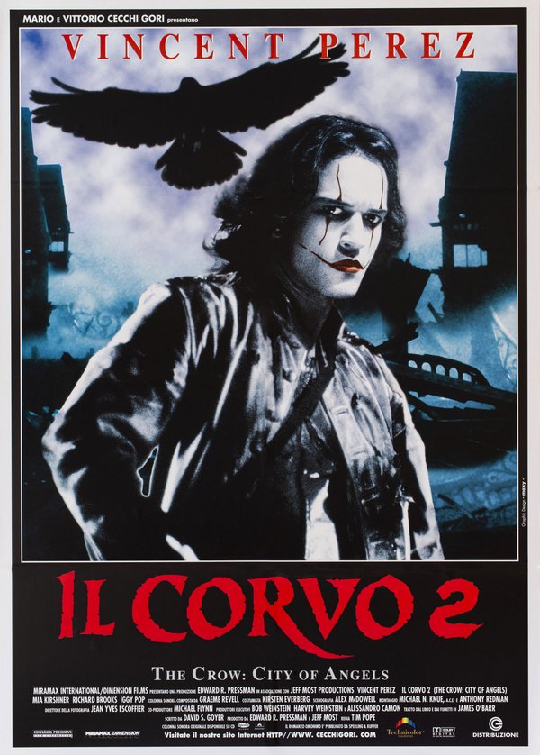
The Crow: City of Angels (Tim Pope, 1996)
The poster for The Crow: City of Angels is an accomplished example of Maxy's graphic direction of the photographic image: Vincent Perez in a black leather jacket, his white-painted face marked by dark scars, looks into the camera with the intensity of a tragic mask, while above him a crow with outspread wings glides like an omen. All around, a gothic city of spires and wreckage drowns in a livid blue haze, worked until it looks more painted than photographed. Below, the red title with its splintered lettering bleeds against the black. The work's strength lies in its unity of atmosphere: photography, backdrop and typography fused into a single night, proof that even in the era of the production still, the difference was still made by the eye of the one who composed.
The trade changing under his hands
There is a detail in these works that is worth an entire chapter of history: the signature. On The Stepfather and Ci hai rotto papà, "Maxy" is traced inside the painting, as painters have always done; on Halloween 6 and Il corvo 2 it appears instead printed in the margin, in small type, with the words "Graphic Design". Within a few years the same artist passed, in the eyes of the industry, from painter to graphic designer: not because he had changed, but because the world around him had. Maxy crossed this mutation by working, adapting, carrying the painter's sensibility into new tools, and this is why his works are precious documents: they tell, better than any essay, how the season of painted cinema ended and what resisted until the very last, that is, the idea, the invention, the hand.
Maxy among the Maestri Cartellonisti
Within the landscape of Italian cinema painters, Maxy holds the last frontier. His airbrush technique belongs to the same international tradition as Renato Casaro’s, the master who had made that technique a banner, and his work for the fantastic and the popular places him on the same timeline as a Bruno Napoli, who in those same years watched the trade he had learned thirty years earlier fade away. His story, however, remains unique for its starting point: no one else came to the film poster from the family printing house, from that back room of the industry where the dreams of cinema became paper, glue and ink. Maxy arrives at the end of the long chain of cinema painters and does not let it fall: with his last works, he delivers it directly to memory and to the archives.
The works reproduced on this page come from the original prints of the period, recovered, photographed and digitally restored by Movie.it.