Mario Piovano, the Painter of the Paradiso Workshop
By the Movie.it Editorial Team
July 20, 2026
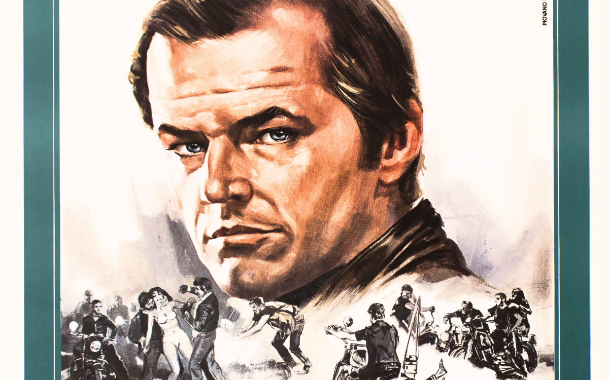
On every sheet that carries his hand, beside the artist's name stands the name of a workshop: "Piovano | Studio Paradiso". It is a double signature, rare in the Italian film poster and it tells by itself a whole way of understanding the trade: not the solitary painter in his studio, but the artist inside a working organism, one of those Roman ateliers where painted cinema was produced as in an art factory, with the tight deadlines of theatrical releases and the quality of people who knew how to do everything. For decades Mario Piovano was the painterly face of this reality, covering one of the longest and most varied arcs of the Italian film poster, from Totò's comedies to Japanese robots.
From Terni to Rome
Mario Piovano was born in Terni on 9 August 1934. Like so many talents from the provinces, he found in Rome, the capital of cinema, the place where drawing could become a profession and he entered the orbit of Studio Paradiso, one of the historic workshops of Roman poster art. As early as the beginning of the Sixties his executive paintings accompanied the releases of Totò's films and from there his activity stretched over more than twenty years across the entire catalogue of popular cinema: the sword-and-sandal epic, the Italian western, the American cinema of the New Hollywood, up to the Japanese cartoons that conquered Italy at the end of the Seventies. Piovano died in 2015 and today his paintings pass through the auction houses alongside those of his most celebrated colleagues, with that double signature that has become a mark recognised by collectors.
The Workshop and the Painter
Studio Paradiso deserves a chapter of its own, because Piovano's story cannot be understood without it. The workshops of Roman poster art were organisms halfway between an art atelier and an advertising agency: they received the films' materials, coordinated sketches and deliveries and guaranteed distributors the continuity that a single artist could not always ensure. Within these structures the painters kept their own hand and their own creative autonomy, and Piovano's case is special precisely because his name travelled printed beside that of the workshop: a recognition of artistic authorship inside a collective enterprise. It is a precious document of how the industry of the cinema image really worked, made of individual talents and of structures that carried them onto the walls of all Italy.
The Works Chosen for the Italian Releases
Piovano's repertoire is among the broadest of his generation. There are the great genres of popular cinema in its maturity: the burning Rome of the peplum, the gunfighter on the crag of the western, the motorcycle rebel of the new America. And then there is the chapter that makes him unique: when at the end of the Seventies Italian cinemas filled with children for the feature films drawn from Japanese animated series, it was his hand that translated those television heroes into the language of the poster. Heidi drawing at the blackboard, Jeeg looming gigantic behind Hiroshi's motorcycle: images that an entire generation looked up at, holding their parents' hands outside the cinema. Piovano is, in the fullest sense, one of the painters of Italian childhood.
The Style: Clarity in the Service of the Story
Piovano's hallmark is legibility. His painting does not seek the virtuosity that draws attention to itself, but the communication that lands: central, firmly planted figures, dramatic skies laid down in broad brushstrokes, colours that declare the genre at once, gold and fire for ancient Rome, stormy turquoises for the western, vivid pinks for animation. With the Japanese subjects this quality became decisive: Piovano respected the original design of the characters, which children knew by heart from television and carried it onto the giant format with a cleanness of contour and a saturation of colour that turned the television model into a monument. It is a work of translation even before painting and few could do it with the same naturalness.
The Works
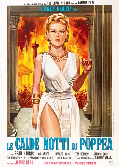
Poppea's Hot Nights (Guido Malatesta, 1969)
The poster for Poppea's Hot Nights frames its heroine between two Corinthian columns, in a white tunic with a deep slit, a gold necklace and blonde hair braided in imperial style, while behind her Rome burns in a yellow and red blaze that swallows temples and rioting crowds. The water at her feet reflects the columns, the fire lights up her profile. The construction is frontal and theatrical, the woman motionless at the centre of the disaster and all the colour works on the contrast between the whiteness of the gown and the inferno behind: the erotic peplum of the decade's end summed up in a single figure.
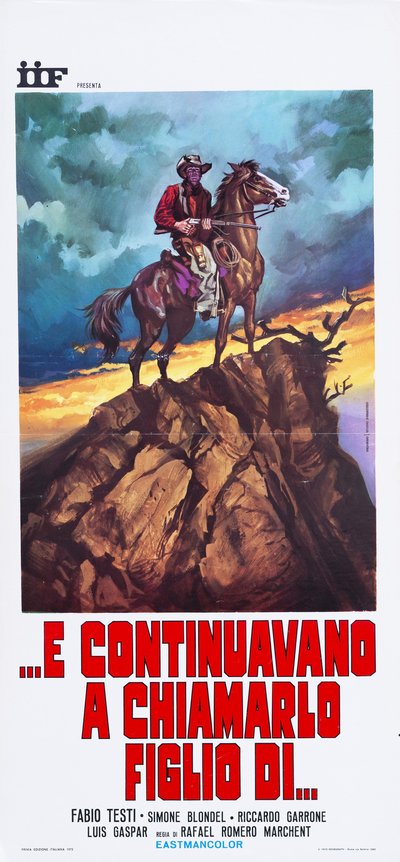
The Avenger, Zorro (Rafael Romero Marchent, 1969)
The "locandina" (Italian small format) for The Avenger, Zorro hoists the gunfighter on horseback to the top of a steep crag, against a sky of green and blue clouds torn at the horizon by a strip of golden sunset. The red shirt, the Winchester held across the body, the dry branch clawing at the void: every element is arranged to give the silhouette monumentality, with the rock occupying half the sheet like a natural pedestal. It is the Italian western in its heraldic formula, the man, the horse and the crag, painted with a freedom of brushstroke that in the sky becomes almost abstract.
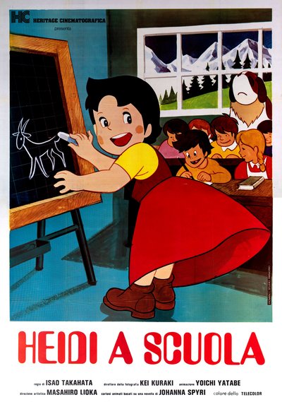
Heidi in the Mountains (Isao Takahata, production Beta Film 1974)
The poster for Heidi in the Mountains brings to the large format the round, happy line of Japanese animation: the little girl, in a red dress and yellow shirt, turns smiling toward the viewer as she draws a small goat on the blackboard, while behind her the classmates follow the scene from their desks, with the dog peeking in and the snowy Alps beyond the window. The respect for the original model is absolute, clean contours, full colours, but the composition is a poster artist's: the diagonal of the blackboard, the red dress exploding at the centre, the landscape opening the background. It is the image of an era in which children's cinema spoke Japanese with an Italian accent.
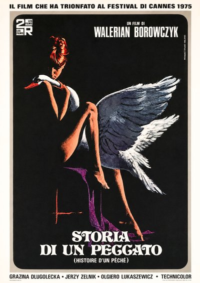
The Story of Sin (Walerian Borowczyk, 1975)
he poster for The Story of a Sin shows Piovano at his most elegant and unexpected: against a completely black background, a young red-haired woman with her hair pinned up sits in profile, her bare legs drawn up, holding a large swan close to her as it rests its neck on her shoulder, while its outstretched grey-and-white wings spread across half the poster like a cloak of feathers. A violet shadow beneath the seat, the title set in elegant Art Nouveau lettering with the French version in parentheses, and, at the top, a banner announcing its triumph at the 1975 Cannes Film Festival.The imagery draws on the ancient myth of Leda and the Swan, reinterpreted with the restraint of an art poster: no scene, no star’s face, only an emblem. Proof that Piovano could create a poster worthy of a film archive with the very same hand he used to paint Japanese robots.
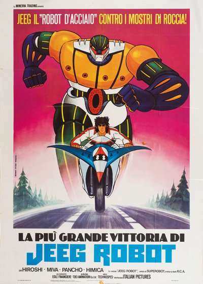
La più grande vittoria di Jeeg Robot (Italian edition, 1979)
The poster for La più grande vittoria di Jeeg Robot launches Hiroshi's motorcycle toward the viewer, front wheel in the foreground and a determined gaze under the fringe, while behind him the steel giant advances with clenched fists, orange and blue against a blazing magenta sky. The road in rushing perspective and the fir trees at the sides give depth to the ride and the yellow headline above, "Jeeg the steel robot against the rock monsters!", completes the poster with a fairground barker's voice. Fidelity to the original Japanese design lives alongside a colour direction that is all the poster artist's own and the result is one of the images most beloved by Italian children of the late Seventies and among the most sought after by collectors today.
Piovano among the Maestri Cartellonisti
Within the landscape of Italian cinema painters, Mario Piovano represents the solidity of the workshop: constant quality, versatility without lapses, a hand that serves the story before itself. His path intertwines with that of Franco Picchioni through their shared association with Studio Paradiso and his chapter on animation places him in an ideal dialogue with Bruno Napoli, the other great painter of Italian childhood, engaged in those same years on the Disney front while Piovano held the Japanese one. Two imaginary worlds for children, two painters: and between them, a generation that learned to dream by looking at walls even before screens.
The works reproduced on this page come from the original prints of the period, recovered, photographed and digitally restored by Movie.it.