Adelchi Serafini, the Painter of a Thousand Registers
By the Movie.it Editorial Team
July 17, 2026
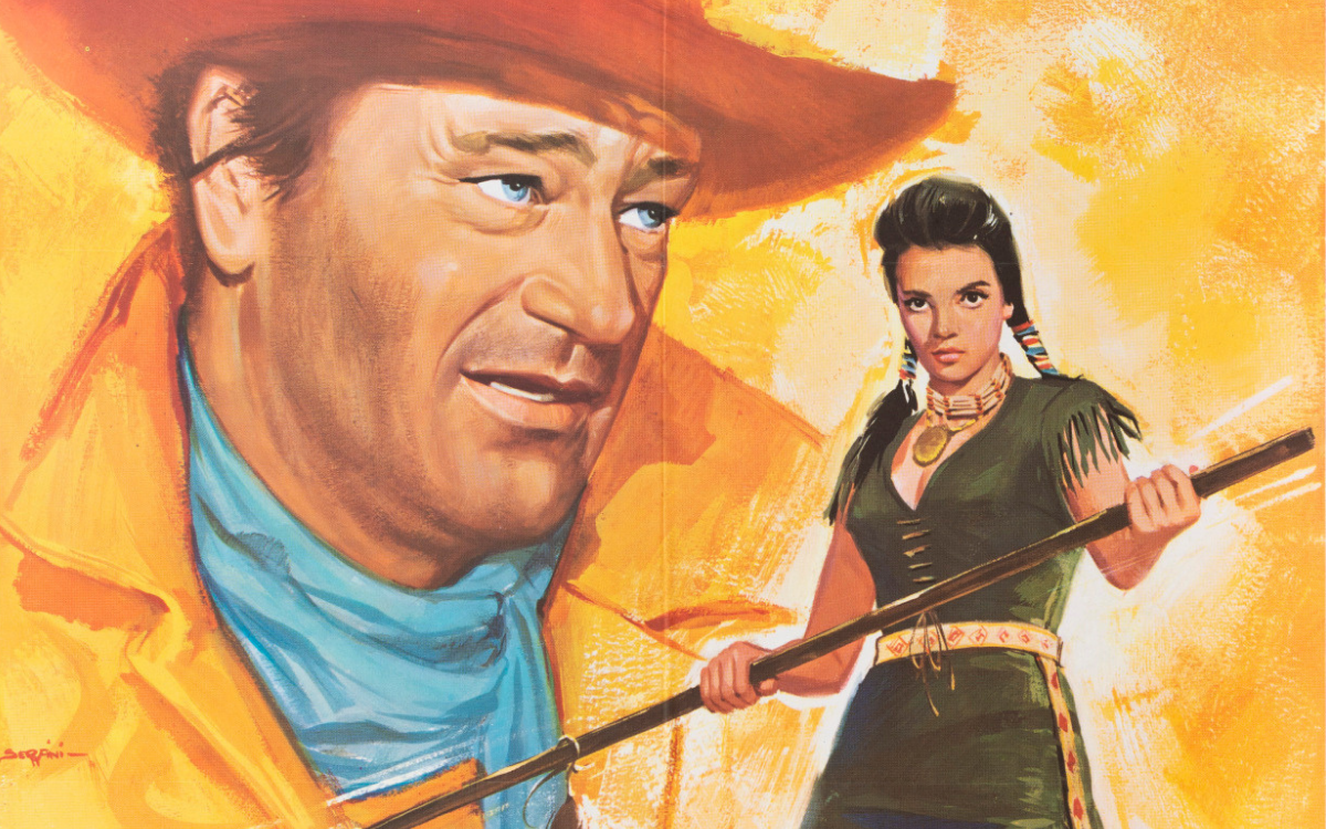
There is a simple way to measure the greatness of a film poster artist: line up his works and count how many languages he could speak. With Adelchi Serafini the exercise yields a result that surprises even trained eyes: one poster that looks like a beach watercolour, another that is a psychological thriller in two faces, a small-format sheet that seems to come from a gallery of abstract art, an epic poem in tempera, a jazz-club nocturne painted almost with light alone. Five works, five worlds, one signature. And behind that signature, an exceptional training: Serafini was a pupil of Renato Guttuso and from the great master of Italian realism he brought to the film poster a sensitivity for the expressiveness of faces, for living colour, for the truthful stroke, which explains the painterly quality of his entire career.
From Frascati to Rome, the Lesson of Guttuso
Adelchi Serafini was born in Frascati, in the Castelli Romani, on 19 May 1935, and moved early to Rome to cultivate his passion for painting. The turning point of his formation was his apprenticeship with Renato Guttuso: from the celebrated artist he learned that particular intensity in the expression of faces, the vivid colours, the realism of line that would become the foundation of his trade. It is a rare and precious lineage: few poster artists can claim an author's schooling of this level and in Serafini's works it can be recognised, in the psychological truth of the portraits as in the courage of the colour. From this base the step toward cinema was a natural one: Rome was the capital of film and the young painter began collaborating with major Italian and foreign film companies. A structure of his own was also born, that "Studio Serafini" which appears as a signature on some of his works beside the plainer "Serafini", following the double identity typical of the mature protagonists of the field: the artist and the workshop. Serafini died in Rome on 22 April 2005.
The works chosen for the Italian releases
The range of companies that chose his works tells of a front-rank career: Warner Bros. for the thriller starring the best-loved of divas, Titanus for the mythological epic, United Artists for American auteur cinema, Italian productions for musical comedy. Among the famous titles that passed through his brush are Wait Until Dark, The Searchers and Apache, and a chapter of its own belongs to animation: Serafini painted carefully crafted versions for the Italian releases of the Disney classics, among them The Three Caballeros, Bambi and Song of the South, entering that enchanted territory which demanded of painters absolute respect for the original design together with a poster artist's eye. His works were chosen, according to the golden rule of the trade: the painter took the general indications into account, but before the sheet he answered to his own talent and the results spoke for him.
The Style: One Painter, Many Hands
To define Serafini's style is to describe a fan. There is the brilliant illustrator Serafini, quick and watercolour-like, perfect for beach comedy; there is the dramatic portraitist, able to fill an entire sheet with two faces and a threat; there is the modernist, who breaks the scene into geometric fields of pure colour like an abstract stained-glass window; there is the epic painter, with dense tempera and blazing skies; and there is, finally, the poet of light, who can build a whole poster around the beam of a spotlight. What holds these different hands together is Guttuso's lesson: the expressive truth of faces, colour unafraid of itself. In every register, Serafini knows exactly where the eye must go and takes it there without our noticing. It is the quality of the total professionals, those who do not impose their style on the film but find for each film the right style.
The Works
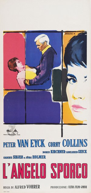
Dirty Angel (Alfred Vohrer, 1958)
The "locandina" (Italian small format) for Dirty Angel is a small graphic revolution: the surface is divided by an irregular black grid into fields of pure colour, pink, blue, violet, ochre, like a modern stained-glass window and inside this abstract architecture live the figures, a white-haired man seizing a girl within a blue panel and on the right, gigantic, a female face built in flat planes of colour, black fringe, intensely blue eyes. It is a language that looks to the most advanced international graphics of those years and carries it onto Italian walls, proving that the film poster could also be a laboratory of modernity: a work one would gladly see framed today beside the finest European design posters.
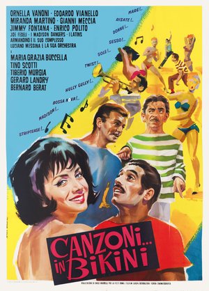
Canzoni in... bikini (Giuseppe Vari, 1963)
The poster for Canzoni in... bikini is the Italian summer of the boom years on a single sheet: on a ground divided diagonally between sky blue and sun yellow, a youth painted in quick strokes dances the twist among musical notes and the names of dances raining down like confetti, Madison, Hully Gully, Bossa Nova, while in the foreground a girl with a black bob smiles with shining eyes and two suitors turn toward her. The line is deliberately swift, like a sketch from life, and precisely this freshness is the invention: the poster does not describe the film, it plays its rhythm. A delightful document of the season of the musicarelli and of the Italy that danced on the beach.
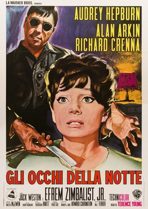
Wait Until Dark (Terence Young, 1967)
The poster for Wait Until Dark is a thriller on two planes: in the foreground the stricken face of Audrey Hepburn, her wide eyes unseeing, her hand stretched out to feel the dark; behind her, against a violet ground cut by the pink light of a lamp, the tormentor in dark glasses grips a blade. The visual screenplay is perfect: we see what she cannot see and the poster makes us accomplices and helpless at once, exactly like the film. The painting is nervous, in brushstrokes that leave the surface vibrating and the acid colour, violet, orange, magenta, turns the domestic interior into a pop nightmare.
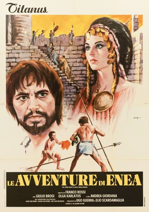
Le avventure di Enea (Franco Rossi, 1974)
The poster for Le avventure di Enea brings epic tempera to the large format: the proud, melancholy face of the hero, dark beard and pale eyes, commands the left half, while behind him rises a princess with a headdress adorned with gold coins and, on the walls of a besieged city, defenders raise their spears against an orange sky. Below, the duel: two half-naked warriors face each other with spears. The composition in overlapping planes, the faces, the walls, the combat, is the classic structure of storytelling in images, and the dense, warm pictorial matter restores the flavour of Virgil's poem brought to the screen in the film version of Franco Rossi's television epic.
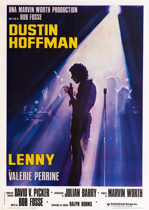
Lenny (Bob Fosse, 1974)
The poster for Lenny is a nocturne painted almost with light alone: from the upper corner of a deep blue ground descends the white cone of a spotlight and inside that dazzling triangle stands, against the light, the silhouette of Dustin Hoffman, microphone in hand, head bowed, cigarette between his fingers. Around him, barely suggested in violet, the club tables, the glasses, the outlines of the audience, the microphone stand. No face, no scene: just a man alone in the light, which is the entire arc of Lenny Bruce resolved in a single image. Among the most refined works of the Italian poster of the Seventies and the definitive proof of this painter's range.
Studio Serad, the Second Life
When the season of the painted film poster drew to a close, Serafini did what true talents always do: he changed stage without changing trade. In the Eighties he opened Studio Serad, a creative structure with which he launched, together with his collaborators, among them the graphic designer and comics artist Mauro D'Amico, numerous advertising campaigns for famous brands such as Renault, Canguro and Buffetti. And cinema, which had been his first life, returned through the door of music: from the studio came numerous record covers, including that of the soundtrack composed by Ennio Morricone for Ettore Scola's La famiglia. There is a fine circularity in this epilogue: the pupil of Guttuso who had painted the stars on the walls closed the circle by placing his art at the service of the music of our cinema's greatest composer.
Serafini Among the Maestri Cartellonisti
Within the landscape of Italian cinema painters, Adelchi Serafini represents versatility as an art form. His forays into pure graphics bring him close to the experimentalism of a Sandro Symeoni, his Disney chapter places him in dialogue with Bruno Napoli, the other great Italian interpreter of the animation classics, and belonging to the generation born in 1935 makes him the exact contemporary of a Renato Casaro, with whom he shares the season and the level of the international campaigns. But his most enduring lesson lies in his method, which is in the end the one learned from Guttuso: before every film, Serafini began again from scratch, seeking not his own recognisability but the visual truth of that story. It is perhaps why his name is less known to the wider public than others and it is exactly why he deserves rediscovery: his posters do not resemble one another, they resemble the films. Which is the highest compliment one can pay a painter of cinema.
The works reproduced on this page come from the original prints of the period, recovered, photographed and digitally restored by Movie.it.