
Bob De Seta, the Painter Who Crossed Two Eras of the Film Poster
By the Movie.it Editorial Team
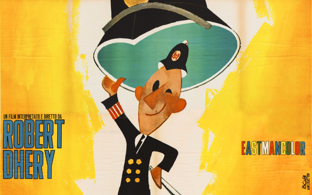
July 13, 2026
In the history of Italian painted cinema there are artists who lived through a single season and artists who crossed two. Roberto De Seta, who signs his works with the unmistakable "Bob De Seta", belongs to the second kind. Born in Rome on 25 January 1937, an artist's son in the most literal sense of the phrase, he travelled the road that leads from the great comedy of the boom years, with its lively pin-ups and the ringing colours of the early Sixties, to the graphic turn at the end of the decade, when the Italian film poster began to incorporate photography and change its skin. Few poster artists made this passage with the same ease, and very few can claim, along the way, an auteur encounter like the one with the cinema of Pier Paolo Pasolini.
A Signature that is a Manifesto in Itself
That pen name, Bob, American and familiar, lettered in capitals beside the surname, is already a statement of style. It speaks of modernity, of pace, of a quick and international idea of the trade, perfectly in tune with the Italy of the economic miracle that filled the cinemas to laugh, to dream of adventure and to gaze at the stars. And it also speaks, perhaps, of the need to stand apart from a surname that already carried enormous weight in the trade: that of his father, Enrico De Seta, one of the giants of the Italian film poster. Roberto grew up inside that world, breathing from boyhood the smell of tempera and the rhythm of deadlines, and when his moment came he chose a road of his own, with a signature of his own. Like all the masters of Italian film poster art, he works independently in his own studio, receiving the photographic materials of upcoming films and returning images designed to stop the passer-by on the pavement. He became the illustrator chosen for the releases of leading production and distribution companies, beginning with Euro International Films, for which his signature appears frequently on posters for comedy, adventure and costume films throughout the golden decade.
The Illustrator Chosen for the Italian Releases
His repertoire is a faithful portrait of the release schedules of those years: the ensemble comedies with Walter Chiari, Sandra Mondaini and Raimondo Vianello, the costume films with heroines in arms, the imperial Totò of the historical parodies, up to the flagship comedies with Ugo Tognazzi. To each of these territories De Seta brings one constant quality: the ability to turn the film into a single invented scene, one that does not reproduce a frame but condenses the promise of the show. The woman with the harpoon resting her foot on a suitor, the pirate queen commanding the rigging, the puzzled commander on his golden chariot: they are little comedies in a single image, built so that anyone, in one second, gets the joke and smiles.
The Style: The Elegance of the Quick Line
Looking at De Seta's works preserved in the Movie.it archive, photographed from the original vintage prints, what strikes one first is the confidence of the line. His painting is quick, synthetic, advertising-like in the highest sense of the word: a few solid colours, open grounds that let the paper breathe, figures cut out with a clean contour that makes them leap off the wall. In his female portraits there is the lesson of the American pin-up, long legs and theatrical poses, tempered by a thoroughly Italian irony: his women are never merely beautiful, they are protagonists in command of the scene. And when, at the end of the Sixties, the trade changed and photography entered the poster, De Seta did not suffer the transition: he rode it, signing mixed media compositions in which treated colour and the montage of images converse with a painter's sensibility without losing visual force.
The Works
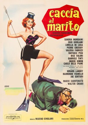
Caccia al marito (Marino Girolami, 1960)
The poster for Caccia al marito stages a breathtaking redhead in a black and purple bustier, diving fins on her feet and a mask worn like a little hat, gripping a harpoon with the ease of a seasoned huntress while resting her foot on the back of a mature suitor in a green suit, on all fours and resigned to capture. The metaphor of the title, a husband hunt, becomes a complete visual gag, played on the contrast between her slender, triumphant figure and his hunched, bespectacled bulk. The barely sketched ground, with a watercolour beach horizon, leaves the whole scene to the two characters, with a swift line and a cartoonist's humour carried to giant format.
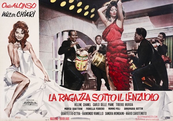
Girl Under the Sheet (Marino Girolami, 1961)
The "fotobusta" (Italian lobby card) for Girl Under the Sheet sets two registers side by side with great intelligence: on the left, the painted figure of Chelo Alonso wrapped in a white sheet, shoulders and legs bare, with the knowing smile of a woman aware of her effect; on the right, the photographic scene in which the same actress, in a red fringed dress, dances wildly among drummers in tails. The painted sheet stretches beneath the photograph and carries the title traced in red like handwriting, stitching painting and photography into a single narrative surface. The fotobusta, born as a fully painted piece in the 35x50 format later replaced by the 50x70, had by those years become a production still more or less retouched by the painter: here De Seta goes beyond retouching, because the painted figure does not correct the photograph but stands beside it as an autonomous creation and the sheet joining the two halves is a compositional invention in its own right.
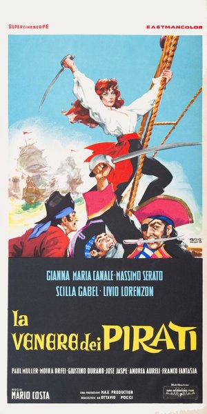
The Queen of the Pirates (Mario Costa, 1960)
The "locandina" (Italian small format) for The Queen of the Pirates hoists Gianna Maria Canale to the top of the image, clinging to the rigging with her white shirt swollen by the wind, a red sash at her waist and her sabre raised, her red hair streaming like a battle flag. Below her, three pirates caught in three different expressions, the shout, the fright, the grin with a blade between the teeth and a patch over one eye, while in the background galleons exchange cannon fire among clouds of smoke. The inverted pyramid composition, with the heroine at the apex and the crew at the base, overturns the hierarchies of the genre: here it is the woman who leads the boarding and all the colour, the ringing blue of the sky against the reds and blacks of the costumes, works to crown her.
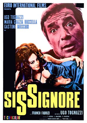
Dismissed on His Wedding Night (Ugo Tognazzi, 1968)
The poster for Dismissed on His Wedding Night belongs to the mixed media season, in which De Seta combines photography, chromatic intervention and authorial graphic construction. The face of Ugo Tognazzi, tinted in a vivid magenta that is already a painterly choice, occupies the upper corner with an expression somewhere between astonishment and guilt, while below Maria Grazia Buccella reclines in a blue silk robe, her gaze aimed straight at the viewer. The yellow title crosses the black field with a giant double S binding the two words together, turning typography itself into a comic device. It is the work of a changing era, in which the treatment of colour and the cropping of images take the brush's place without giving up the poster artist's visual direction.
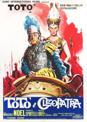
Toto and Cleopatra (Fernando Cerchio, 1963)
The poster for Totò and Cleopatra places the prince of laughter on a golden chariot, in an embossed cuirass with a blue plume on his helmet, wearing the puzzled expression of a commander who would rather have stayed home. Behind him rises the queen of Egypt, tall crown, gold collar and imperious gaze, while the background explodes in red brushstrokes from which lances and backlit horsemen emerge. The contrast between the solemnity of the apparatus, armour, gold, army silhouettes and Totò's face is the whole film at a glance, and the freedom of the ground, almost abstract in its red sweep, shows a painter capable of modernity even inside costume parody.
De Seta and Pasolini
The chapter that more than any other defines Bob De Seta's career is his encounter with the cinema of Pier Paolo Pasolini. For Oedipus Rex (1967) he created the two-sheet poster and the locandina, resolved with an allusive essentiality far removed from the commercial poster: Laius's servant carrying the infant Oedipus and the palace of Thebes as images of destiny. The following year he signed the graphic composition of the posters and locandina for Teorema (1968), dominated by the face of Terence Stamp with the image of Silvana Mangano in the space below. These works are still studied today: in 2022, for the Pasolini centenary, they were exhibited in Treviso in the show "Pier Paolo Pasolini. Manifesti per il suo cinema", curated by the Museo Nazionale Collezione Salce with materials from the Cineteca del Friuli. That a painter who had come from beach comedies could find the right register for the most radical auteur cinema says everything about this artist's versatility.
Bob De Seta among the Maestri Cartellonisti
Within the world of film set painters, De Seta belongs to the minimalist camp: his approach is not one of dense, textural painting, but of clean lines and flat colour reminiscent of graphic design, a realm that brings him closer to an artist like Sandro Symeoni than to pure portraitists. His involvement in advertising for Pasolini’s films places him alongside colleagues such as Carlantonio Longi and Angelo Cesselon, who were called upon during those years to work on the same auteur-driven projects. But the deepest connection remains a family one: Roberto is the son of Enrico De Seta, and his career represents the second generation of one of the few true dynasties in Italian poster art. His father had built his own legend during the golden age of the cinema poster; his son has taken that legacy and brought it into the modern era, right to the boundary where painting meets graphic design. Two names, two eras, one family: it is also through stories like this that Italian painted cinema reveals itself for what it was, a craft passed down in the same way as the arts and crafts are handed down.
The works reproduced on this page come from the original prints of the period, recovered, photographed and digitally restored by Movie.it.