
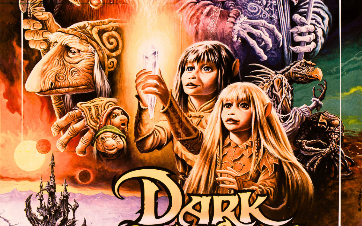
There is one poster artist who, more than any other, accompanied the childhood of generations of Italians, even though almost no one knows his name. Anyone who stopped in front of a cinema in the Seventies or Eighties to gaze at Snow White, Cinderella or Popeye, anyone who dreamed before a rearing Pegasus in a stormy sky or smiled at two yuppies clinging to the same gilded chair, has met the painting of Bruno Napoli. His signature, a quick, slanted "B. Napoli" at the edge of the image, runs across thirty years of fantasy on Italian walls: animated cinema, mythological adventure, the great American comedy. Napoli was the painter of wonder, the man to whom Italy entrusted the films that were meant to make eyes open wide.
From Tunis to Rome, a Family Vocation
Bruno Napoli was born in Tunis on 10 February 1940 to Sicilian parents and arrived in Rome at the age of ten. His talent for drawing showed early and found its first teacher at home: it was his older brother Vito Napoli, an illustrator and graphic designer of considerable stature, who encouraged him toward cinema poster art. Like the Nistri brothers, another celebrated family pairing of the Italian film poster, the Napolis prove that this trade was often handed down at home, through an apprenticeship of workshop practice and daily example. Bruno began creating for the cinema at a very young age, and his works were often chosen for film promotion, in particular by Rank's publicity office, which admired his sketches and the resulting posters and "locandina" (Italian small format), earning him his first recognition. It was the beginning of a career that would last until the threshold of the new millennium.
The Illustrator Chosen for the Disney Releases
The turning point came with animation. In 1962, at just twenty-two, Napoli signed the four-sheet poster for the Italian re-release of Snow White and the Seven Dwarfs, a work in which Disney scholarship already recognises a perfect understanding of the American studio's spirit. The head of Disney's Italian publicity office, Dottarelli, became a convinced admirer and in the early Seventies, when Disney distribution passed to CIC, the future United International Pictures, Napoli became the illustrator chosen for the Italian releases of the studio's films: for years he would be the only Disney poster artist in the country. Snow White in the re-releases of 1972, 1980 and 1987, Cinderella, Sleeping Beauty, Fantasia, Bambi, The Fox and the Hound, The Rescuers: an entire catalogue of classics passed through his brush and these were no mere adaptations. Napoli often completely redrew the American artwork, with results that critics have judged in many cases superior to the originals, to the point that some of his posters were adopted for foreign editions as well. The same sensibility led him to collaborate for years with Clementoni, for which he painted the artwork for their Disney-themed jigsaw puzzles. Through CIC came the great international titles too: Clash of the Titans, Trading Places, Day of the Cobra.
The Style: Colour that Tells the Story
Napoli's painting has a quality you recognise at first glance: the fullness of its colour. His backgrounds are never neutral; they are skies on fire, blue nights, golden caves and within these settings the figures move with the clarity of an illustrated storybook. From animation Napoli takes the cleanness of contour and the absolute legibility of every character; from adventure illustration, the ability to build crowded scenes without confusion, where every detail, a treasure chest, a sword, a briefcase, works for the story. It is a descriptive, pop, generous style that does not fear abundance: its task is to promise wonder and it keeps the promise. Yet he could also change register completely when a film demanded it, reaching refinements of déco taste that show how much more versatile his hand was than the label of family painter might suggest.
The Works
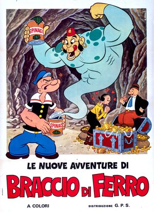
Le nuove avventure di Braccio di Ferro (animation anthology, Italian edition 1974)
The poster for Le nuove avventure di Braccio di Ferro throws open a treasure cave and fills it with all the characters children loved: Popeye opens his can of spinach and releases an enormous polka-dotted blue genie in a red fez, who in turn triumphantly brandishes another can; on the right Olive Oyl, surrounded by little hearts, admires the scene beside Wimpy who, seated on a chest overflowing with coins and pearls, thinks only of biting into his hamburger. Every figure is drawn with the cleanness of an animation frame, the colours are full and festive and the composition holds three simultaneous gags together without ever losing the eye: a small handbook of how to tell fun on a wall.
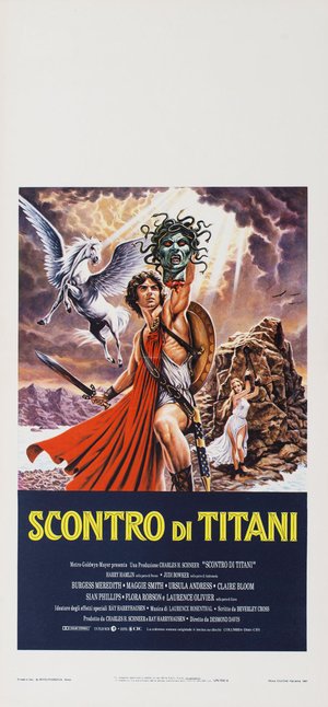
Clash of the Titans (Desmond Davis, 1981)
The locandina for Clash of the Titans raises Perseus at the centre of the storm: his sculpted body wrapped in a red cloak, a sword in one hand and, lifted toward the sky in the other, the severed head of Medusa with its snakes still writhing, while rays of divine light tear through the leaden clouds. On the left Pegasus rears with wings spread, on the right Andromeda in chains waits on a rock beaten by the sea. It is the repertoire of myth treated with a care close to fantasy illustration, raking light, dramatic anatomy, a physical substance of cloud and foam and with a cross-shaped construction that puts every element of the legend in its place, like an altarpiece of adventure.
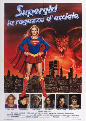
Supergirl (Jeannot Szwarc, 1984)
The poster for Supergirl plants the heroine with legs apart and hands on hips above the night skyline of an American metropolis, the lit towers beneath her red boots, while behind her a burning sky condenses into the silhouette of a winged demon looming over the city. Contrast is the engine of the image: the bright, smiling figure in the foreground, the reddish, almost abstract menace behind, the photographic city below anchoring fantasy to reality. The strip of photographic cast portraits along the lower margin tells the story of the international poster of the Eighties, where painting now lived alongside photography, but the heart of the work remains the great painted figure.
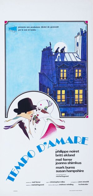
A Time for Loving (Christopher Miles, 1971)
The locandina for A Time for Loving is the proof of Napoli's versatility: no adventure, no ringing colour, but a graphic elegance of déco flavour. Above, inside a round-cornered frame, a midnight-blue Parisian building with lit windows and two lovers seated on the roof against a full moon; below, outside the frame, a stylised Twenties couple, he with a black hat pulled over his eyes, she in a white cloche decorated with a peacock, their profiles almost touching. The title runs diagonally in light-blue déco lettering that completes the game. It is a poster that renounces the scene to seek an atmosphere and finds it with a restraint few would expect from the painter of genies and dragons.
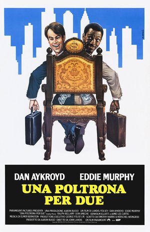
Trading Places (John Landis, 1983)
The poster for Trading Places builds the comedy around a single object: a monumental, gilded chair crowned by a dollar sign, contested by Dan Aykroyd and Eddie Murphy leaning out from behind it, briefcases in hand and banknotes sprouting from their pockets, while the legs of both men tangle beneath the seat in an impossible balance. In the background, the skyline stylised in flat blue shapes keeps the scene in New York without stealing space from the protagonists. The two actors' faces are portrayed with a smiling precision that approaches caricature without ever slipping into it and the whole image translates the film's mechanism, the exchange of roles and fortunes, at a single glance. For the Italian public, which has made the film a Christmas ritual, this image is by now part of collective memory.
The Last Season of the Brush
Napoli's career spans the entire final arc of the painted film poster. In the Nineties poster art was progressively reduced to the enlargement of production stills, then computer graphics took over and Disney itself ended up adopting the identical American materials worldwide. The craft Bruno had learned from his brother and carried to its heights faded before his eyes. Napoli passed away in 2003, closing an artistic story that had begun forty years earlier in front of a four-sheet of Snow White. Today his originals are sought by collectors and studied by scholars of the Disney imagination, confirmation that his painted wonder was not passing advertising but a true chapter of Italian visual culture.
Napoli among the Maestri Cartellonisti
Within the landscape of Italian cinema painters, Bruno Napoli holds a territory of his own: family fantasy, which he commanded with an authority never seriously challenged. His international season runs parallel to that of Renato Casaro, the other great Italian name of the Eighties on the majors' front, and his roots in Rank distribution link him to a path, that of the Italian poster artists who grew up with the British and American companies, which counts Arnaldo Putzu among its other protagonists. But the key to his story remains familial and artisanal: a boy who arrived from North Africa, an older brother who put the brush in his hand and a whole life spent painting wonder for the most demanding audience there is, children.
The works reproduced on this page come from the original prints of the period, recovered, photographed and digitally restored by Movie.it.