
Rodolfo Gasparri, a Painter of Originality and Simplicity
By the Movie.it Editorial Team
July 7, 2026
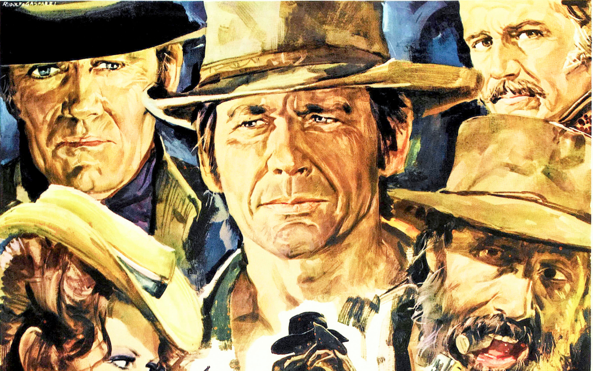
Rodolfo Gasparri, born in Castelfidardo in 1928 and died in Rome in 1981, was one of the most incisive and original painters of Italian cinema. Having moved to the capital very young to fulfil his dream of painting for the big screen, in just a few years he won himself a leading place among the poster painters. His strength is synthesis: he can isolate a face, a gaze, a gesture and charge it with all the tension of the film. Even when he starts from the sketch and from watercolour, his painting aims at bold contrast, dramatic light and essential construction, always recognisable for its balance between graphic invention and painterly vigour.
From the Apprenticeship of Crime Novels to the Big Screen
Before reaching the cinema, Gasparri served a long apprenticeship as an illustrator for popular publishing, drawing covers for crime and thriller novels for several Roman publishing houses. Among these, the cover for Il Vampiro of 1958 remains well known, a small classic of the genre. It was a hard but valuable training: the intense work on covers, with their dramatic lighting effects and suspended atmospheres, sharpened his line and gave him the confidence he needed to move on to the film poster. When he finally arrived on the big screen he brought with him that ability to condense a whole story into a single striking image, which is the very heart of the poster painter's craft. In just a few years he signed over two hundred posters, many of them tied to major box-office successes.
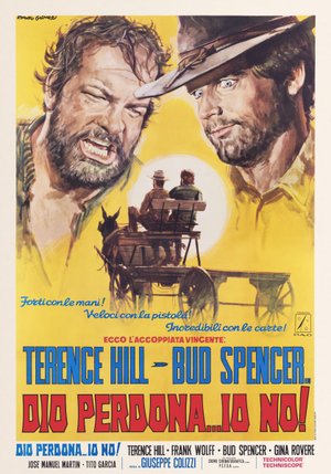
God Forgives... I Don't! (Giuseppe Colizzi, 1967)
The poster for God Forgives... I Don't!, the first film to bring together the couple of Terence Hill and Bud Spencer, is dominated at the top by two large portraits side by side: on the left the bearded, furious face of Bud Spencer shouting, on the right the younger, sly face of Terence Hill, with his hat and pale eyes. At the centre, in a smaller inset, the two leads are seen from behind on a cart drawn by a mule, riding off into a yellow, dusty landscape. The bright yellow ground and the lines "Strong with their hands, fast with the pistol, incredible with the cards" charge the image with irony. It is a poster built to introduce the public to a comic duo destined to become legendary, with that caricatural edge Gasparri knew how to measure without ever weighing it down.
Incisive Synthesis and the Force of Contrast
Gasparri's true signature is his gift for synthesis. Where others pile up detail, he takes away, staking everything on a close-up, a bold colour contrast or a sudden blade of light that isolates the subject. He handled the light technique of the sketch and of watercolour with assurance but, unlike a master of transparency like Ercole Brini, he bent it towards results of strong impact, in which full colour and textured brushwork count for more than soft gradation. It is a rigour that never leaves him, from the western to the epic drama and comedy, and one clearly felt in the works gathered here.
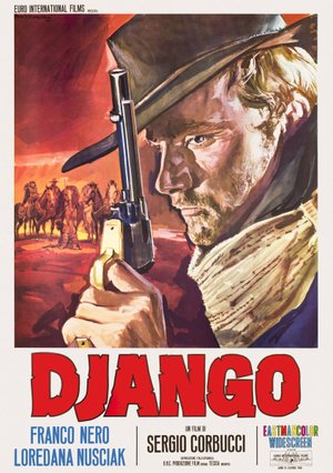
Django (Sergio Corbucci, 1966)
The poster for Django, Sergio Corbucci's dark and violent western, places at its centre the face of Franco Nero, unshaven and with very pale eyes, raising a large wooden-gripped Mauser pistol beside his face. On the left, against a blood-red sunset sky, a line of hooded riders advances through the shadows, a prelude to the violence of the story. The warm range of reds and oranges, broken by the white of the scarf knotted at his neck, creates a murky and threatening atmosphere. The title, in large red letters, is already a brand in itself. The image sums up in a single glance the allure of the solitary antihero who would set the tone for the Italian western.
The Italian Western: From Leone to Corbucci
Gasparri’s name is associated with some of the most iconic images of the Italian Western. His is the striking synthesis of Clint Eastwood's face for For a Few Dollars More, and Maurizio Baroni's volume Pittori di cinema documents his sketches for Sergio Leone's great films, from The Good, the Bad and the Ugly to Once Upon a Time in the West and Duck, You Sucker!: authorial studies that in some cases did not become the poster chosen for release, but that testify to his personal reading of that cinema. Alongside Leone, he also gave a face to Corbucci's grim Django and to the birth of the Terence Hill and Bud Spencer partnership in God Forgives... I Don't!. In these works his painting becomes more textured and dramatic, without losing the elegance of touch that sets him apart, a quality he shares, for all the difference in style, with another specialist of the western poster of those years such as Enzo Nistri.
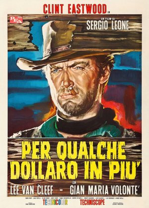
For a Few Dollars More (Sergio Leone, 1965)
The poster for For a Few Dollars More, the second chapter of Sergio Leone's Dollars trilogy, is a true masterpiece of synthesis. Clint Eastwood's face fills almost the entire sheet: the hat pulled down over his eyes, the short beard, the cigar between his lips and the cutting gaze framed by the green-collared poncho. Behind him, a background of peeling wooden planks in tones of blue, orange and rust creates a vibrant, textured surface. At the top the actor's name in red, at the bottom the title in a ringing yellow. By reducing everything to a single close-up, Gasparri fixes the icon of the man with no name, showing how much force a portrait built on contrasts can hold.
The Art of the Portrait
Gasparri's talent emerges with particular force in the portrait. In the sketch for Splendore nell'erba the face of Warren Beatty, framed by an intense red, stands out in an essential, incisive composition. The same intensity returns in the portrait of Clint Eastwood for For a Few Dollars More, a genuine masterpiece of synthesis, and in the sketch for Duck, You Sucker, where the rapid touches of the brush render a vibrant, dynamic face. In these works the artist shows that he can isolate a single element, the gaze of a lead, and charge it with all the tension of the film: a versatility in moving from the intense portrait to the atmospheric scene that brings him close to a versatile author like Averardo Ciriello, equally at ease in glamour and in adventure.
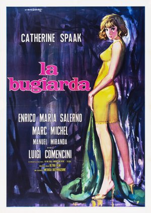
Six Days a Week (Luigi Comencini, 1965)
The poster for Six Days a Week, a comedy by Luigi Comencini, stakes everything on the figure of Catherine Spaak. The actress is portrayed standing, seen from the side and almost from behind as she turns her face towards the viewer, sheathed in a tight sleeveless yellow dress, her blonde hair in a bob and her high-heeled shoes, while a green drape slips to her feet. The background is a nocturnal backdrop of blue and violet laid down in broad brushstrokes, against which the yellow figure stands out with force. The title is set in a bright pink. The pairing of the warm yellow of the body and the cool of the background gives the image that elegant modernity and taste for essential compositions typical of Gasparri.
Lightness, Irony and Modernity
Alongside the dramatic tones, Gasparri could be light and playful. In Naughty Girl a very young Brigitte Bardot appears surrounded by colourful balloons, in a sunny, carefree image. In L'amante infedele the reclining body of Michèle Mercier in a blue interior, essential and modern, elegantly suggests the film's themes without fully revealing them. The same refinement returns in the posters for Italian comedy, from the bittersweet high society of Io la conoscevo bene to the sophisticated figure of Catherine Spaak in La bugiarda, where the contrast between warm and cool colours becomes a true narrative device.
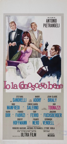
I Knew Her Well (Antonio Pietrangeli, 1965)
The "locandina" (Italian small format) for I Knew Her Well, Antonio Pietrangeli's bitter portrait of an era, gathers at the top a scene of high society: at the centre a girl in a green dress, Stefania Sandrelli, is surrounded by men in evening dress, one standing in a bow tie, one seated in a gallant pose, one watching her from behind, in a small comedy of glances and postures. The palette is pale and delicate, played on soft greens, blues and pinks, almost like watercolour. The title runs in a soft pink script. With a few touches Gasparri suggests the film's theme, the loneliness of a young woman used and courted by the world of show business, without ever falling into vulgarity and instead wrapping everything in a light glow.
A Family Legacy
Gasparri's story has a human side that makes it special. His son Franco grew up dreaming in front of the posters his father painted, and it was from those very images that his passion for cinema was born: having become an actor and then a star of the fotoromanzi, Franco was the lead in the Mark il poliziotto series, whose posters were naturally signed by his father. A rare case in which the poster painter painted the face of his own son to launch his films. From 1979 Gasparri turned more explicitly to easel painting, taking part in exhibitions in Italy and abroad, before his sudden death in 1981. His hometown has not forgotten him: in 2011 Castelfidardo named its town theatre after him and keeps a permanent exhibition of his work. In just a few years of activity, with a gift for synthesis and compositional originality, Rodolfo Gasparri left an indelible mark on the history of the Italian cinema poster.
The works reproduced on this page come from the original prints of the period, recovered, photographed and digitally restored by Movie.it.