Brigitte Bardot, More Than an Image
By Paolo Zelati.
October 15, 2026
Brigitte Bardot was one of the most instantly recognisable faces in post-war cinema. The tousled hair, the easy physicality, the refusal to behave like a conventional leading lady: these features made her a star, but they never quite accounted for the range of women she played. The Italian posters for her films are a useful reminder. Their Bardots can be mischievous or remote, defiant or vulnerable, glamorous or deliberately cartoonish.
Born in Paris in 1934, Bardot trained in dance before moving into modelling and films. Roger Vadim's And God Created Woman made her internationally famous in 1956. She quit acting in 1973, at 39, and went on to devote much of her life to animal welfare. She died on 28 December 2025.
The fifteen designs gathered here date from 1954 to 1971. They are not evidence of what their makers privately thought about Bardot, much less predictions of her life. But they do show what different artists found compelling about her on screen. Seen together, their choices trace a revealing tension between the actress, her characters and the public image that eventually took on a life of its own.
Before the Breakthrough
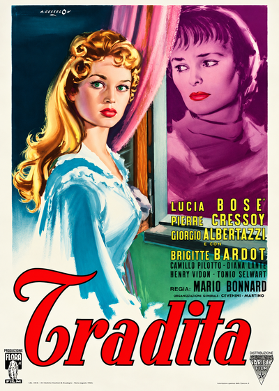
Concert of Intrigue (Tradita, Mario Bonnard, 1954), Angelo Cesselon
Lucia Bosè was the leading lady of Concert of Intrigue, while Bardot, still 20, was billed fourth. Cesselon's composition tells a different story. He places a blonde young woman in the foreground by a window, her pale-blue dress and red lips picked out in warm light. Bosè's darker figure recedes into a purple frame. The painter has effectively reversed the billing. There is no reason to claim he foresaw Bardot's stardom. What the poster does show is that her visual presence had already caught an artist's attention, two years before the film that made her famous.
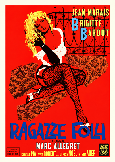
School for Love (Ragazze folli, Marc Allégret, 1955), Lardani
Against a striking red backdrop, Lardani draws Bardot in fishnet stockings, black gloves, white heels and a blouse slipping off her shoulders. Her crossed legs and deliberately untidy hair belong to the language of fashion illustration, but the result is less polished than the standard studio glamour portrait. Even the typography makes a point: the two Bs in her name are enlarged and coloured blue. The initials are becoming a graphic shorthand. The poster captures an enduring paradox of the Bardot phenomenon: an image carefully put together to look unstudied.
A Different Kind of Leading Lady
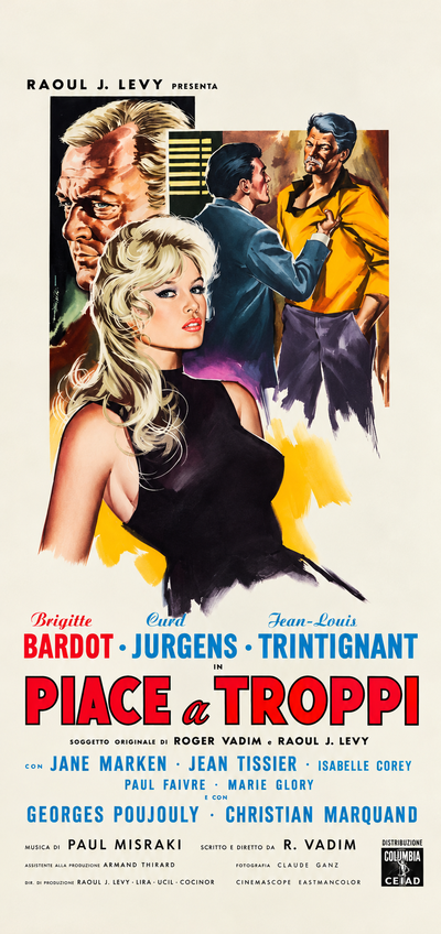
And God Created Woman (Piace a troppi, Roger Vadim, 1956), Sandro Symeoni
Symeoni paints Bardot in a close-fitting black top, looking straight out at the audience. Three men hover behind her. They matter to the story, but visually they are secondary: this is her space, not theirs. The image certainly sells sex appeal, yet it also conveys something more unusual for a mid-1950s film advertisement. Bardot does not seem to be waiting for male approval. Three years later, Simone de Beauvoir would examine the freedom from conventional feminine behaviour that made B.B. such a disruptive figure. Symeoni's composition had already found a striking visual equivalent for it.
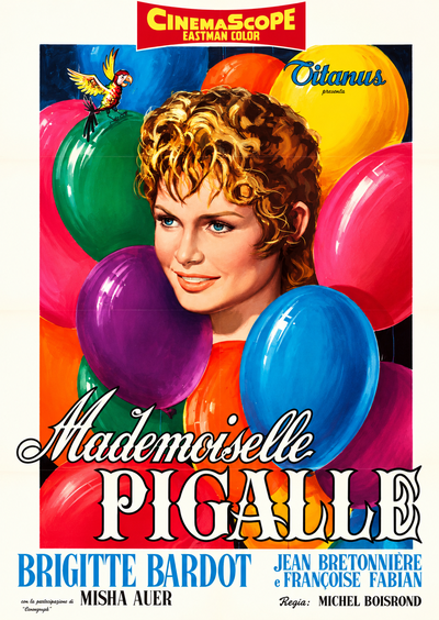
Naughty Girl (Mademoiselle Pigalle, Michel Boisrond, 1956), Rodolfo Gasparri
Gasparri almost removes Bardot's body from the picture. Her short-haired head peeps out among a jumble of bright balloons. It is a breezy, playful design, closer to a cartoon than a pin-up. Compare it with Symeoni's poster from the same year: one artist sees a sexually independent woman; the other finds an irrepressible girl. Neither image can stand for Bardot as a whole. Together, they suggest why she proved harder to categorise than the familiar label of screen siren implied.
In the Public Eye
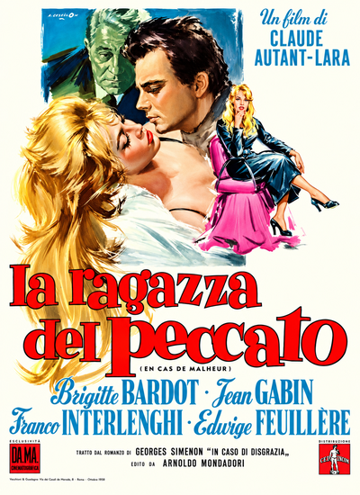
Love Is My Profession (La ragazza del peccato, Claude Autant-Lara, 1958), Angelo Cesselon
Bardot plays a young defendant whose relationship with her lawyer, played by Jean Gabin, becomes the centre of the drama. Cesselon's design does not simply enlarge the star and let her dominate. It places a smaller, seated Bardot among other figures, with Gabin's green-tinted face looming nearby. The arrangement makes her the focus of other people's desires and anxieties. In retrospect, it invites a reading beyond the film: the woman attracting so much attention is not necessarily the one controlling how she is seen.
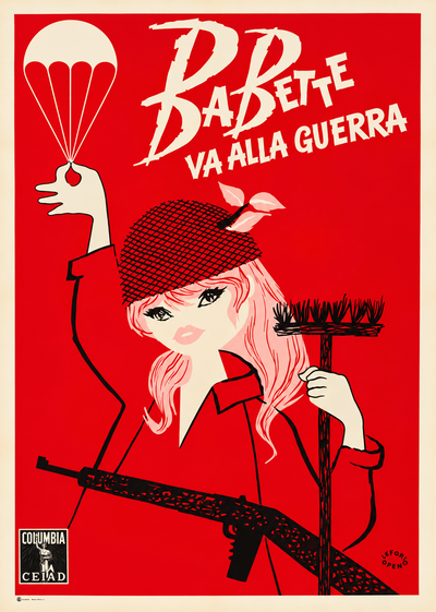
Babette Goes to War (Babette va alla guerra, Christian-Jaque, 1959), artist unidentified
A pink-haired cartoon heroine in a camouflage cap tied with a bow holds up a parachute like a flower and clutches a broom, while a machine gun cuts across the bottom of the design. There is little attempt at a likeness. It hardly matters. By 1959, Bardot was identifiable through a handful of playful visual cues. The poster is an exercise in graphic shorthand, and proof that her appeal could be put to comic as well as romantic use.
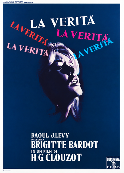
The Truth (La verità, Henri-Georges Clouzot, 1960), photographic poster, designer unidentified
The one non-painted design in this selection, a sign that photography was beginning to take its place alongside painting, is also one of the most revealing. Bardot's upturned face emerges from deep blue, surrounded by five repetitions of the title in different colours. The effect is of competing voices, each insisting on its version of the truth. Clouzot's courtroom drama casts her as Dominique, a young woman judged not only for a killing but for the way she has lived. In a 1990 interview, Bardot said that, if just one film of hers survived, she would want it to be The Truth: it was the film in which she had genuinely felt like an actress. That remark gives the poster unusual resonance. Beneath the familiar face was a performer who wanted her acting to be taken seriously.
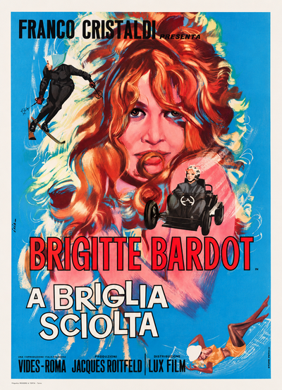
Please, Not Now! (A briglia sciolta, Roger Vadim, 1961), Piero Ermanno Iaia
Iaia sets a dreamy Bardot against pale blue. Her hair sweeps through the composition, linking a series of smaller figures caught in comic action. Her face stays still while everything around it seems to be in motion. As a film poster, it neatly suggests the comedy's pace. It can also be read as a picture of stardom: a whole production orbiting a face that has to do very little to hold the centre.
The Same Face, Different Stories
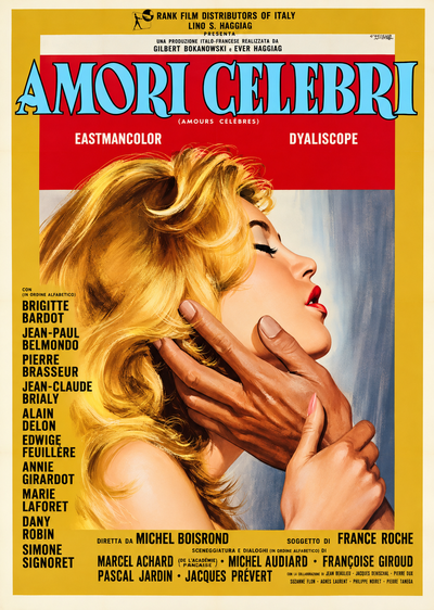
Famous Love Affairs (Amori celebri, Michel Boisrond, 1961), Giuliano Nistri, first design
In the film's tragic Agnès Bernauer episode, Bardot plays a woman whose love for a prince carries a terrible cost. Nistri shows her in profile against gold, head thrown back, while two dark hands grasp her face and neck. The gesture falls somewhere between a caress and an act of possession. This is a very different Bardot from Symeoni's self-possessed heroine of 1956. The design gives priority to the character's vulnerability, rather than to the star's established image.
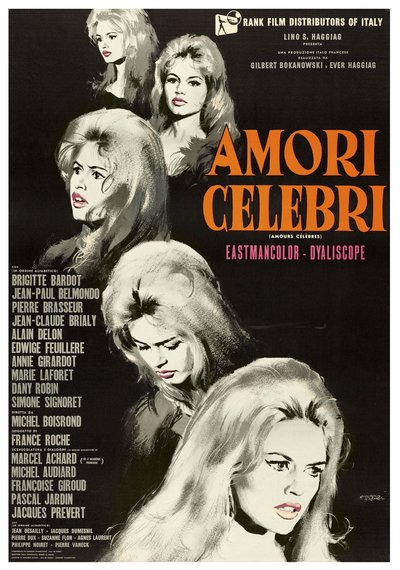
Famous Love Affairs (Amori celebri, Michel Boisrond, 1961), Giuliano Nistri, second design
In a second design, Nistri drops the dramatic scene altogether. He paints Bardot's face five times in grey and white against black, with only the lips picked out in pink. The expressions shift slightly; the identity remains unmistakable. Seen alongside the gold design, the change is telling. One poster sells the story of Agnès Bernauer. The other sells the sheer recognisability of Bardot. Few comparisons demonstrate more clearly the choices available to a film-poster painter once an actor's face has become a major attraction in its own right.
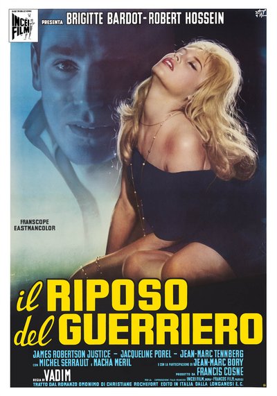
Love on a Pillow (Il riposo del guerriero, Roger Vadim, 1962), Francesco Fiorenzi
Fiorenzi divides the composition into cool and warm zones. Robert Hossein's face appears in ghostly blue; Bardot, painted in warmer colours, tilts her head back, eyes half-closed. The two never meet each other's gaze. In Vadim's film, Geneviève becomes entangled with a troubled man after saving his life. The poster gives us neither a triumphant seductress nor a simple romance. Its disconnected figures suggest the emotional imbalance of the relationship, and point to a more exposed, less self-assured kind of Bardot character.
The Face Everyone Knew
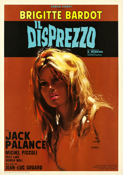
Contempt (Il disprezzo, Jean-Luc Godard, 1963), Giuliano Nistri
Nistri places a large close-up against an austere brown background, with little to distract from Bardot's expression. It is a face that audiences around the world would recognise, yet its mood remains difficult to fix. That ambiguity suits Godard's film, in which Camille is constantly looked at and interpreted, while her estrangement from her husband resists easy explanation. The poster points towards an essential distinction: being instantly recognisable is not the same as being understood. For Bardot, whose public image had become so powerful, the distinction matters well beyond this particular role.
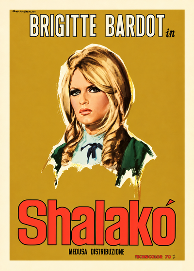
Shalako (Edward Dmytryk, 1968), Rodolfo Gasparri
Twelve years after his balloon-filled image for Naughty Girl, Gasparri paints Bardot as a European aristocrat in a western. She wears dark green and white, her blonde hair arranged in curls; her expression is measured, almost stern. The palette is restrained, the mood markedly different. The comparison is not simply evidence that Bardot has grown older. It shows how one artist could move from treating her as unruly comic energy to presenting her as a reserved, imposing presence, in response to two very different screen roles.
Playing the Legend
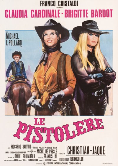
The Legend of Frenchie King (Le pistolere, Christian-Jaque, 1971), Enzo Nistri
Bardot and Claudia Cardinale stand side by side in cowboy hats. Cardinale's posture is open and her gaze lifted; Bardot, dressed in black, folds her arms and looks away. Rather than exaggerating their rivalry, Nistri makes it a matter of body language. Bardot is no longer the sole attraction around which the composition is arranged. She shares the billing, and the picture, on equal terms with another formidable European star, and the poster gives each woman her own temperament.
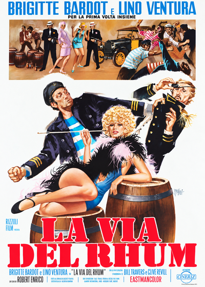
Rum Runners (La via del rhum, Robert Enrico, 1971), Sandro Symeoni
Symeoni returns to Bardot fifteen years after And God Created Woman. This time she plays Linda Larue, a silent-film actress, and the painting dresses her in the trappings of 1920s celebrity: blonde curls, feather boa, blue costume and long cigarette holder. She lounges on rum barrels while the surrounding figures supply the bustle and adventure. In 1956 Symeoni had drawn a woman who appeared to reject the usual rules of the game. Here, he presents a star performing the established gestures of stardom. Looking back, it is a suggestive final comparison: a performer once acclaimed for her unstudied presence is now playing a diva, while the painter quotes an older language of glamour.
The Many Bardots
These posters offer no single explanation of Brigitte Bardot. Cesselon gives prominence to a newcomer before she has achieved fame. Symeoni finds independence in her early screen image. Gasparri moves from playfulness to reserve. Fiorenzi reveals the emotional vulnerability of a character. Giuliano Nistri, working with the same actress and even the same film, shows how differently a painter can approach narrative, desire and sheer star power.
Each design was made to advertise a particular film, not to document Bardot's private character. Yet, taken together, they reveal how readily her presence could accommodate conflicting readings. The actress was not always the seductress of popular shorthand; the public figure was not necessarily the person behind the face. Some of the painters' choices seem especially perceptive in hindsight. Others simply remind us that an unmistakable face could look remarkably different in different hands.
Bardot left the screen in 1973. What survives in these Italian posters is not one definitive B.B., but a succession of women seen through the eyes of the artists who painted her.
The works reproduced on this page come from the original prints of the period, recovered, photographed and digitally restored by Movie.it.
You may also like
Sandro Symeoni, from Seductive Figures to Social Dramas
Francesco Fiorenzi, Master of Movie Poster Photomontage