Basilio Morini, the Painter Who Borrowed From the Masters
By the Movie.it Editorial Team
October 13, 2026
The Man Behind the Signature
Almost nothing is known about Basilio Morini. Official records barely register him: Italy's national heritage catalogue lists him simply as "Morini", active in the second half of the twentieth century. No confirmed birth date, no interviews, no biography to speak of. What survives is his work, and a signature, MORINI, written in block capitals, sometimes tucked into a corner, sometimes running vertically along the edge of a poster. His paintings tell a story stretching across some three decades, from Dramma nel porto - Ultimo addio in the mid-1950s and the Mexican melodrama Sete d'amore (1959), featuring Silvana Pampanini and screened at the Venice Film Festival in August that year, to Febbre d'amore (1985). It is a remarkably varied body of work, taking in Hollywood thrillers, Italian melodramas, American counterculture and Japanese animation.
Morini was one of the Pittori di Cinema, the Italian poster painters whose images once covered city walls and cinema entrances, reaching millions of filmgoers while the artists themselves remained largely unknown. The term comes from Maurizio Baroni, author of the book Pittori di Cinema. With so little biographical evidence to draw on, Morini's posters have become our best guide to the man who painted them.
Bold Brushstrokes, Striking Contrasts
Morini could paint a face with remarkable care, catching the fall of light across the skin or the direction of a glance. Elsewhere, he allowed himself far greater freedom: sweeping patches of colour, visible brushstrokes, even the occasional drip. That contrast gives his posters the immediacy of a working sketch, without sacrificing their impact on the street. The stars are instantly recognisable from a distance; move closer and you can almost follow the painter's hand.
The design chosen for Alfred Hitchcock's Torn Curtain (1966) makes the point beautifully. Paul Newman and Julie Andrews are rendered with a seasoned portraitist's assurance. Around them, a crimson curtain erupts into restless, vigorous brushwork. The tear in the fabric does more than illustrate the title: it holds the whole composition together.
When Old Masters Meet Hollywood
Perhaps Morini's most playful ideas appear in the Italian posters for two early Brian De Palma films, Greetings (1968), released in Italy as Ciao America!, and Hi, Mom! (1970). Both star a young Robert De Niro. Their Italian poster editions date from 1979 and 1978 respectively, by which time De Niro had become a major name, and his billing leaves little doubt about it. Faced with two irreverent films rooted in the American counterculture, Morini went looking for inspiration in some unlikely places.
For Greetings, he places the Uncle Sam of the famous American recruiting poster, pointing finger and star-spangled hat included, among muscular, trumpet-blowing figures that recall Michelangelo's Last Judgment. For Hi, Mom!, he turns to one of the best-known portraits in art history. Whistler's mother still sits primly in her black dress, but now she is holding a submachine gun. The joke works because the source image remains so recognisable. The sacred and the satirical, the respectable and the outrageous, occupy the same painted space. Morini shows just how effectively a film poster can draw on art history without losing its wit, clarity or popular appeal.
From Gothic Melodrama to Giant Robots
His range becomes even clearer when the subject changes. For Il bacio di una morta (1974), drawing on the world of popular novelist Carolina Invernizio, Morini conjures up a Gothic interior of dark wood, velvet and coloured light. A pair of watchful eyes hovers above the scene like an omen. The atmosphere belongs to nineteenth-century melodrama, but the rich crimsons, rusty reds and purples are unmistakably of the 1970s.
Four years later came the locandina (Italian small format) for Mazinga contro gli UFO Robot (1978), an Italian compilation of Japanese animated films. Here Morini moves into a different visual universe altogether: the giant robots and fantastical battles that were capturing the imagination of Italian children. He reins in his expressive brushwork, working instead with clean black outlines, flat colours and sharp movement. Even when adapting to the look of animation, he retains a sure grasp of composition. It reveals a painter equally at home with different visual languages, never confined to a single style.
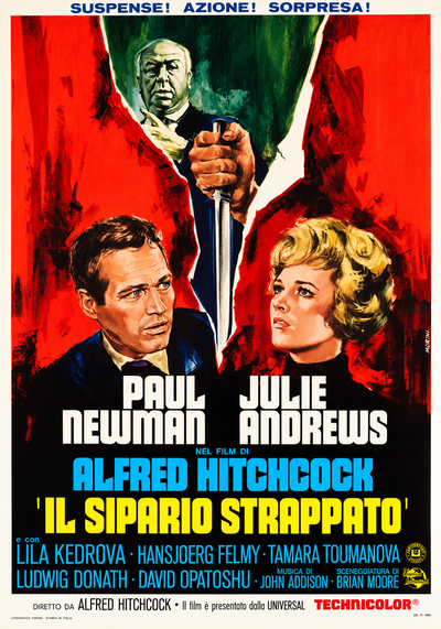
Torn Curtain (Alfred Hitchcock, 1966)
The poster for Torn Curtain is split by a scarlet curtain torn from top to bottom. Quick, overlapping brushstrokes leave flashes of white paper along the ragged edges, while a face emerges from the dark green space beyond. A hand grips a knife pointing down towards two carefully modelled figures at the foot of the design. They look in opposite directions, the blade poised between them. Rich red fabric, cool shadows and warmly lit faces pull the eye towards the opening, turning a simple tear into the picture’s central source of tension.
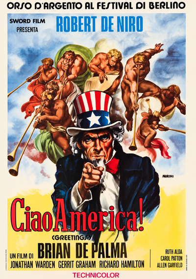
Greetings (Brian De Palma, 1968)
The poster for Greetings puts Uncle Sam centre stage, with his star-spangled top hat and unmistakable finger pointed straight at the viewer. Around him, muscular figures blow long trumpets and raise an enormous book against a cloudy blue-grey sky, echoing the angels of Michelangelo’s Last Judgment. A familiar emblem of American patriotism is suddenly surrounded by the grandeur of Renaissance painting. The transition from graphic caricature to richly painted bodies is remarkably seamless, while a burst of yellow at the bottom gives the title room to breathe.
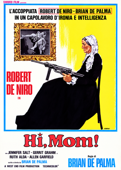
Hi, Mom! (Brian De Palma, 1970)
The poster for Hi, Mom! borrows the quiet, carefully balanced arrangement of Whistler’s Mother. The seated woman is shown in profile, white cap and collar standing out against the broad black shape of her dress. The surprise is in her lap: a submachine gun aimed beyond the edge of the picture. Behind her hangs a black-and-white photograph in an ornate gold frame, while the wall shifts abruptly from white to vivid yellow in a fringe of vertical brushstrokes. The closer the composition stays to the original painting, the more startling the weapon appears.
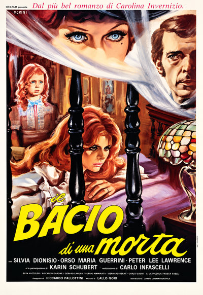
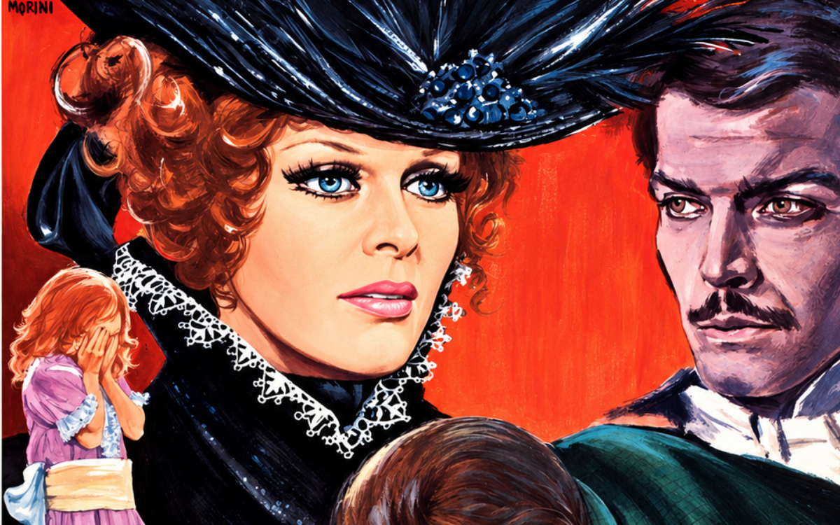
Kiss of a Dead Woman (Carlo Infascelli, 1974)
The poster for Kiss of a Dead Woman is watched over by a pair of wide blue eyes emerging from a sweep of white fabric at the top of the picture. Below, a red-haired young woman rests her head on her folded arms between the dark posts of a bed. A little girl and a stern male face hover in the background. Deep purple, dark timber and heavy shadows give the room a close, uneasy atmosphere, pierced by the jewel-like colours of a glass lamp in the foreground. The loose folds of fabric and pools of coloured light lend the nineteenth-century interior an almost theatrical intensity.
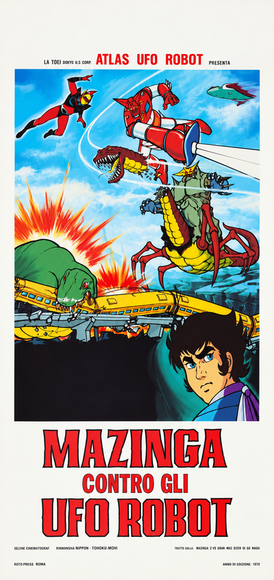
Great Mazinger vs. Getter Robo G: The Great Space Encounter (compilation film, 1975)
The locandina for Great Mazinger vs. Getter Robo G: The Great Space Encounter packs robots, monsters and streaks of energy into a tightly staged vertical composition. Mechanical figures hurtle across the sky amid slanting beams and flashes of light. Below, a green creature crashes into a yellow train on a broken viaduct, with bursts of red and orange spreading across the scene. A young face appears in the lower corner, drawn with the same firm black outlines as the animated figures. Flat areas of primary colour and crisp contours keep the action readable, while a border of white paper sets off the title.
A Painter Worth Rediscovering
Hitchcock, De Palma, Gothic melodrama, Japanese robots: put them together and Morini becomes an artist who refuses to fit neatly into any category. He may not have the instantly identifiable style of some of his contemporaries, but he has something equally valuable: an eye for the telling idea. A torn curtain. A borrowed masterpiece. A disquieting gaze. Again and again, he finds a simple visual hook and develops it in whatever language the film demands, whether realistic portraiture, energetic brushwork or the graphic clarity of a cartoon. There is still much to discover about Basilio Morini. Until more of his story comes to light, his posters speak for him.
The works reproduced on this page come from the original prints of the period, recovered, photographed and digitally restored by Movie.it.
You may also like
Salvatore Spataro, Master of the Airbrush
Bruno Napoli, the Painter of Wonder