Paolo Sestito, from Brush to Computer
By the Movie.it Editorial Team
September 7, 2026
From the 1990s into the early 2000s, the same signature appeared in the corner of remarkably different manifesti: the black crow looming above Brandon Lee, the five acid-tinted faces of Trainspotting, the painted embrace of The Ignorant Fairies. Sometimes it appeared in full as Paolo Sestito, sometimes as the surname alone, and sometimes it was concealed behind a studio stamp. Behind that signature was Paolo Sestito, born in Rome on February 7, 1949, a painter who brought an artist's eye to graphic design and advertising, and one of the figures who helped carry the Italian movie poster from the age of the paintbrush into the digital era. His story has remained largely untold, and is retraced here.
An Artist in Rodolfo Gasparri's Studio
Sestito began his training at a very young age in Rome's advertising and graphic-design studios during the 1960s and 1970s. He worked at Scalera-Tarantelli and, above all, in the studio of the painter Rodolfo Gasparri, one of the great Italian poster artists associated with westerns and adventure films. It was an apprenticeship in the traditional workshop model: learning by watching a master of the painted poster at work, understanding how an image was built through paint before fully mastering the language of graphic design. Rooted in the tradition of the illustrated movie poster, Sestito gradually moved towards graphic design without ever losing a painter's way of seeing.
Grammo Studio: Graphic Design, Advertising and Film
In 1978, together with several partners, Sestito founded Grammo Studio, a full-service graphic-design company. Its work ranged from corporate identity and communications to institutional and product campaigns, logo design, packaging and special events, for clients including Ferrarelle, Palmolive, Surgelati Brina and Allergan. Film, however, soon became one of Sestito's principal fields of work. The studio worked for distributors including Titanus, Cineriz, Medusa Film, Cecchi Gori Film, Penta Film, Mikado Film and Lucky Red, as well as a number of smaller companies.
During the 1980s, alongside his work at the studio, Sestito taught graphic design at the Istituto Europeo di Design. In 1984, he collaborated with Studio Kaleidos on a multi-image audiovisual presentation for the exhibition L'economia italiana tra le due guerre, 1919-1939 (The Italian Economy between the Two Wars, 1919-1939), staged at the Colosseum in Rome. These were also the years when computers began to enter the design studio. Sestito immediately recognised their potential and began incorporating digital tools into his work, speeding up production while opening up entirely new possibilities for creating and manipulating images. In 1988, Grammo Studio also won the Liburna d'Oro for the poster for Ironweed. From 1992 onwards, Sestito continued his career as a freelance designer, while Grammo Studio was dissolved in 1994. He went on to work with major distributors including Medusa Film, 01 Distribution (Rai Cinema), Bim Distribuzione, Lion Pictures and Dieffe Cinematografica.
Cinema: The Posters of the 1990s
It was during this period that Sestito created many of the posters most closely associated with his signature. Illustration and photography merge with digital compositing in images spanning radically different genres: supernatural horror, science fiction, the new British cinema and major auteur films.The result is a body of work that reveals the versatility of an artist capable of reinventing his visual language from one title to the next.
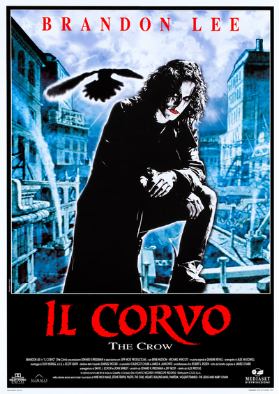
The Crow (Alex Proyas, 1994)
The poster for The Crow shows Brandon Lee crouched on a beam above a bleak, crumbling city, his long black coat falling behind him like a second shadow, his pale face marked by dark makeup around the eyes. Above him, the silhouette of a crow cuts across the stormy sky, while the title burns in jagged red lettering. The image sets a photographic figure against an illustrated, desaturated cityscape, blending photography and drawing in a way that gives the poster its cold, funereal blue cast.
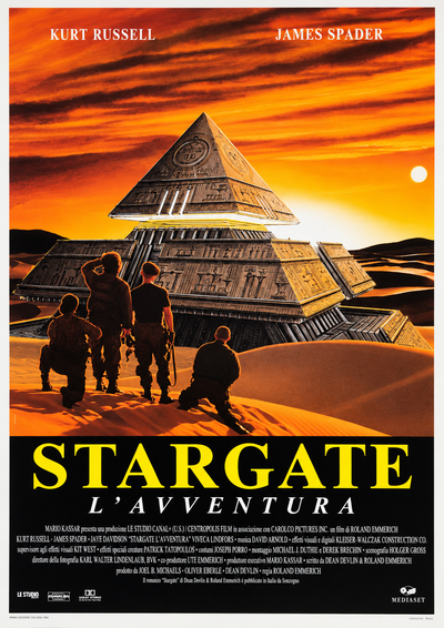
Stargate (Roland Emmerich, 1994)
The poster for Stargate shows a vast pyramid-shaped spacecraft rising from the desert against a blazing sunset, its metallic sides etched with hieroglyphs. Tiny silhouettes of soldiers kneel on the dune below, looking up at it, while the sky is streaked with orange and the title stands out in solid yellow lettering. The entire composition plays on scale: the monument is immense, while the human figure is reduced to little more than a speck, using warm, illustrative colours to capture the sense of awe associated with grand-scale science fiction.
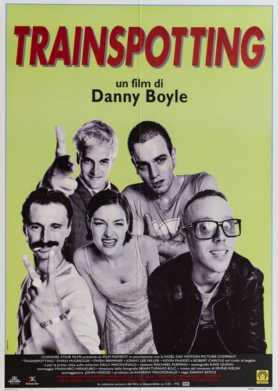
Trainspotting (Danny Boyle, 1996)
The poster for Trainspotting features the five main characters cut out in stark, high-contrast black and white against an acid-green background. Each is frozen in an exaggerated pose — a pointing finger, a sneer, a wide-eyed stare — while the title appears in red with a grey outline and the names of the soundtrack artists run along the bottom edge. It is pure pop graphics: no setting, no environment, just faces and lettering on a flat field of colour, a visual translation of the film’s punk energy.
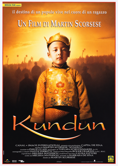
Kundun (Martin Scorsese, 1997)
The poster for Kundun shows the young Dalai Lama in golden brocade against a blazing sunset, with a crowd of monks dissolving into silhouette behind him. The entire image is bathed in warm amber tones, while the title appears in elegant, flowing gold lettering. Here, graphic stylisation gives way to a photographic composition that is frontal, almost devotional, and built entirely around light. One of Scorsese’s most contemplative films, it features cinematography by Roger Deakins and a score by Philip Glass.
The Ignorant Fairies* and the Ciak d'Oro
The high point came in 2001, when Sestito returned to the medium he knew best: painting.At a time when photographic and digitally produced posters had largely displaced illustrated ones, Sestito turned once again to drawing for Ferzan Ozpetek's The Ignorant Fairies, distributed by Medusa. He created an image of three embracing figures reduced to essential shapes and fields of colour. The poster became the defining image of one of the season's major successes and earned Sestito the 2001 Ciak d'Oro for Best Poster. It was a striking acknowledgement of the expressive power of a hand-drawn image at a moment when the industry was moving decisively in the opposite direction.
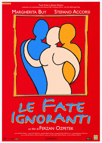
The Ignorant Fairies (Ferzan Ozpetek, 2001)
The poster for The Ignorant Fairies features three figures outlined in thick, wavering black lines, huddled together against a solid red background: one blue, one cream-coloured and one orange, their heads bowed towards one another inside a rough frame, with the title handwritten in light blue. The image abandons any photographic reference in favour of a warm, almost childlike visual language built from bodies and colour, more emblem than illustration. A symbolic poster, capable of capturing in a single image the tone of a new chapter in Italian auteur cinema.
Today: A Signature Within a Tradition
Film, however, represents only part of Sestito's work. He has also designed the graphics and visual presentation of art exhibitions and their accompanying publications, and he continues to collaborate with graphic and web designers today.This is what sets his story apart from that of many movie-poster artists. While their careers often came to an end with the decline of the painted poster, Sestito's continued seamlessly into the digital age. He belongs to the tradition of artists Maurizio Baroni celebrated as Pittori di Cinema (Painters of Cinema), but he is also one of those who carried the craft into the computer age, a living bridge between Gasparri's workshop and today's digital image. His signature, seen by countless viewers in the corner of so many posters, finally has a name and a face.
The works reproduced on this page come from the original prints of the period, recovered, photographed and digitally restored by Movie.it